Say hi to our newest member, RichardELDEN!
3. Smoothing groups........ Any good tutorials out there on that?Smoothing groups are pretty easy to add. Is there one at the 'pit already? I suppose not as you asked... Might be my first one :biggrin:
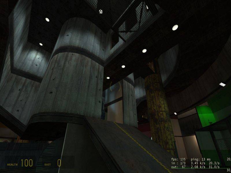
4. Could you be a bit more specific about the ramps?They're just too simple for my taste. Try to replace them by more high-poly stairs, add some supports to the walls around, some structure beneath them ect.
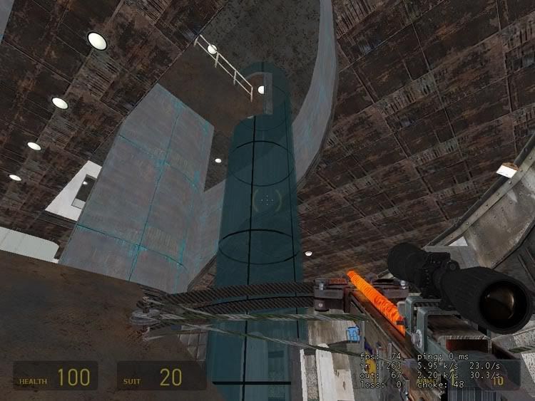
7. The jetson tubes. What did you mean, lose the enclosure?, retexture?Maybe both. It's easier to criticize something than to come up with the solution <:]
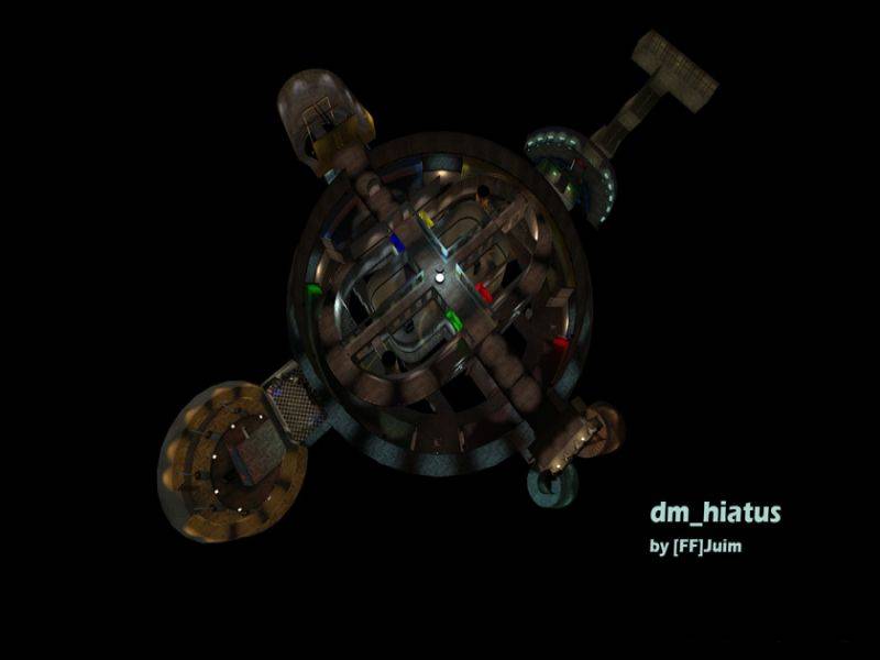
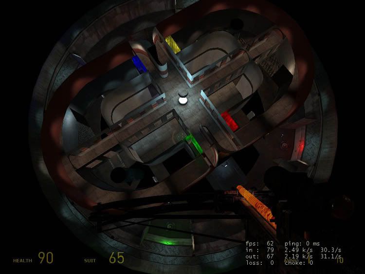
8. The colored lights. This brings me to my next problem. I actually love the red striped texture in the main room, but unfortunately I don't have access to photoshop or any real decent photo tinkering software. Is there someone who might take pity on me and make me a blue, green, and yellow of the same texture? I would be forever greatful, and it would solve a myriad of texturing inconsistencies.I feel heroic today. I might give it a shot, shouldn't take more than 10 minutes.


 ).
).