Black by mrnatural332000

Map Rating

  • 0
  • unrated

Map Download

Map Info

Map Description

After a freak accident with the experimental quass cannon a tremor struck the foundation of the black mesa weapon research building. Stripping the color out of the very fabric of reality. It also stripped the minds of all within blast. Now only insanity and violence remain.

Discussion

Posted by Kage_Prototype on Sat Jul 17th 2004 at 1:15am

If you're going to have a black and white theme, you need to emphisize the contrast. The lighting is where you fail, it's too smooth and bland, and just makes things incredibly dull.
Posted by mrnatural on Sat Jul 17th 2004 at 12:45am

User posted image
Posted by mrnatural on Fri Jun 4th 2004 at 2:16pm

yeah....clip brushes are gonna be placed....that and certain areas will teleport so.

i keep forgetting about that button and non working elevator. haha

and i stuck the weapon arrow in cause it looks cool. haha

ill have to make something in place of those wooden crates. but it works in well with getting out of the elevator.

ok...kewl.

thanks for the comments. nevermind about my r_speeds..they are down alot. hint brushes work well.
Posted by 7dk2h4md720ih on Fri Jun 4th 2004 at 2:01pm

A mid-size map centered around a scientific weapons research building
theme. After a incident the lab and building are in rubble.
There's no actual suggestion as to what the building actually is when you're inside it. :smile:
Posted by 7dk2h4md720ih on Fri Jun 4th 2004 at 1:37pm

Ignore any of this that is obsolete.

User posted image

1. The weapon arrows are a bit unnecessary, it just seems like you added them because they look cool.

User posted image

2. Have the button target an ambient_generic with a locked door type sound.

User posted image

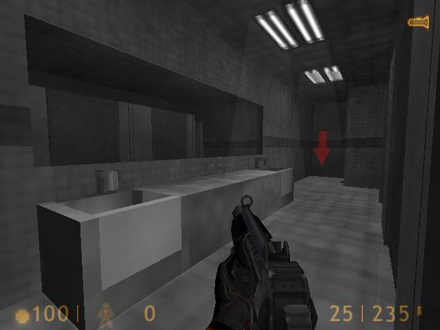
3. These light fixtures are neat but they'd look just as good flush
with the floor while saving polys. They're also far too close together.

User posted image

4. Shameless use of crates here. Why would there be a bunch of wooden
crates blocking the door to the elevator? No wonder the place is in
such disrepair! :biggrin: A couple of medium sized crates would look better
but something not a crate would be preferable.

User posted image

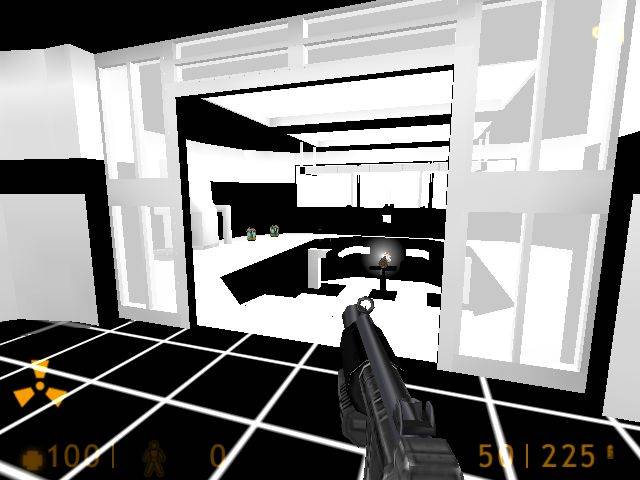
5. I wouldn't go with a black and white theme. While it may seem a
novel idea, it just ends up looking dull and lifeless. Handicapping
yourself by not using colour puts you at a severe disadvantage.

User posted image

6. As you can see, I was quite thorough! :biggrin: I liked all the destroyed stuff and the way you had to go around damaged areas.

User posted image

7. Just a world brush a few units too small, looks far too straight to be an intentional crack.

User posted image

8. It's generally considered bad practice to have areas where you can't get out of. Maybe it's just not finished though.

User posted image

9. If you want people to be able to jump/fall off the side, make the exterior a little more presentable.

Overall a decent map, but needs more razzle-dazzle! :smile:
Posted by mrnatural on Fri Jun 4th 2004 at 1:29pm

i changed the map around quite a bit. thats why just the last screenshot.

thanks

shayne
Posted by 7dk2h4md720ih on Fri Jun 4th 2004 at 2:15am

I took some pics of this but didn't write comments, give me a few mins.
Posted by mrnatural on Fri Jun 4th 2004 at 2:03am

hey.

that texture lighting is kewl. making my own unique rad files works out well with my custom textures.

anyway..check out the third screenshot and you guys let me know how it looks please.

thank you

shayne "mr.natural" hawkins
Posted by mrnatural on Wed Jun 2nd 2004 at 12:16am

ah...sorry...no idea.
Posted by Cassius on Tue Jun 1st 2004 at 4:04am

I tried to join and I got REJECTED for some reason.