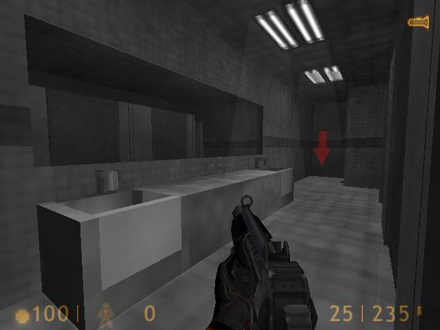
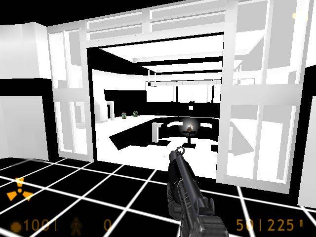
Black by mrnatural332000

Map Rating

  • 0
  • unrated

Map Download

Map Info

Map Description

After a freak accident with the experimental quass cannon a tremor struck the foundation of the black mesa weapon research building. Stripping the color out of the very fabric of reality. It also stripped the minds of all within blast. Now only insanity and violence remain.

Discussion

Posted by Crackerjack on Tue May 4th 2004 at 3:03am

For new person to mapping, Im quite impressed, you deff came to the right place if u want to learn to map :wink:
Posted by mrnatural on Tue May 4th 2004 at 2:33am

oh

if any want to playtest this map let me know.

im running a server that i will be testing out my maps on consistantly.

hardly near done but input is welcome. new versions will be avaialble almost daily. so be sure to delete the old ones.

the game is half-life and the server called dead again and password is black

well thanks. email me at shayne@ptd.net for suggestions
Posted by Tracer Bullet on Tue May 4th 2004 at 2:32am

-Pic 1: The hole in the wall is far too square. in general the rubble doesn't look very realistic, particularly as there is no real debris laying around.

-Pic 2: The glass seems to glow, you may want brighten up that area so that it isn't so noticeable. it too dark in that screen anyway.

-Pic 3: You appear to be using entities for those floor lights. I'm not one of those who thinks ent lights are evil, but in this case you really should do texture lighting

-Architecture: good job so far, you are doing well with keeping a blocky theme interesting. that can be a real challenge.

-Lighting: Generally flat. you need to experiment with both texture lights and Light_Spot entities. I terms of lighting mood I like that darker picture which I mentioned earlier. You can brighten it up without destroying the mood by making a spot light shine down from that hole in the roof or something similar. Don't think light or dark. think contrast. you want light and dark mixed together into yummy atmospheric goodness.

Good work so far!

Oh, I almost forgot. loose those crates entirely. Insipid cubes will not do your map any favors unless you are absolutely sure the fit the theme, and you place them logically. Using them simply to make rooms less empty is horrible.
Posted by parakeet on Tue May 4th 2004 at 2:01am

the crates are neat but just one suggestion .. i doubt all the crates would survive after everythin else would splode
Posted by mrnatural on Tue May 4th 2004 at 1:43am

yeah.

in the end though its all going to be in all black and white. im going to strip the colors out of the halflife wad and make it custom.

so mulitshaded and textured.

at least so far thats the plan.
Posted by EDEdDNEdDYFaN on Tue May 4th 2004 at 1:33am

It looks pretty nice but...the blue looks...so...ugly?