After a freak accident with the experimental quass cannon a tremor struck the foundation of the black mesa weapon research building. Stripping the color out of the very fabric of reality. It also stripped the minds of all within blast. Now only insanity and violence remain.
I don't think there is any problem with hitting 1000, but you should still do all you can to keep it as low as possible for what you have in the map. If, for instance, you played a map that was basically just a box, and w_poly was up at 1000, that wouldn't be acceptable, but if you are playing a highly detailed level then 1000 is fine really. You don't wanna be up there TOO often of course...
ReNo said: Do you understand how to use hint brushes? A lot of people who don't, think that they can miraculously reduce your r_speeds, and while occasionally this is true, they certainly can't always be used to great effect.
Agreed! HINT brushes have some ingenious applications but they are rarely effective at reducing polygon counts. It is certainly a bad idea to rely on them as a "last-minute save".
Do you understand how to use hint brushes? A lot of people who don't, think that they can miraculously reduce your r_speeds, and while occasionally this is true, they certainly can't always be used to great effect.
thank you very much for the critisms and the compliments.
i looked at the tutorials for the textured lighting and such. especially the glass one.
dont quite it but will.
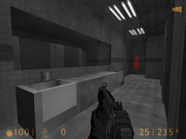
yes these rooms are blocky but i have plans to liven it up.
the main rooms which are test areas for weapons will be differant and fun.
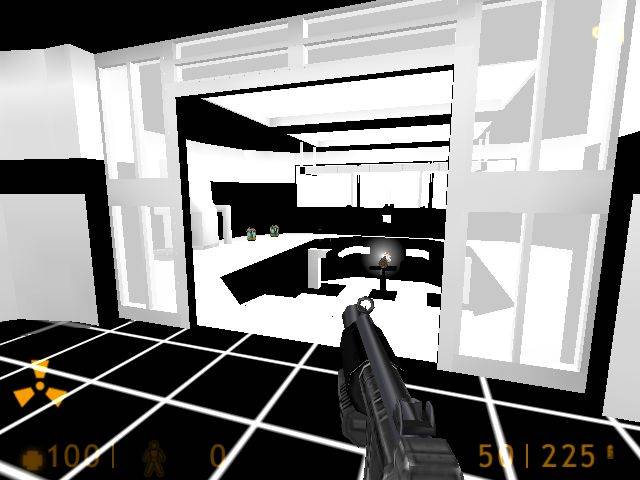
the whole theme is going to be around a botched experiment that made the immeditate area black. gonna do like black and white color scheme in the main room. than branch off from there with grayscale textures than at the fringes colored textures. this coupled with shock that destroyed certain sections of the buliding.
yes the boxes and crates are nessacary. its to a elevator shaft with climbable cables and such. it works in well. already got rid of my glow in the dark glass. lol.
boxy but very three diminsional so far with varying heights.
r_speeds high. some at 1000 max. but im gonna cheat with hint brushes. so. most are at 700/600. but my theme is fun. fun with a artistic/imaginetive flair.
no im not new to mapping. i suck at doing the entity work. did it years ago so. but i enjoy mapping too much.
but yeah seems this is a very good site for mappers.
I wouldn't call the blue ugly, I WOULD call it clashing with its surroundings though. It could work if the rest of the map didn't look like some dirty industrial area - how the hell did the blue stay so clean?! I appreciate that you are turning it black and white though, so its not an issue.
Otherwise, I think it looks quite cool - the blue structures provide a sense of integrity to the rooms, they feel solid and supported, unlike a lot of empty box rooms we see as the first shown work of most authors.
In the first shot, is that hole in the wall a window that has been bust up a bit, or is it just a blown up wall? If it is the former, give it a frame around the non-bust up bits, as some of those textures look wierd just ending in the middle of their pattern and a trim would help. If its the hole, then try and make the edges less straight.
In the second shot, the glass is much too bright compared to the rest of the scene. What render mode have you set it on? It should be texture, and try a render amount like 64 or 96 to make it quite subtle. The scene definately needs at least one light in it too - be it a fixture or just light coming in through the hole in the roof or the window.