dod_merderet by warlord

Map Rating

  • 4
  • 1 rating / 4 stars

Map Download

Map Info

Map Description

i seem to make a lot of remakes for old games into source. im not sure why, its either that i really want to play that map on the source engine and it was never made, or the ones out there are terrible reconversions.

anyway ive always loved merderet on dod and i havent ever seen a server play one for source.

this is playable but it is still in beta for detail work and playability.

NOTE: as far as i know ive only used base content on this map so there shouldnt be any missing textures and such, but let me know if you see anything!

currently beta 9

Discussion

Posted by warlord on Thu Jun 4th 2009 at 7:05am
[Author]

thx for the full scale review.

1 i diddnt know about the clipping probs with the windows.
2 the bell tower is intentionally cramped, mainly i diddnt want a player to be able to see into spawn nor have an all access pass to easy kills.
3. yea a lot of that clipping was rushed work. i just lose the creative edge now and again.
4. as youve seen when it comes to using displacements on surfaces that are not horizontal i suck. but yes i will include a but more of them and better ones.
5. and one thing that i gotta keep my eye on is the bridge itself, in a fullscale battle it can be a fps killer, so im working on ways to fix it up a bit more.

ive also learned a lot more about optimization since this realease so hopefully it will run better too.

side question tho
does anyone know the limit of ropes, as i see a lot of rope limit errors in th console (only in noclip tho)
Posted by Riven on Mon Jun 1st 2009 at 6:32am

Well, I had the chance to take a short stroll through your map, and it looks like it's well on it's way to becoming a very nice looking DOD map. Your gameplay feels solid (although I can't say for certainty unless I get the chance to play online with it), but I don't think you should have too much to worry about in the gameplay department in this map. I understand the map is in beta, so beyond some of the obvious fixes that you need such as: light fixture models in rooms that have lighting, and player clip brushes to smooth over doorways so that players don't get caught up in geometry, the map simply needs some more polishing in the visuals department.

I can tell that you spent more attention to some areas than you did to others in terms of visuals, and I think as long as you spread your time out, this will be good. Here are some focal points that I spotted:
User posted image
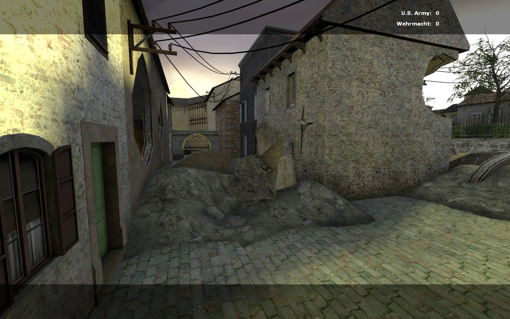
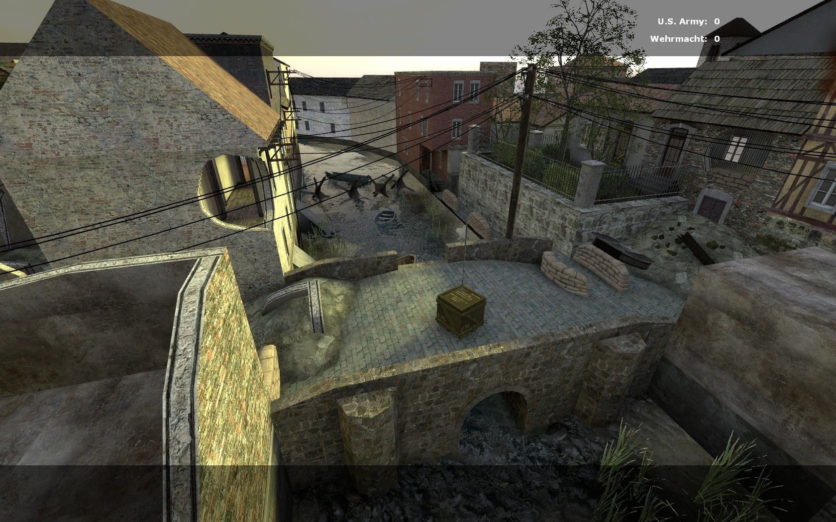
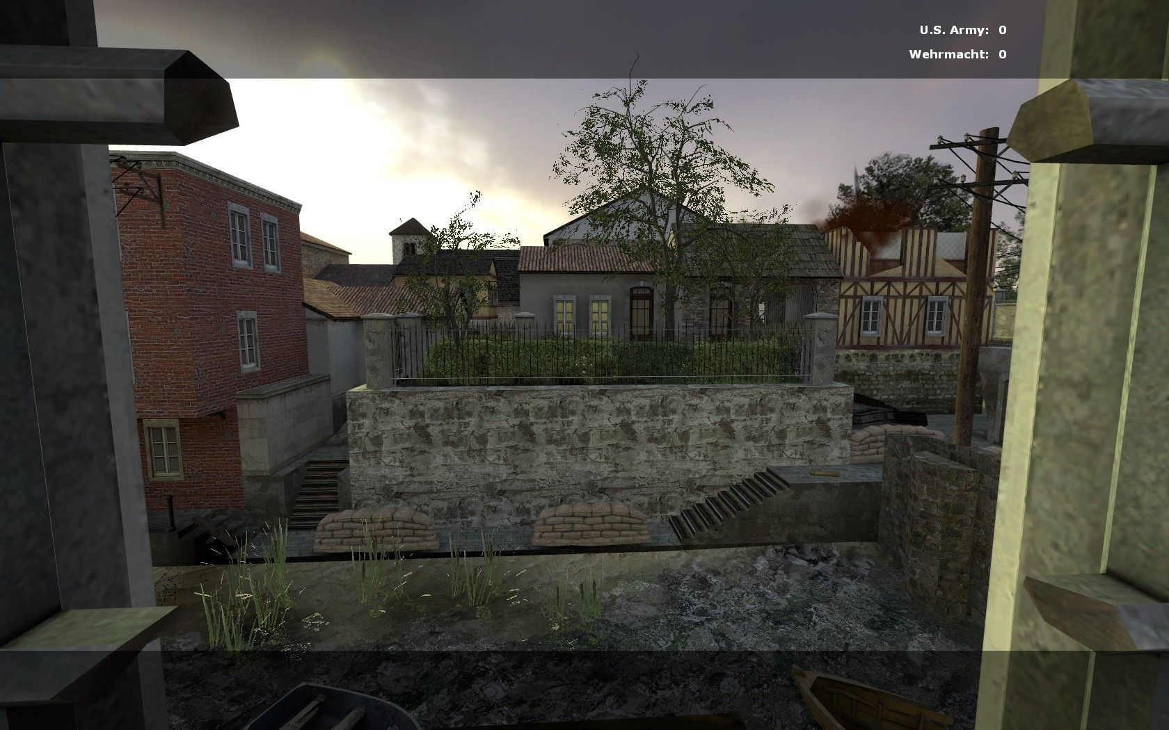
^-A little cosmetic glitch where I see you probably used an occluder or hint brush of some sort, for optimization. You only notice it as you move in or back away from it. Not a big deal, but could be fixed up by changing the height of that fence/wall thing (aside: personally, I would get rid of the rubble simply because it doesn't look accurate, especially considering what's on the other side of it). You could just have an interesting looking building there or a wall. The 20 foot tall wall of rubble just doesn't fit IMO. Take it or leave it, your call.
User posted image
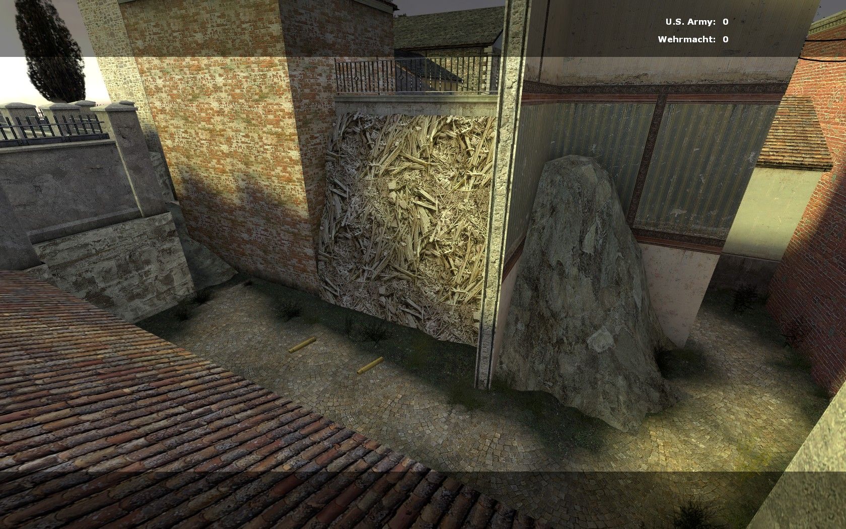
For this shot, I just wanted to complement you really. For some reason, I really liked this destroyed portion. I like how the bed frame from below is partially sticking out, and then if you look deeper, you can spot the road through the wall. It's not a large gaping hole like most you have around the place, and it feels like a nice aesthetic that I think you could use elsewhere. (along the same lines of how Valve had bricked-up doorways in HL2). -The only other note is the mislighting of the model portion of the destruction; it's evident in other portions of your map for some of the coins on the side of the buildings and stone door frame models where the light_environment is making them look brighter even thought they're in the shadow of another building. -Have you tried using the info_lighting point entity to try and fix those yet?
User posted image
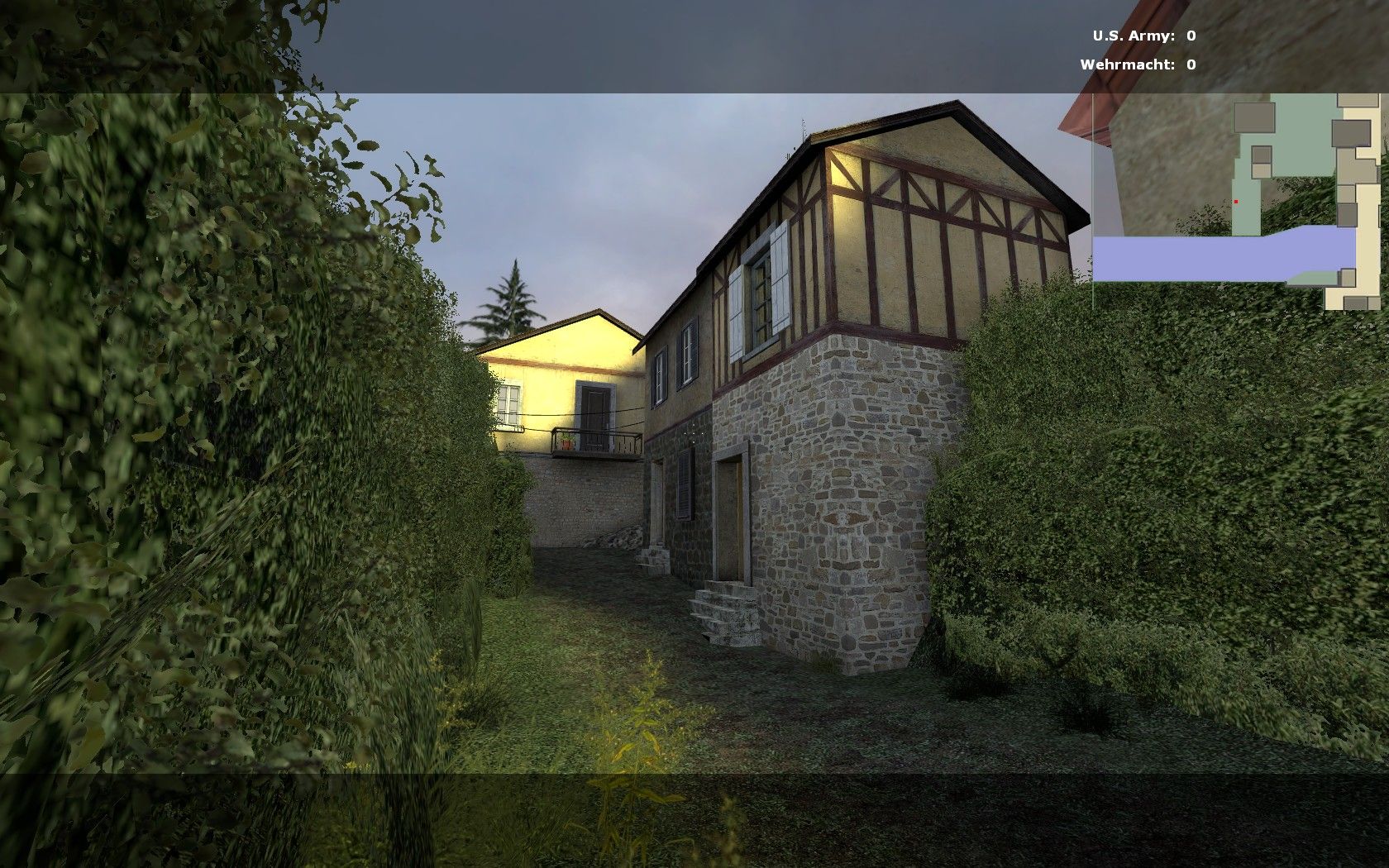
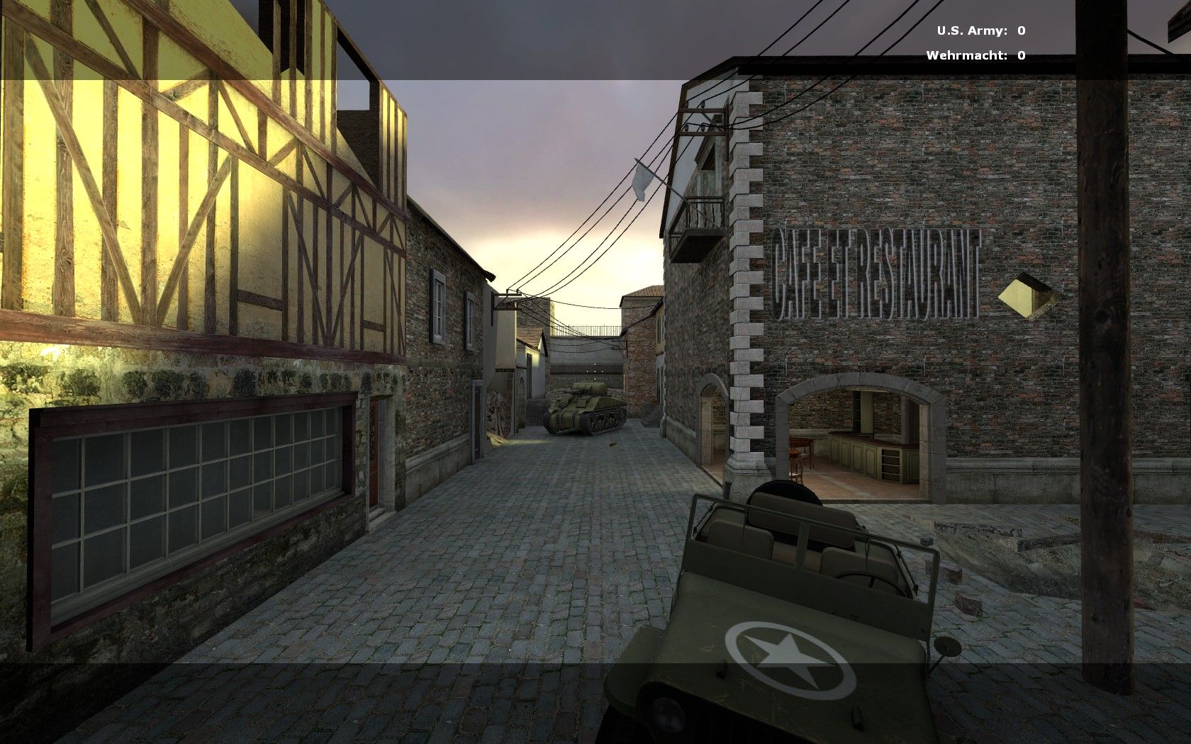
^-Here is just another spot that requires some serious player clip brushes. I was getting caught up all over the place from the models trying to get through this corridor.
User posted image
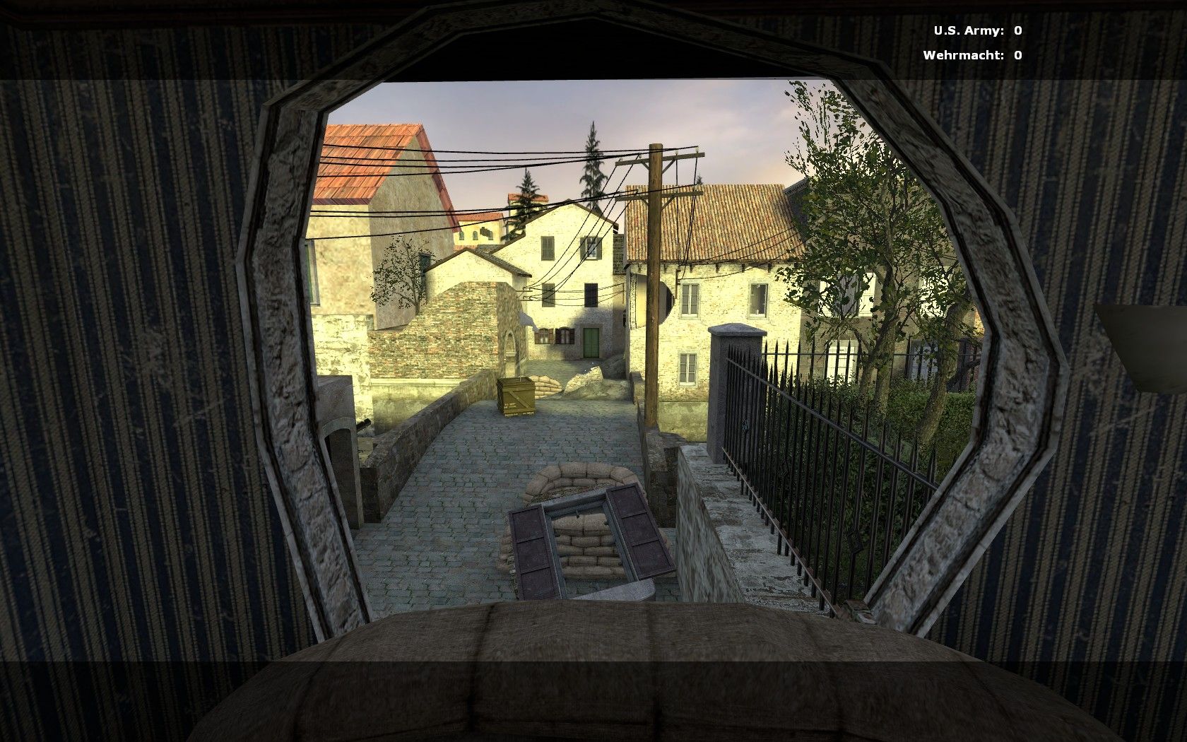
^One last major point I'd like to make about the map focusing the most on this shot. Here is where I begin to see it break down. Obviously you must of had a fun time with the clip tool in this map, making all your wall holes. But here, for this roof, it looks like you did a rush-job. I know it's hard to simulate the breaking up of objects using the clip tool, but I think this roof (for as prominent as it is) could use some more care. I don't think any kind of wooden surface would ever splinter like that in the least bit. If anything, I would use the (not sure what the name for this method is) fill-peg hole method. Whereby you can clip a perfect orthogonal shape (much like you would do for the wooden rafter models to fit in) and then fill the hole with 'damaged' or broken func_detail shapes. I also thing this very spot could become focus for some serious visual attention. Like having some sun rays shine down though it or something.

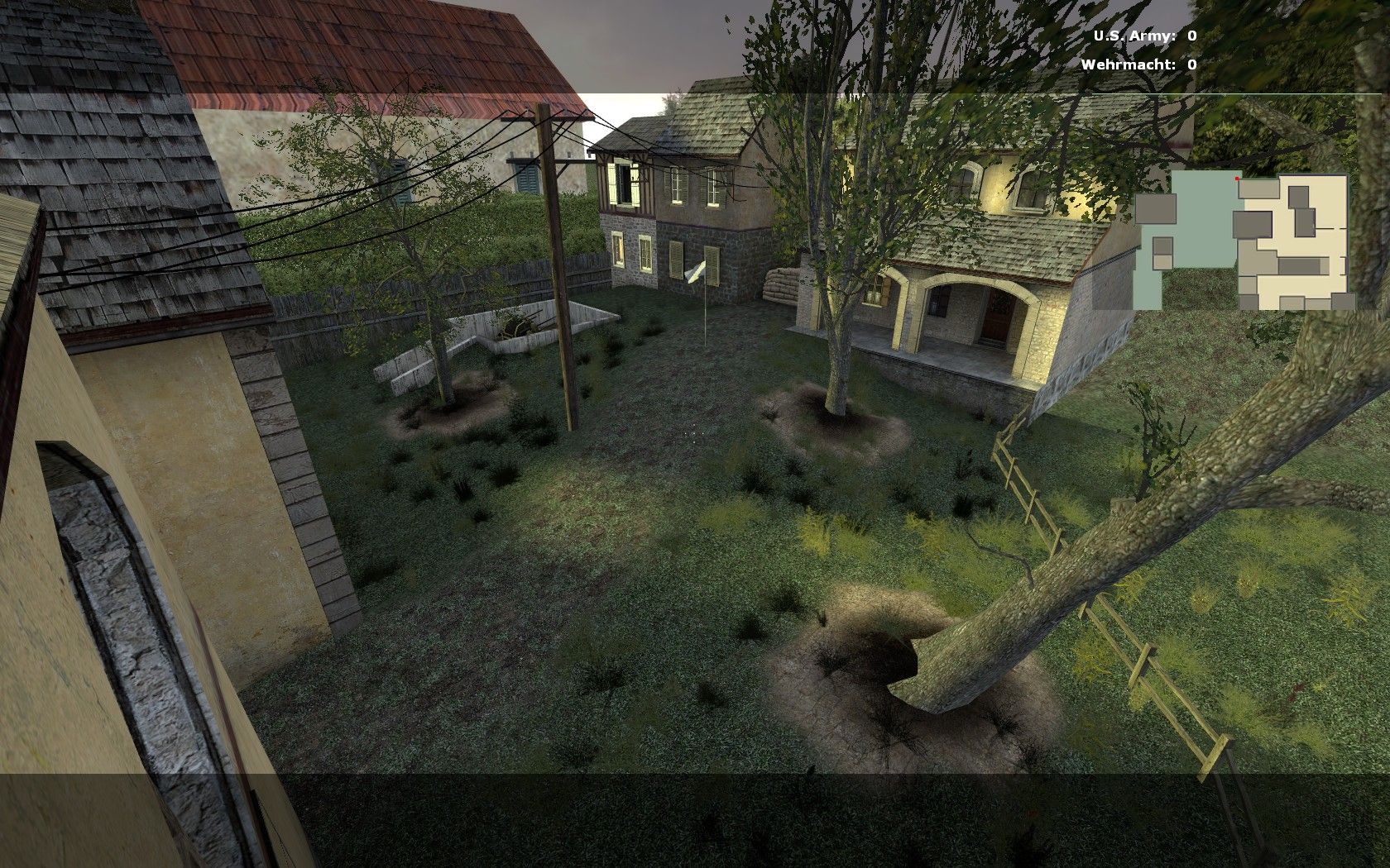
-Your bell tower (the inside) is too cramped. Either get rid of the crates, or raise the height of the bell so the player can actually move up to the windows if they wanted to. It feels pointless to go up there now, since you can't get a good view out of the window for any shots because there's too much stuff in the way.

Here's another quick clipping job I think could get re-done to look a little better:
User posted image
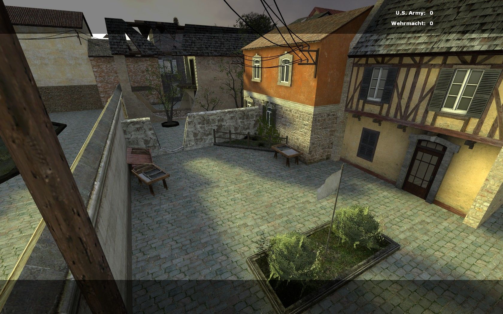
Other than those quick points, I think the map could use some heavy work in the optimization department, but I'll leave those comments until you get the visuals down packed.

It feels like a solid map though. I'm waiting for the next update...
Posted by Niborius on Sat May 30th 2009 at 9:59am

aaron_da_killa said:
Oh right, still in beta, I must have missed that. It seems well on track than. ;)
then* :D

Now about the map, I don't have DoD:S installed at the moment and I barely played it so I'll just say what I think of the screenshots.

You made great use of the textures, for example, at the second screenshot, you can see sand under the trees, just like in real life.
It's good you used the displacement thing, because I've seen some other maps which could've been much better because they didn't know how to do that.

The bridge looks like a very fun part in the map, and the hole in the building on the 5th screenshot on the left is well made.
You could try to add some windows on the middle building in the background, and the sides of the bridge should be as round as the bridge itself, unless you did this on purpose. But it's still in beta so maybe you already knew that and you'll fix that later.
In overall, it looks like a very fun map to play. I'm not a DoD:S Fan, but when this map gets popular, and people will play it, I will definitally install DoD:S Again just to try it!
Posted by Le Chief on Sat May 30th 2009 at 4:20am

Oh right, still in beta, I must have missed that. It seems well on track than. ;)
Posted by warlord on Fri May 29th 2009 at 5:36pm
[Author]

im aware of the blandness of it, kinda why its still a beta, everytime i compile it i add alittle more detail. the first goal was playability.
i expect about 20 beta stages before its really final
Posted by Le Chief on Fri May 29th 2009 at 6:25am

I don't have DOD either so I can check this out in game so I'll say what I can.

I think the level looks good but overall it could have used more love in the aesthetics department. The geometry in the level seems very linear and doesn't seamlessly integrate together I feel, when I look at it I can clearly see, that's the road, that's a building, that's another building.. everything is very distinct and there is no real "gray area" between each of the objects.

For example, in this screenshot, look at the road on the left edge, its dead straight almost except for a little bit at the end where it extends out a little, to me, the road really sticks out, it's very bold. Also in that screenshot, that cafe sign really isn't good, not only is it stretched, but it looks fake and has no wear and tear at all.

In this screenshot, the front of the picture looks nice, but in the background where the river curves out of the image, those buildings are very bare and stick out alot.

I think just that extra attention and effort to those smaller things would really strengthen the aesthetics of the map. Other than that, it looks good though, it seems to be a typical DOD themed map, yep, yep that's it.
Posted by warlord on Thu May 28th 2009 at 8:53pm
[Author]

only alternative i can think of is using crafy object viewer, but if you dont have dod then textures might not show up
Posted by haymaker on Thu May 28th 2009 at 4:46am

Those are some very excellent screens! Don't have dod so I can't look any closer :(

unless you think it might open in css or hl2dm