Offload by RedWood

Map Rating

  • 4
  • 1 rating / 4 stars

Map Download

Map Info

  • 1 rating
  • 6318 views
  • 854 downloads
  • added Wed Jul 29th 2009
  • updated Sun Oct 26th 2025
  • more content for: Counter Strike Source

Map Description

The setting of this map is a old railway unloading dock. The facility has been added to repeatedly over the years and it can be seen in the architecture of the structure. The CT's start off in the most modern section and make their way to the T side to rescue the hostages keep under the stairs and in the cargo container. The has a rather wide open but compact play area. If you control the second level you control the map so a good amount of your man power should be concentrate there. It should make for a fun and dynamic chok point. Watch out for grenades and have fun.

Discussion

Posted by RedWood on Fri Aug 7th 2009 at 8:19pm
[Author]

Riven:

First pic: I see what your saying. I'll have to think of something.
Second pic: I was hopeing it would go unnoticed but it didn't. I'll have to change it and put decals in it place.
Third pic: Iv been neglecting this area. Lighting is still a work in progress.
forth pic: I was hopeing no one catch it. Ill have to change it.
Fifth pic: Eah, iv been mulling that over myself. I think maybe ill make the door destructible. Ill let people shoot it out of the way if they want. as for the one leading outside iv yet to give a visual reason why it wont open.
Seventh pic: The lighting still to dark in areas of that room (like on top the stairs). And i thought i had added enough after Reaper brung it to my attention but i guess it needs more detail. I will add some more.
Eight pic: Yes! i am working on a large sky box. As for the crate, i added it in just before the last compile because that one track need some cover. im deleting it to add something different.
Ninth pic: Yes. I hate aligning textures manually. I hate it a lot! It has been on my to do list.
Tenth pic: No, i haven't optimized much at all. so fare only hints. I plan on starting that really soon.
Eleventh pic: The lighting the cargo room is far to bright, and yes to bland. Im going to add spot lights on the walls to light the paths witch will be a little to dark on their own when i have the lighting where i want it to be.

Iv been racking my brain on how to block off the ends of the map. What iv come up with is that the T's blew up the tracks and now their is a large crater. Iv yet to make the displacement.

Thanks a ton for the extensive walk through. I know how much time that takes. Much appreciated.

Arron:

As for the the T's side being to open and hard to defend... When i ran bots by themselves the end score was 125 rounds CT and 125 rounds T (Win!!!) I think when it comes to real people they will be able to storm rooms much better. I have decided that the T side need to be a little harder to over run.
It need sound, I know.
Thank you for recording demos! Im excited to watch them.

Thanks guy! Its nice to hear you guys not sugar coating your responses. Must mean the map has some real potential. Next screens shouldn't b to far away!
Posted by Le Chief on Fri Aug 7th 2009 at 6:59am

Alrighty, I download the latest version and had a go of it with some bots.

After I got a grip on things I recorded two demos, one counter-terrorist and one terrorist.

I don't play much counter-strike and don't know too much about it, but usually I don't like hostage rescue maps but I really didn't mind this. I had fun playing as both the counter-terrorists and terrorists but I think that the counter-terrorists have an advantage in this map, or at least the counter-terrorist bots have an advantage over the terrorist bots.

According to my possibly incorrect assumptions (please inform me), you really need to give the terrorists an advantage because it seems it's easier for the counter-terrorists to win a hostage rescue game.

Here, it felt that the counter-terrorists could come from any direction and the terrorists where quite vulnerable in guarding the hostages. Those thin windows seem to give counter-terrorists an advantage unless the terrorists rush to that area and secure it first. I'm starting to doubt myself so I'll stop with gameplay talk now, I find it difficult to critique multiplayer gameplay.

Demos.

Hopefully the demos will give you some information on the gameplay side of things.

As for everything else, here are my thoughts:
  • Perhaps a bit too bright/white in some spaces, lighting could also be a bit more interesting too.
  • Some spaces are (understandably) plain-jane, really need to give them some love and character and make them interesting, flesh them out a bit more.
  • I like the interior space where the hostages are, I think this is probably the most interesting space but still could be improved.
  • Don't like this brick texture.
  • The main container room, I think you could arrange the crates better and utilize gameplay on top of the containers more!
  • Not convinced fully the main container room looks like an area you would store containers in.
  • I was able to get to the other half of the main container room, the non playable area via jumping ontop of the containers and couldn't get back out.
  • I'm a bit restless with those wooden corridors. I can't pinpoint anything wrong with them considering this is a wip, but I don't know... maybe it's just the texture or lighting or something like that.
  • I think the whole map is missing certain things, ranging from the rest of the exterior space (background/3d skybox) to maybe a few things near the railway tracks and a few props here and there.
  • Don't forget ambient sound!
Posted by Riven on Fri Aug 7th 2009 at 4:28am

So I finally got the chance to play through this map, and I have to say, it seems very well built with a conscious effort in design layout given to it. :clap:

Here is a quick run-down with images:
User posted image
In this area, it was such a tease to leave that door open but closed just enough so that the player can't fall in or go through it. It normally didn't bother me until I tried to escape through it, and it just caught me off guard as being so close to aesthetic convenience that it was done annoyingly wrong.
User posted image
In this one, It's good you've given thought to how textures are aligned with one another, but trying to pull this one off just looks bad. I would eliminate that grime for those sides.
User posted image
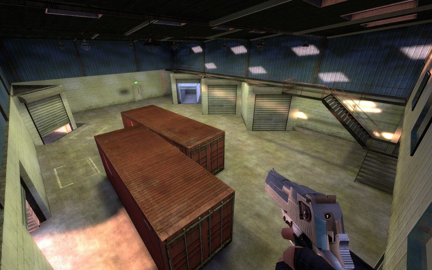
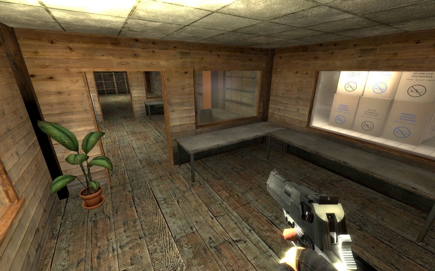
This space in general just seems very plain. I like the lighting on the walls very much, but for all those lamps hanging (that are also on, btw) I would imagine they should be casting some form of circle lighting on the floor below.
User posted image
I like this space very much, but there was one thing that caught me off-guard, and that was the size of the texture for this flooring. It's too small which makes the otherwise hidden tiling more noticeable.
User posted image
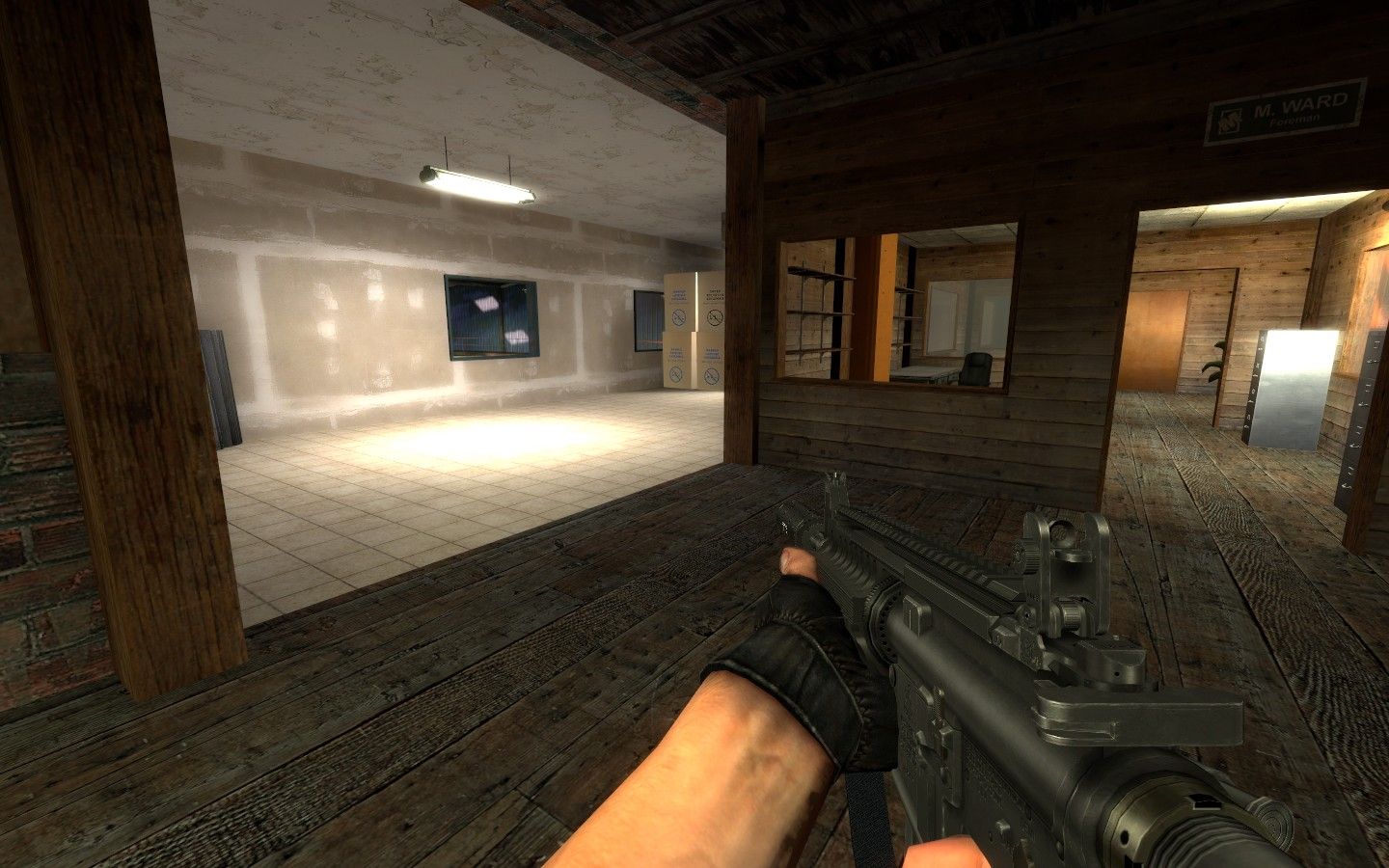
I understand in CS there is this unwritten rule to make the map as static as possible including possible doors that could open to make new entrances. I think here is a prime example. Either I think it should be able to be opened dynamically, or that room should be sealed off all-together making it pure eye-candy.
User posted image
Same goes for this door too.
User posted image
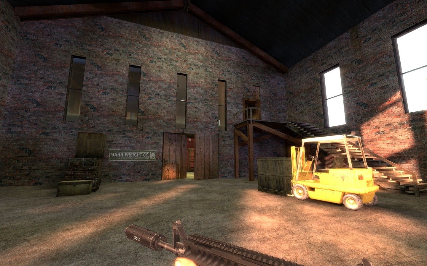
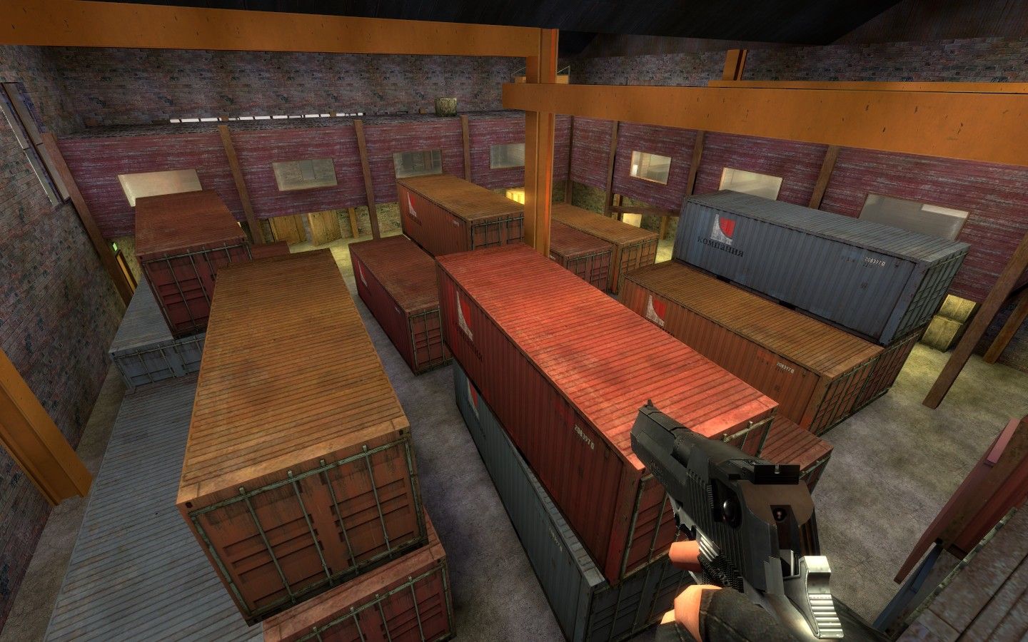
This space is lovely. The lighting is interesting enough and the space is quite large for being semi-indoors. (It doesn't feel like you're indoors because the ceiling is soo high up). But once again, it suffers also from lack of close-up detail and trim textures separating texture changes and adding more pzazz to the scene. Otherwise, nice layout.
User posted image
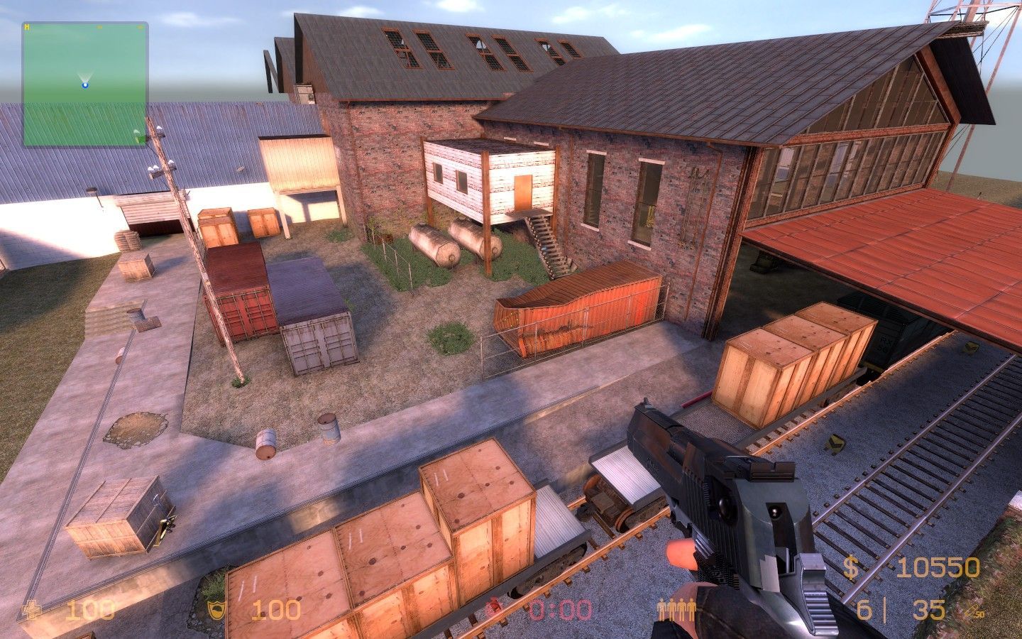
This is me standing on the overturned crate near the fence. This space has soo much opportunity for a big countryside 3D skybox that I don't think I should have to say anything more about. I'm guessing you're already working on that ;)
User posted image
A little something most mappers don't think about when making stairs. From certain angles, you can see this was a copy/paste job. All it needs is a little love by aligning each face left and right at random intervals. -Same goes for the other stairs.
User posted image
I can tell there hasn't been much optimization in this map when looking with wireframe on. -Might want to start thinking about the guys out there who may not be able to run a map like this as well. I shouldn't be able to see anything beyond that wall, and yet it's all getting rendered as clear as day.
User posted image
This area here can be very confusing when you first enter it. I guess you could leave it alone, and let experienced players navigate it flawlessly, but perhaps a decal or two denoting which way is which or using them as placemarks, might help. It looks and feels like a rat maze. -Maybe that's the feeling you were going for, I just didn't care for it.

Once again though, lighting here seems very bland too. It does have interesting shadows on the walls, but that's where it stops. -And I'm not advocating that you just amp-up the lightmaps for the floors too, (that would be wasteful), but figure a way to make some interesting shadows happen via those large stacked crates. You could easily create dark areas with the elegant use of some block_light brushes! :hee:

All-in-all, it is a decently designed map, that looks better than most out there. But it still seems like a little on the dull-side to me and could use some more love and care to make it really polished. I do think it's actually too open in terms of the line you can draw that the CTs will take to get to the hostages is fairly short and unobtrusive. I think it needs a little mixing up. Other than that, do away with the invisible walls, and instead add some convenient blocking props or brushwork to explain why players can't get on the other side of the tracks ;)

Good stuff! I Am looking forward to playing an update!
Posted by reaper47 on Wed Aug 5th 2009 at 5:07pm

lol, sorry, that came across a little rude. I should have looked closer. But don't worry about feedback. I can only speak for myself, but I guess we're all enjoying it, not "expecting" you to use any of it if you don't feel like it. It's somewhat more relaxing to criticize someone else's work than to come up with something yourself. :D

The new roof textures look more fitting (although nobody will ever see them outside spectator?). I'd split off the lower 128 units of the brick wall and give it a "bottom texture", then texture remaining upper part with a different one. Structureless endless repeat textures tend to look a little flat on big walls like that.
Posted by Le Chief on Wed Aug 5th 2009 at 4:20am

I didn't notice the differences straight away either.

Will download the latest version, play with some bots and tell you my thoughts. ;)
Posted by RedWood on Tue Aug 4th 2009 at 8:31pm
[Author]

reaper47 said:
Hmm... is there a difference? I can't find anything?
[IMG]http://imgur.com/y71Tk.jpg[/IMG]

The lighting is still being adjusted but, the outside is close to where i want it to be. Plus theirs some texture changes and a few details added. Not that important but i figured i should show some progress sense people are being so helpful. :cowjump:
Posted by reaper47 on Tue Aug 4th 2009 at 4:04pm

RedWood said:
Here is the original screen and the new one so they can be compared.
http://imgur.com/bLI1j.jpg
http://imgur.com/gKiLH.jpg
Hmm... is there a difference? I can't find anything?
Posted by RedWood on Sun Aug 2nd 2009 at 10:59pm
[Author]

Iv updated the first screen and the map download. This time the rar includes the nav file for sure. The download is named exactly the same as the last one so just make sure to replace this one with the old one (or change the name if u really want to).

Here is the original screen and the new one so they can be compared.
http://imgur.com/bLI1j.jpg
http://imgur.com/gKiLH.jpg
Posted by RedWood on Sun Aug 2nd 2009 at 9:12pm
[Author]

aaron_da_killa said:
The download didn't come with a nav file. I think you've accidentally included the vmf instead of the nav file.
:roll: I can't win!!
Well ill update it next time i post some screens. Windows 7 is problematic when it comes to compiling. Through no fault of my own hdr sometimes won't compile. I should have it today though. I have done massive updates to the lighting. Its made a world of difference. i look forward to posting them.
Posted by Le Chief on Sat Aug 1st 2009 at 3:20am

The download didn't come with a nav file. I think you've accidentally included the vmf instead of the nav file.