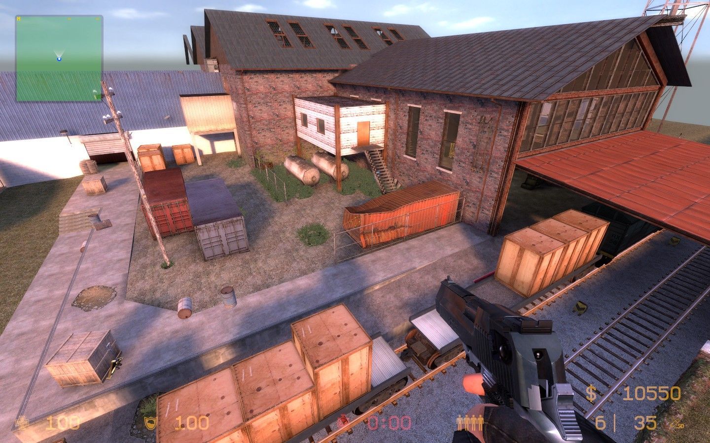
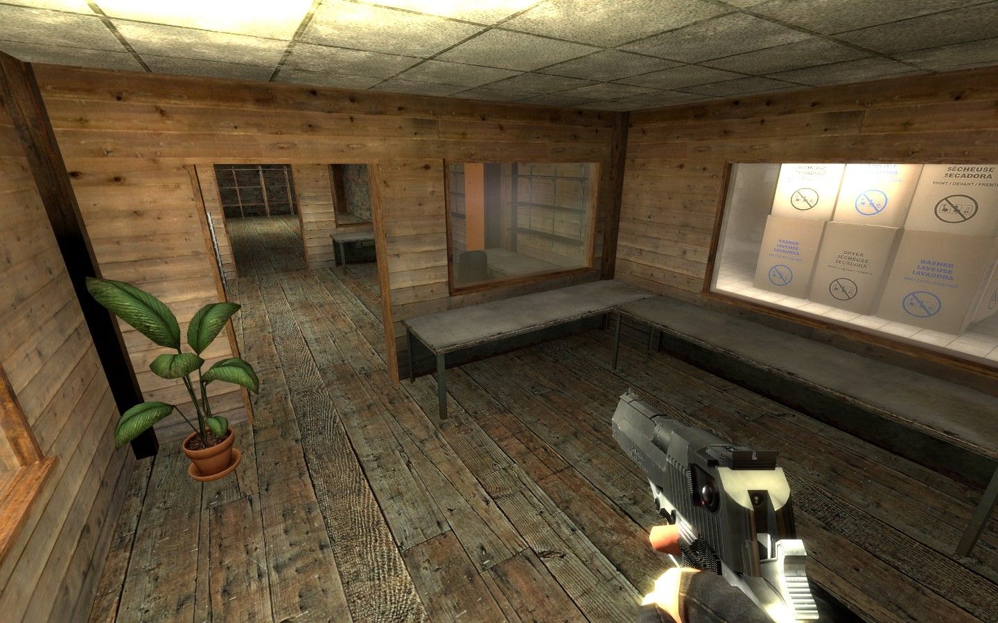
I like what you're doing with sun light. Try to tone down HDR brightness for some of the lights to avoid 255 255 255 white areas of total brightness (like the white walls
here or the floor under
this light). Try experimenting more with indoor lighting as well. You're using the same, ceiling-mounted lamp everywhere. How about some colder, florescent ones, spotlights from lower angles, ect.
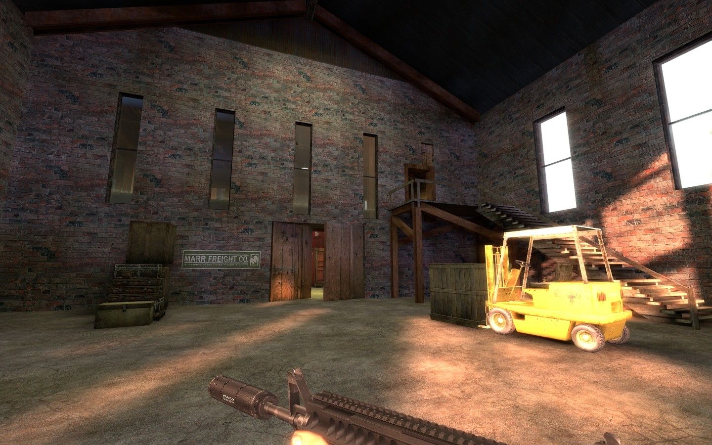
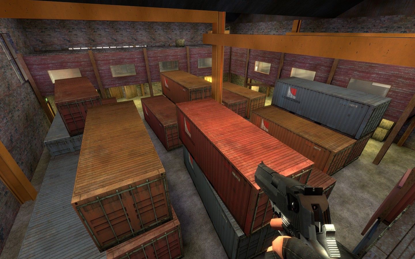
Try finding more structured textures for
this brick wall, it's to homogeneous for such a huge brush.
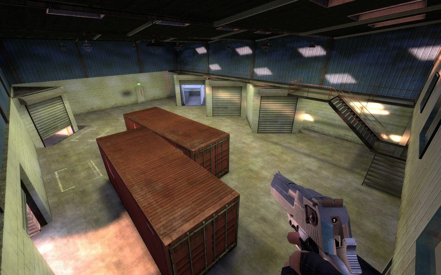
Also your floors need detail. Maybe it just looks a little empty because of the general beta-state. You could, however, see if more three-dimensional floor detail might even add cover/gameplay opportunities. At the moment, you rely an awful lot on evil, evil crates for that. Floors are so incredibly important since they make up 70% of the screen most of the time.
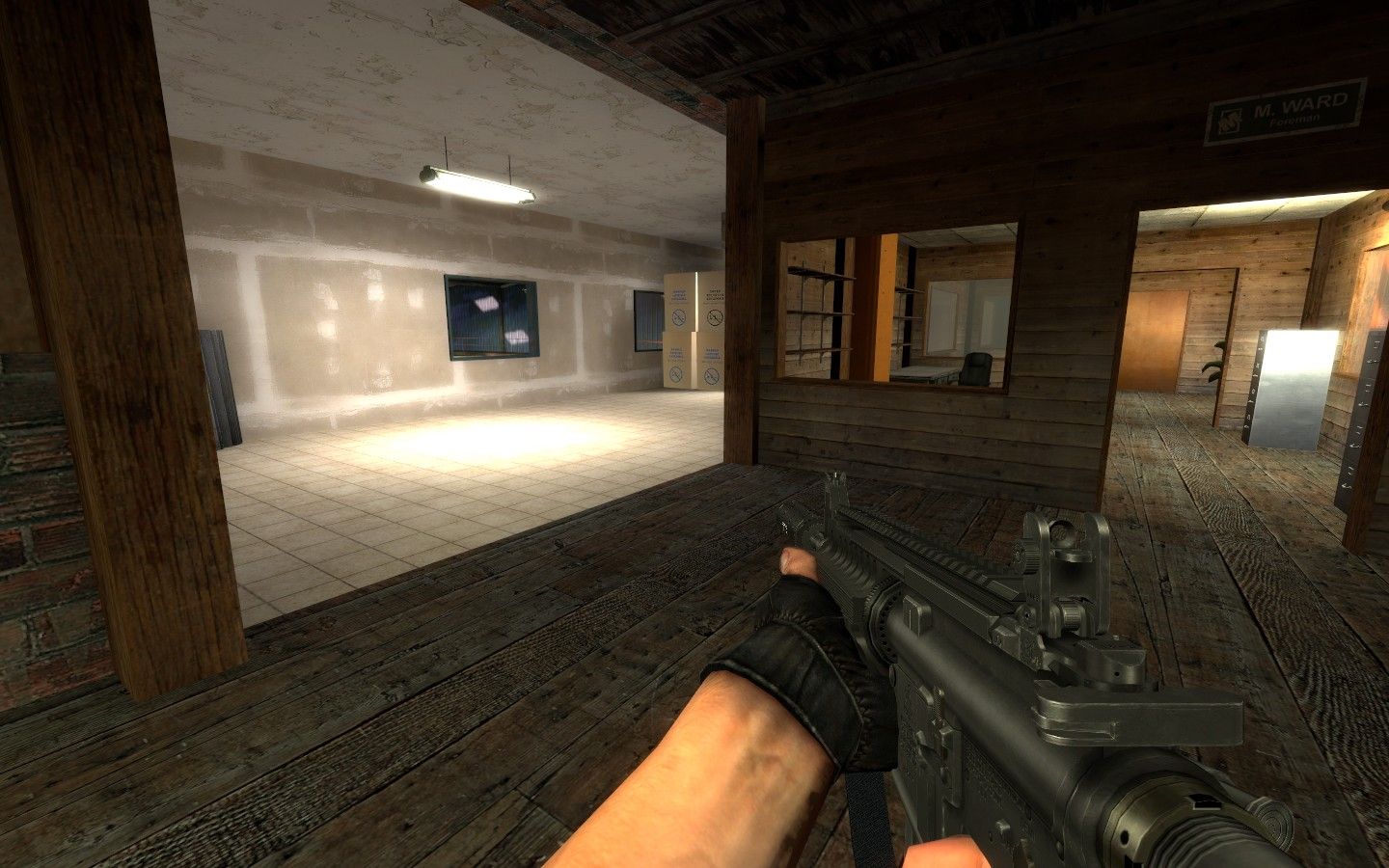
I assume you know you can jump out of the windows,
here?
You probably know more about CSS gameplay than me, so I won't pretend like I had anything to say in this regard. Looks solid, though!

