This map is in dire need of variable heights as it is currently flatter than a pancake. Totally horizontal combat on a flat plain gets old real fast. Additional heights, ledges, overlooks, ditches, embankments, ridges, etc would do this map wonders.
I also agree with Juim about adding additional z-axis areas for improved pathfinding because as is, everything looks similar at a glance and it is tough to get your bearings.
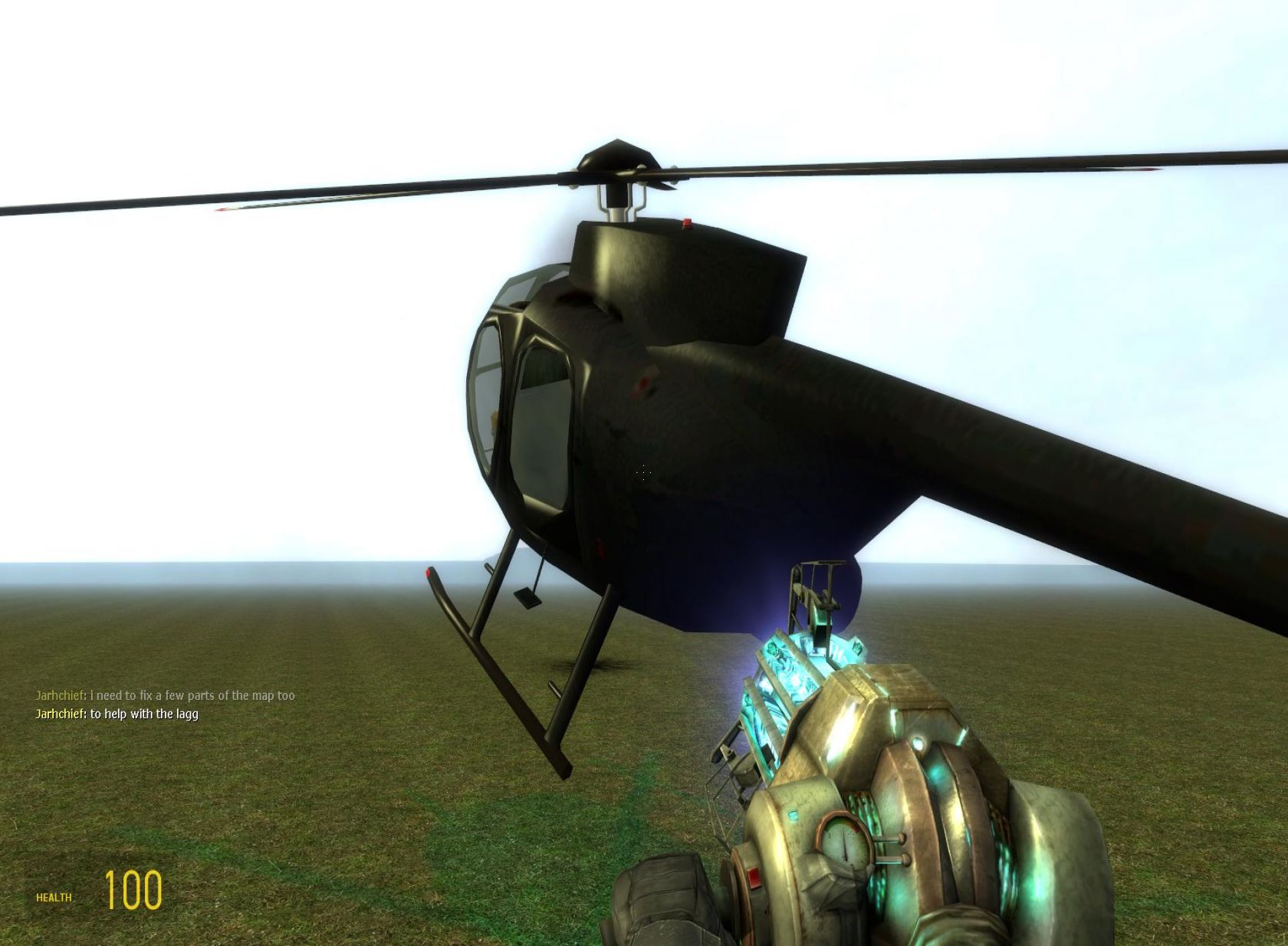
Weapon placement seemed sparse, but I might have missed some things in the dense foliage. I definitely suggest increasing the amount of prop_physics in the map so that the gravgun has a use. I might have missed those too but it seemed like there were none at all. I suggest the throwable gray rocks in EP2, maybe some log chunks, axes, barrels... the point is you need physics stuff in there to take advantage of HL2DM's (only) strength.
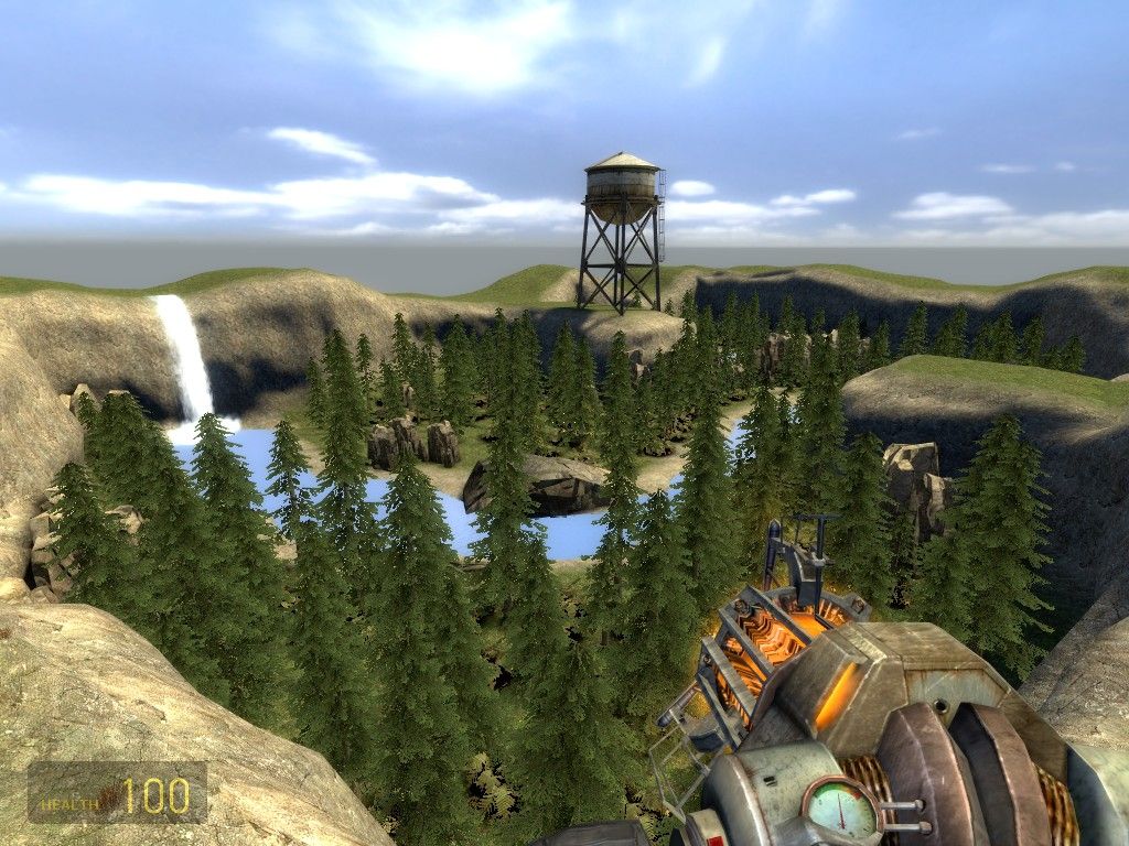
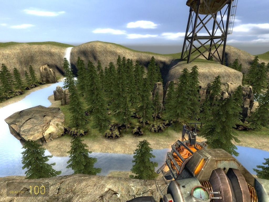
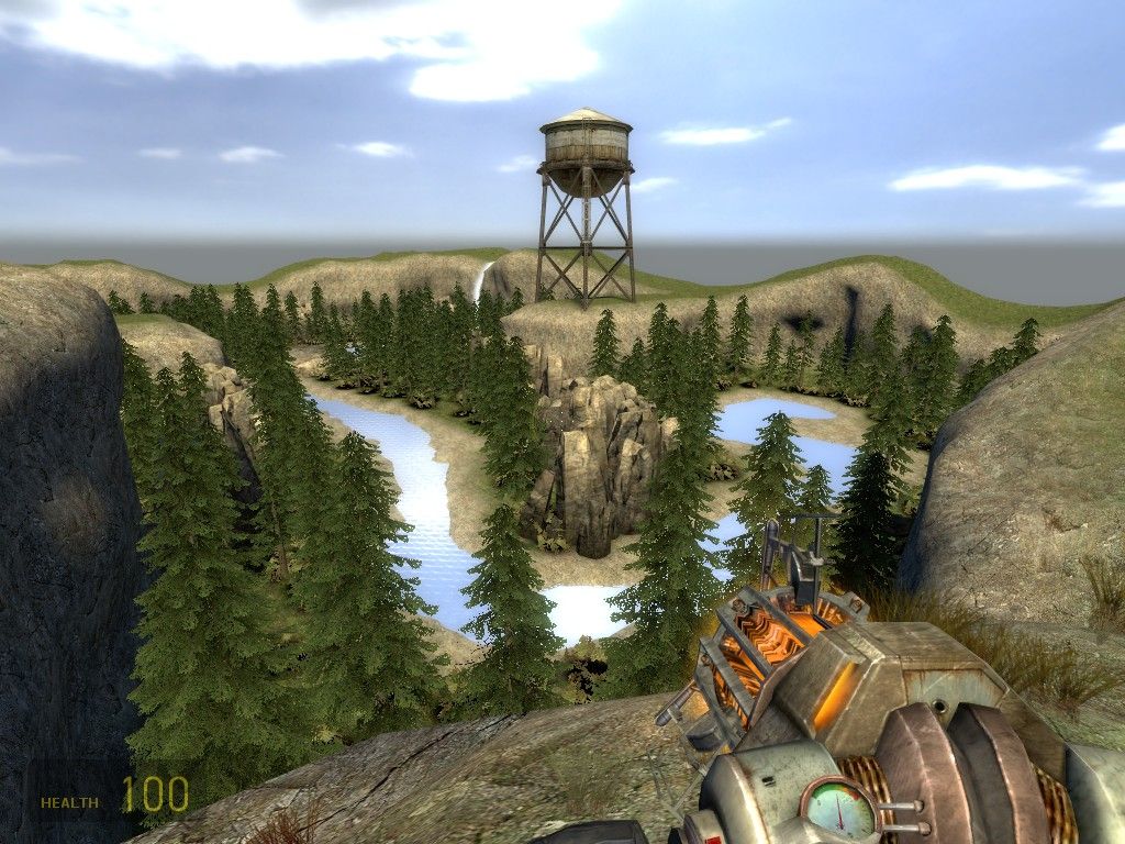
The displacements seemed ok to a point, but I would try to break up the rocky skyline so it wasn't so uniform and I would smooth out the banks of the river a tad. The aggressive flatness of your map comes into play here as well. You could easily make gently rolling hills or depressions and it would improve both playability and the visuals. I would suggest looking at the radio station hunter ambush from EP2 for inspiration.
Also,
The water texture is tiling really badly. I would increase the texture scale to at least 2x from its current setting. Also, this picture is a good example of the flatness of your displacements. Past the riverbank it looks like you just added noise and nothing more which has less than ideal results.
The waterfall looks cool but it seems to be falling slightly too fast.
A ton of props are floating over the ground.
This dead end holds a powerful weapon and is easily camped. To add insult to injury the only way inside is also very narrow. At a minimum you should add another way in.
These fern shadows look horrible. Off the top of my head I can't remember the best way to fix this.