Uproar by SuperCrazy

Map Rating

  • 5
  • 1 rating / 5 stars

Map Download

Map Info

Map Description

Uproar was the third map that I released. It's a small industrial map that I made in a week.

Discussion

Posted by Sehnsucht on Wed Jan 14th 2009 at 1:43am

The mod I am working on is a remake of Quake II for the Half-Life 2 engine. I am considering switching gears and remaking the maps for Quake 4 instead.
Posted by Le Chief on Sun Jan 11th 2009 at 5:55am

I like that better. Sure the old version had a dark moody feel to it but it really isn't suitable for multiplayer.

I would just like to point out that while there is brightness variation in the lighting (well lit areas and slightly darker areas), you could certainly increase the contrast of this brightness variation (well lit areas and much darker areas) to add depth and retain the dark moody feel from the previous version in certain areas of your map such as a corner or a part of a hallway.

Anyway what game is this? Now that I can actually see the map I noticed there is a floating weapon.. is this the Unreal engine?
Posted by G4MER on Sun Jan 11th 2009 at 5:47am

I think its too bright now. It lost it allure and Doomesk feel. =(
Posted by Sehnsucht on Sun Jan 11th 2009 at 5:22am

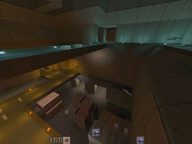
Thanks guys. I have a new display now that I have calibrated and can now see exactly where the light should be. The lights are set to 200 intensity, have a max range of about 512 and fall off to 50% at 256. Should I boost the intensity to 400, or increase the range?

This is a remake of a map from an older game, and here is where the light should be:
User posted image
Posted by G4MER on Fri Jan 9th 2009 at 3:04pm

THAT IS JUST FREAKING AWESOME! The stairs need to have some light for sure. That will add some much needed light to the level.. a few over heads or maybe a dropped flashlight or something amoung the boxes will also add mood lighting without taking away from the theme. Or make some small glow sticks and have them dropped here and there. Or maybe a plasma torch.
Posted by Le Chief on Fri Jan 9th 2009 at 1:36pm

Its certainly too dark for a multiplayer map imo. I imagine it would be pretty difficult to see the other players running around, try making some of those lights more bright, theres nothing wrong with a little contrast in your lightigng, that is bright areas and dark areas, but this is way too dark. :)