After a freak accident with the experimental quass cannon a tremor struck the foundation of the black mesa weapon research building. Stripping the color out of the very fabric of reality. It also stripped the minds of all within blast. Now only insanity and violence remain.
Discussion
Posted by mrnatural on
Mon May 31st 2004 at 4:58pm
[Author]
hey if any want to try out my map on won the server is dead again and the ip 24.229.184.211:27015
the password is black.
glitches in the map so. working alpha. lol
cya
Posted by mrnatural on
Tue May 25th 2004 at 1:28pm
[Author]
Their sweet..want a bsp? map rocks.
Posted by 7dk2h4md720ih on
Fri May 21st 2004 at 3:09pm
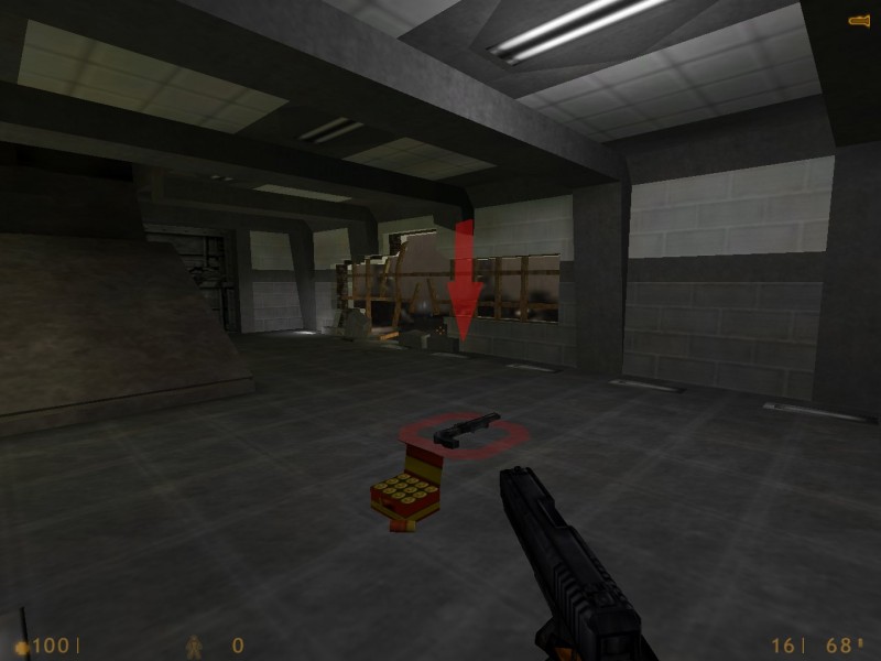
You don't really need the giant red arrows for weapons, they needlessly detract from the realism of the map.
Posted by mrnatural on
Fri May 21st 2004 at 2:12pm
[Author]
any want a bsp ?????
lol. ill send it via email.
some of the themed maps ive seen id love to run around on even if they arnt done.
id give ya feedback...so.
Posted by mrnatural on
Fri May 21st 2004 at 2:09pm
[Author]
thanks..no color though. its gonna be done in black and white.
than in negative image for my second map...haha. ( but thats a secret )
yeah bad shot on the broken section. other way its look grovery....
ok..decal is gone...but i got spinning arrows pointing to my weapons. do i really want that much realism? besides i like fake looking broken glass. haha joking.
thanks again for pointers. i appreciate feedback.
Posted by 7dk2h4md720ih on
Fri May 21st 2004 at 1:50am
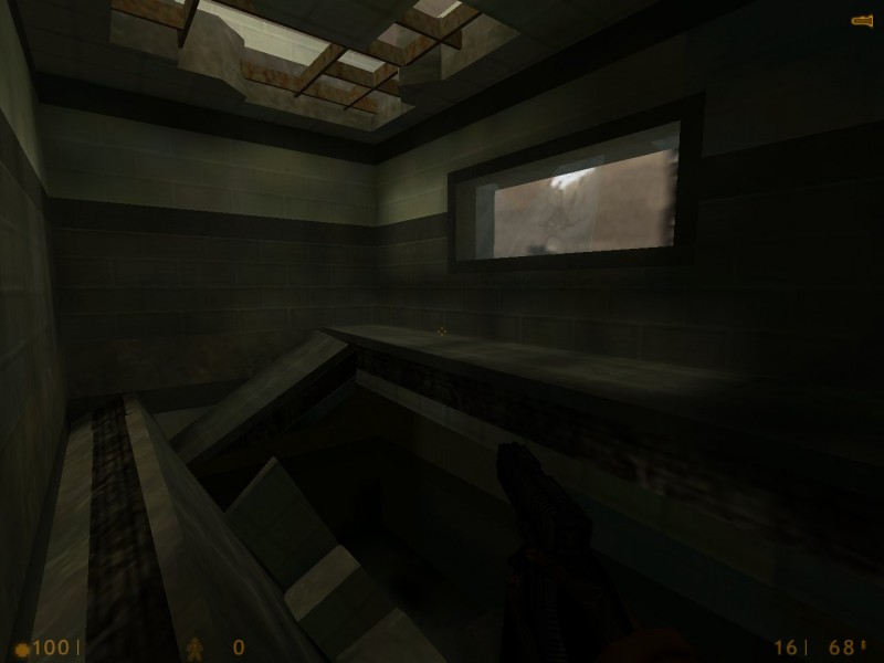
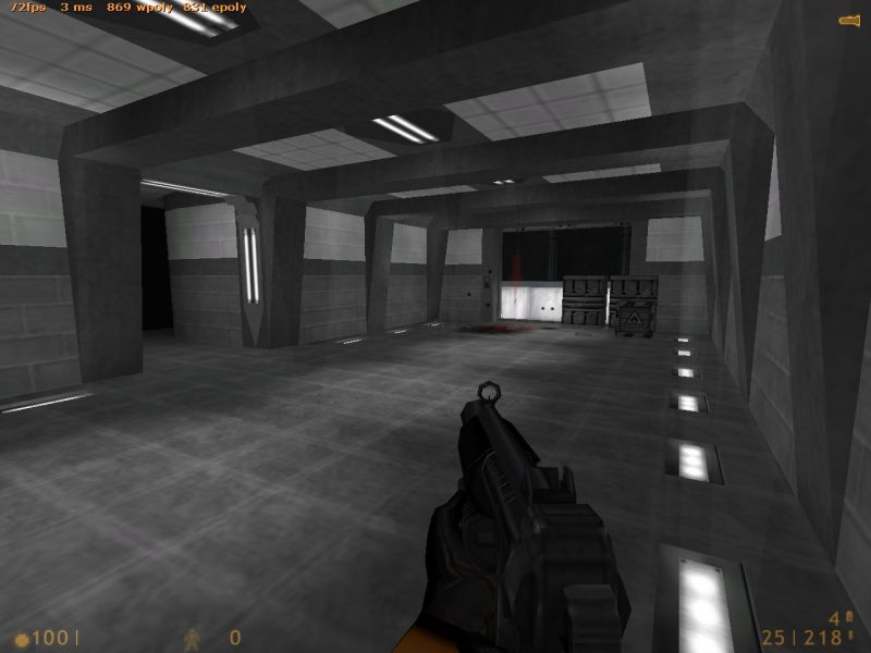
A marked improvement on your last effort, no more blue. :smile: The area in the third screenshot needs the most attention. It's a solid hallway, but it's lacking in colour and the lighting needs serious improvment. I like the first screen, the only serious flaw is the unnatural way the window is broken and the inappropriate decal on it. Screen two faces similar issues to the third one regarding the lack of atmospheric lighting. I remember it was mentioned about the last build too but that destroyed section of wall still looks squarish.
Overall good work and improvements, keep working on it. :smile:
Posted by mrnatural on
Fri May 21st 2004 at 1:47am
[Author]
ok
the one room is dark. i have yet to fiq out tex lighting.
though your right. alot more contrast too make a black and white map more predominant. black and white tends to make a map look simpler. so ill have to work on lighting alot.
ill check the recessed floor lights. see if i like it.
I agree with Tracer entirely - its the lighting that is bringing this down. Play around with colour a little, particularly for little highlights at certain bits of brushwork or in corners, etc. Tone down the general lighting and provide alternating pools of light and dark for contrast. Using the light_spot entity is an easy way to achieve this.
Posted by Tracer Bullet on
Fri May 21st 2004 at 1:30am
#1 Too dark
#2 very nice, but just haveing a texture for the lights on the ceiling is kind of weak. do some brushwork there.
#3 I still think the lights on the floor like a bit silly. are you useing texture lighting? I bet it would make them look much better if they were recessed.
overall you need more contrast. it's all kind of flat grey and boring. I don't nesecarily recomend changing your textures, they doo seem well chosen. just be more dramatic with the lighting. light_spot is calling for your name. heed the call.
Posted by mrnatural on
Fri May 21st 2004 at 1:21am