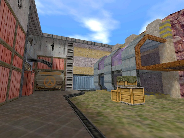
This ramp looks a little too steep. Normally you could get away with a 1/3 slope on a stairway, but not on an exposed ramp. Give it a 1/4 slope since you have the space.

I dunno, looks like a texturing error to me, even though its probably deliberate.

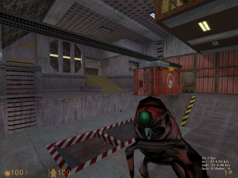
This is simply awesome. It looks like something torn straight out of HL. If you could keep this level of lighting and detail throughout the level it be something else, like a long-lost valve map. :biggrin:
-The connectivity looks good from what I could tell.
-The lighting looks too bright and flat, especially in some of the more cavernous areas. Some shadows would really improve visuals and gameplay.
-I think the outdoors area needs something in the middle, even if it's just more crates. It's too open and there aren't enough ledges and entrances/exits to justify it.
-I know you're going for gameplay over looks, and I will always support that belief, but there's a lot more you could do that would add to both, such as changing the lighting, adding more roof supports you can gauss to, more height differences, etc.