ZGZ by beer hunter

Map Rating

  • 4.333333333
  • 3 ratings / 4.33 stars

Map Download

Map Info

Map Description

Floating sci-fi complex thingy, internal rooms are normal gravity and external bits are low gravity which allows extreme gauss jumping.

Discussion

Posted by tnkqwe on Sat Mar 31st 2007 at 4:27pm

ZGZ means zero gravity zebra.But there is zero gravity and there is no zebra :D
Posted by beer hunter on Tue Aug 24th 2004 at 8:30pm
[Author]

Yeah, it was a long compile but i got help and reduced it to 7 hours :)
Posted by 7dk2h4md720ih on Wed Aug 4th 2004 at 2:28pm

The last screenshot looks really good, but maybe you should tone down the blue strip lights a little so there are more shadows.
Posted by beer hunter on Tue Aug 3rd 2004 at 9:27pm
[Author]

Thx, good idea :) they'll prolly end up as a compromise as the outside bits are making it difficult to get them scaled properly so they look ok at close and long ranges.
Posted by ReNo on Tue Aug 3rd 2004 at 3:40am

I dunno about making them smaller - the lights with obvious sprites are few and far between so i think its acceptable to have them quite prominent. I think a better solution would be to drop the render amount quite significantly. Worth trying both and seeing which looks better at any rate.
Posted by beer hunter on Sun Aug 1st 2004 at 10:10am
[Author]

Ok, consider it done :)
Posted by 7dk2h4md720ih on Sun Aug 1st 2004 at 12:14am

If I were you, I'd make those sprites far smaller. Aim for subtlety.
Posted by beer hunter on Thu Jul 15th 2004 at 9:32pm
[Author]

Really ?

/edit - ahhh yeah, so you do, thanks for pointing that out :smile: its at an early stage so its no problem to change them.
Posted by ReNo on Thu Jul 15th 2004 at 8:09pm

NS doesn't look kindly upon using their textures in non-NS maps :sad:
Posted by beer hunter on Thu Jul 15th 2004 at 6:01pm
[Author]

Thx Frag :biggrin:

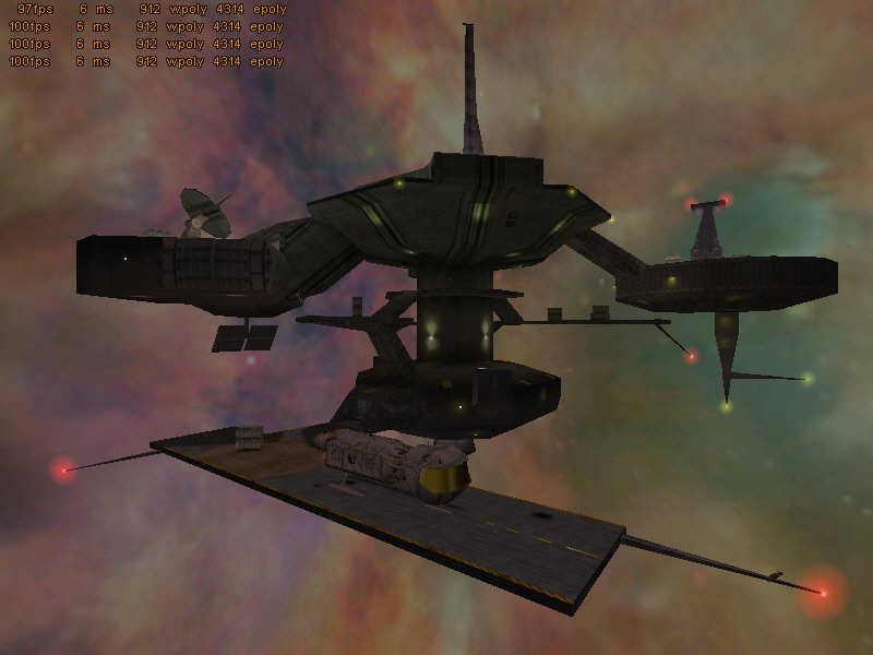
"-Change the sky, it looks ugly :/" - yup, ForceFlow mentioned this as well so i'll find something better

"-In the low level shot, the undersides of most of the structures dont have very good definition..." - yeah, there's a lot of stretched textures to get wpoly down but i'm hoping to get round this.

"-The landing strip really ends very abruptly. ROund off the edges, or add a ramp or build a wall around it." - good idea, will go for rounded bits as they won't affect polys too much in those areas.

"-Textures on the model look very bland" - prolly because most of that model has shiny surfaces, its very spiffy imo

"-In the spaceship pic, the ground texture looks overstretched, and the texture on the wall behind the ship is misaligned" - yup, its another stretched tex for the landing platform, i'll have to improve it and the weird wall.

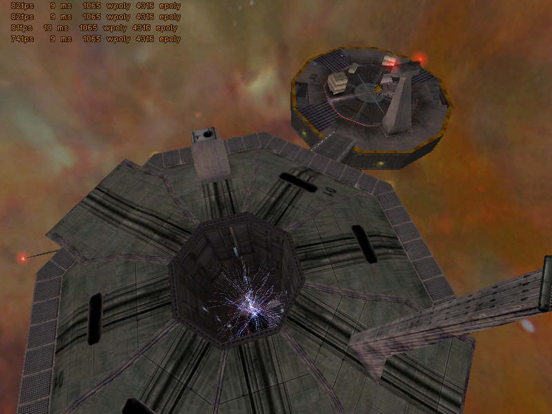
"-The corridor with a crate room is brilliant. Just do something about the shaderlab roof texture, it looks out of place." - agreed, i'll rip it out and use something that matches.
Very nice. I don't like those huge strip lights in the last screenshot though.
bleh, the strip lights are staying in :smile:
It's cool and all, but aren't one or two of those NS textures? I apologize for any sabotaging of the thread from my saying this
Sabotage away :smile: just checked and they're mostly NS/HL and a couple from CS/VS.