Thank you, ReNo, I had no idea if you were talking about a texture, a tutorial, a prefab model, or what. I also appreciate that you're willing to help someone out who is new to all of this, who got into Half-Life mapping late in HL's lifespan, and that you do not make them feel like a moron for missing the obvious. Thank you, ReNo, for your help.
Too often these days, the internet is filled with twits who feel like it is their duty to just hassle people and ridicule them. It must be compensation for something else they're lacking in their lives, because they certainly offer nothing constructive in their criticism.
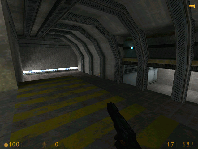
The problem here is that beneath all the crazy geometry, it's pretty plain. Along with new textures, it could use some more logical, human architecture - right now, some parts look like a jumble of ill-fitting, crazy shapes.
Ok, I went out to Wadfather and picked up a ton of new textures. Hopefully I'll be able to find something within the spruce up the texturing.
ReNo
~spotblue? Where's that? I searched the forums for it, found nothing.
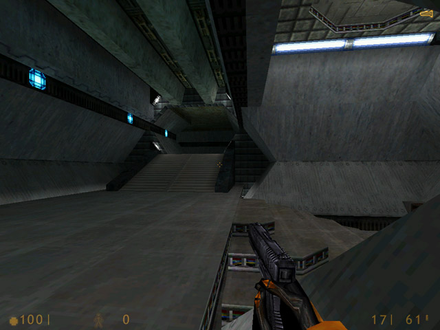
The blue spots in that portion of the hallway have been removed. The white spots are still there, as are the blue spots further along in the hexagonal hall. I'm still working on finalizingthat hexagonal hall, so don't put too much stock in how it looks currently.
I've added and changed a bunch of stuff; I'll post some screenshots tomorrow or so. And this time, I'll post them in the thread and link them off my site, just for Orpheus.
Yes the architecture is pretty nice but the textures could be better, particularly the trim on the arches in the second pic looks out of place to me. Also I think you're lighting is a little too functional. Try to add more contrast and move the lights around so they highlight the brushwork better.
The new shot is definately an improvement, however that blue spotlight
texture on the left is awful when made that obvious. Check out
~spotblue for a slightly nicer blue spotlight. That said, I don't think
either will look good in this scenario.
Crono said: You can delete shots, just post which shot you deleted and replaced, or link it outside. The reason why I say this is you can only have 5 shots uploaded on the pit so it'd be retarded to have the same hallway with before and after shots on an unfinished map.
sorry, my bad, i have a pit, i can post a hundred screens, i forget some cannot :sad: