Some images in this post have been automatically down-sized, click on them to view the full sized versions:So, I?ve had a run-through and?
<A href="http://www.snarkpit.com/pits/tracer%20bullet/armada0000.jpg" target=_blank> </A>
</A>
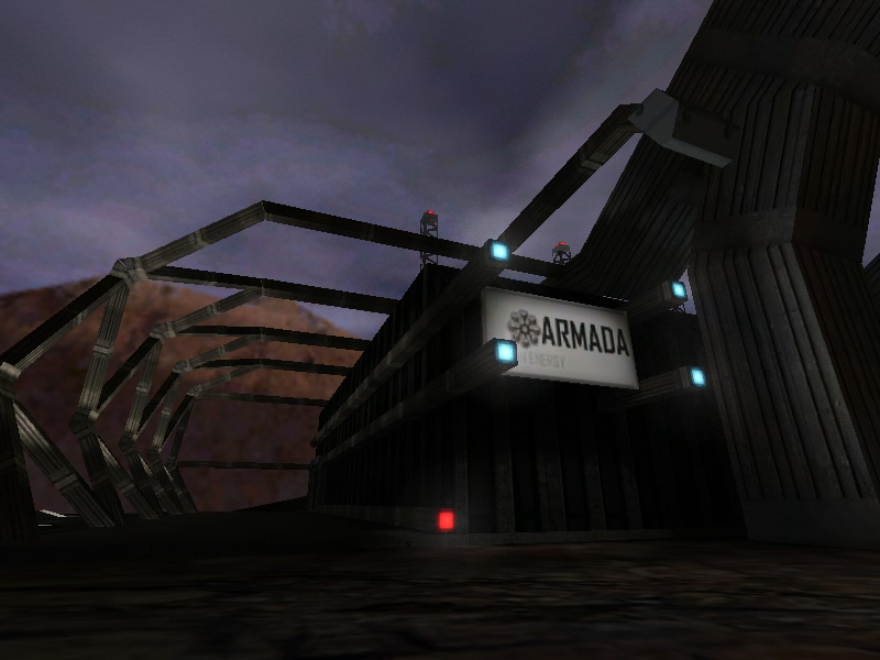
This is gorgeous. very grand and imposing, exactly the sort of attitude you want to set for the interior which is to come. It?s unfortunate that the ground is so flat, but you can?t really afford the r?s. My only real criticism here is that I think maybe those pillars should taper a bit more before they produce those metal towers.
<A href="http://www.snarkpit.com/pits/tracer%20bullet/armada0001.jpg" target=_blank> </A>
I think theses lights need to be either recessed or extruded. the just look wrong being totally flush with the ground.
<A href="http://www.snarkpit.com/pits/tracer%20bullet/armada0002.jpg" target=_blank>
</A>
I think theses lights need to be either recessed or extruded. the just look wrong being totally flush with the ground.
<A href="http://www.snarkpit.com/pits/tracer%20bullet/armada0002.jpg" target=_blank> </A>
r_speeds are a bit high...
<A href="http://www.snarkpit.com/pits/tracer%20bullet/armada0003.jpg" target=_blank>
</A>
r_speeds are a bit high...
<A href="http://www.snarkpit.com/pits/tracer%20bullet/armada0003.jpg" target=_blank> </A>
<A href="http://www.snarkpit.com/pits/tracer%20bullet/armada0004.jpg" target=_blank>
</A>
<A href="http://www.snarkpit.com/pits/tracer%20bullet/armada0004.jpg" target=_blank> </A>
</A>
Oops... I fell right out of the map... you really ought to kill the player before something like this can happen.
<A href="http://www.snarkpit.com/pits/tracer%20bullet/armada0005.jpg" target=_blank> </A>
</A>
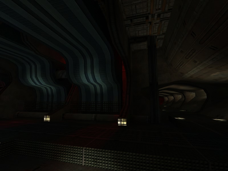
There are an awful lot of light sources here for not much light... You either need to increase their brightness, or decrease their number to make it look realistic.
<A href="http://www.snarkpit.com/pits/tracer%20bullet/armada0007.jpg" target=_blank> </A>
Very pretty
<A href="http://www.snarkpit.com/pits/tracer%20bullet/armada0008.jpg" target=_blank>
</A>
Very pretty
<A href="http://www.snarkpit.com/pits/tracer%20bullet/armada0008.jpg" target=_blank> </A>
</A>
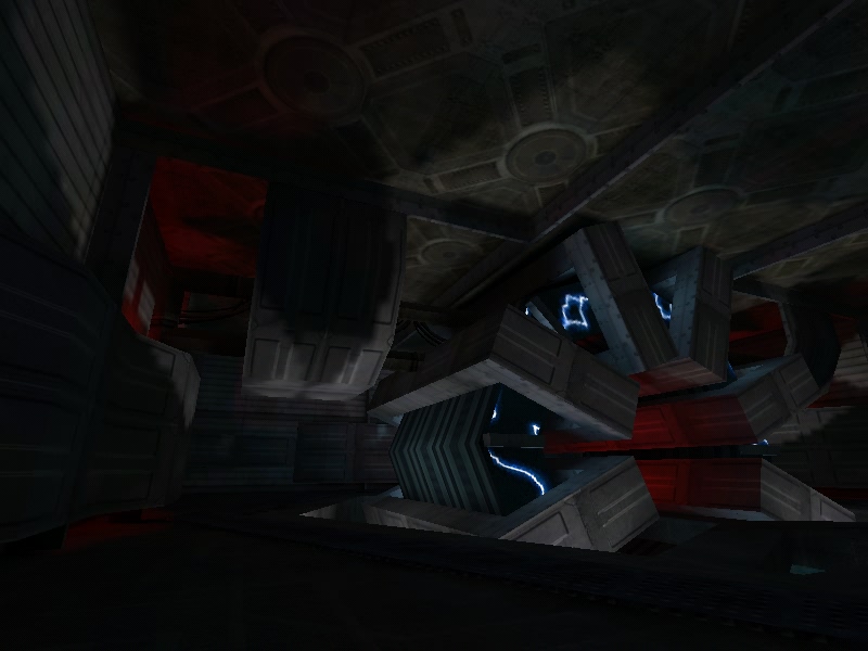
Also very pretty, but those r_speeds are killer. Don?t be fooled by that 59 FPS reading. I think it was lying to me because this was a total slide-show for me.
<A href="http://www.snarkpit.com/pits/tracer%20bullet/armada0009.jpg" target=_blank> </A>
</A>
Another place where I ought to be dead.

These doors do not open synchronously as they should. Give them both the same name, and then use a trigger_multiple to open them in unison from each side.

This ought to make some noise. The silence here was weird.

I fell out of the map again?

You can walk straight through this wall and right out of the map, and there are many more like it. I guess what I?m saying is that there are large accessible areas that are totally covered in NULL. These ought to be clipped off.
Overall I really like it but there are a few general problems. I know you want it to be dark but I think this is a bit much. Even in areas that were supposed to be bright it felt dark. I suggest you use the ?dscale switch on hlrad to globally adjust the brightness of direct lighting. In this way you can easily brighten up the areas that are supposed to be, but also leave those nice murky corners. The other major beef I have is the r_speeds. You?re really pushing it there, and my computer did not run the level smoothly. Add more visblocking.