Obligatory Warning: This critique is given freely with no further thanks required, with the understanding that if it doesn't fit your vision of how the map should be, you can ignore any advice given, as long as you keep any angry retorts to yourself.
OK, the first thing that dawned upon me when I first contemplated doing critiques for HL2 was the realization that machines are not all created equally. My machine may not display the maps in a satisfactory way to depict how the author designed it to look because my hardware is inferior to give the desired results. For this i humbly apologize in advance, and will be happy to post my machine specs and settings so everyone will know that if it looks like crap, it is more than likely my machines fault and not the author.
Machine Specs. Celeron 2.6GHZ, 512 megs PC133 ram, 64 meg Radeon 9000 card with the latest drivers.
Settings are set as follows.


I would like to say up front that it was a real chore just trying to get any screenshots to comment on. For the most part, the map had few if any real issues to gripe about. The map is obviously incomplete and I am asking in advance to do a critique when it is nearer to completion, without the constant need to noclip from place to place. I would like to see the map with the finishing touches so to speak. My only real complaint was that the map did not feel like an HLDM map. This may be by design, so its entirely opinion and by no means retracts from the map in any way. I did find a few screenshots of what i would alter, but this is entirely up to the author. So without further delay:
 Doorways, nearly all of them were a bit narrow for my taste. I was constantly bumping into them, and I was only looking, not running from or toward anyone.
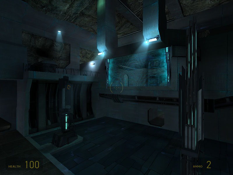
 I spawned here, I never did figure out how to get over there without noclip. Obviously this was because of either the unfinished nature of the map, or my ineptitude to solve basic riddles.
 Floor texture looked out of place when one looked at it with the wall in the same frame. I also never did figure out how to disable the force field, but it later was off when i returned to this location :/
 This texture not only hurt to look at, but also seemed to me to be an alignment nightmare. I also felt it was seriously over used, but it did fit the theme. I think if used in moderation it would be OK, but not as a tunnel/hall ceiling
 This effect, I cannot even begin to describe how it effected my vertigo issue. I actually had to get up and leave for a minute to swallow the last of my lunch before it made an abrupt appearance. It was very cool really, i think it would have looked better in a bigger frame. To bad I cannot view things like this very long.
 One of those narrow doorways I mentioned. there was some excess wall space to utilize for the increase its width. Also, the halls tended to have far less detail than the open areas. It seemed like they were left for last or were less important to the maps overall looks. the ceilings tended to be flat and plain, although some/most had some sort of a gizmo on at least one wall. This was a nice touch.
 This hall of mirrors effect nearly did it for me. I know it was temporary, but it was also unexpected when I first encountered it.
 Bottomline, ugly light.
 Another hall that clearly illustrates my "plain" comment earlier. Again the texture on the floor looked wrong too.
 Very nice beginning of a room, oddly empty in spite of its accoutrement's. Maybe it was the flatness of the ceiling and floor, but whatever it was, the room needs help.
 One of my favorite areas. Plenty of vertical in this map for sure. I hope that connectivity doesn't hamper it however, since sometimes elevated spots get out of the loop when the author adheres to strongly to the theme. For instance, if a player had to navigate to far to get to a perch such as this, they might avoid it in favor of kill totals in a more convenient locale.
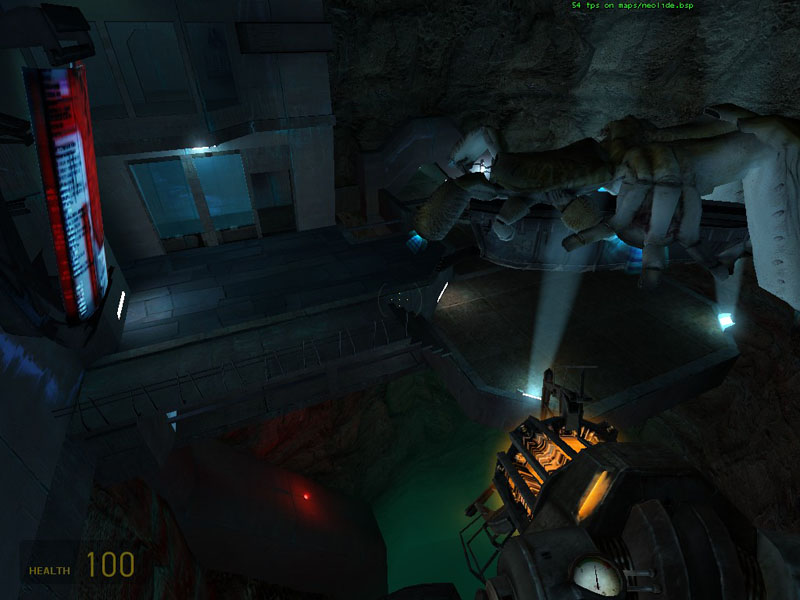
 Perhaps it was my low settings, but this angled shot looked wrong. the green stuff down below was oddly incomplete looking.
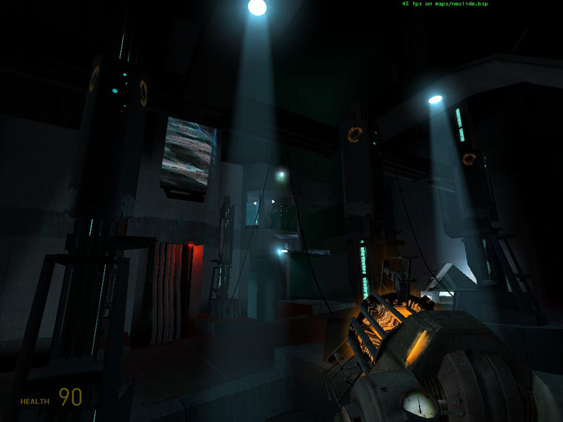
 up wasn't much better.
 That was a gizmo, I accidentally smashed it so I think I ruined its desired objective :sad:
 Very sweet area. Those thumper things were a little distracting, Always shaking the floor and stuff. Otherwise, it was prime.
 Very long sight lines. No noticeable slowdowns on my pathetic machine either.
 Lots of water I assume moisture as well, but no plant growth on the walls or ceiling. many under water, but strangely dead above the surface.
 I think some lights under the surface would greatly enhance the effects of the water. i couldn't even tell it was water till i turned on my flashlight the first time.
All in all, it was nice to see my first real user made HL2 map,That is to say, one that wasn't over rated prior to my viewing it :biggrin:
I hope to get to see this at least once more before its release.
Two thumbs up so far Lep. Nice job.