Its the very first time ive used Hammer, so its my first map, i'm quite pleased with progress ive made in a day or so, so hopefully i'll make bigger and better maps, although this one is really fun to play with 4/5 people.
Looks like you're having a good time with the new hammer. It is possible to produce a fun level your first time out.
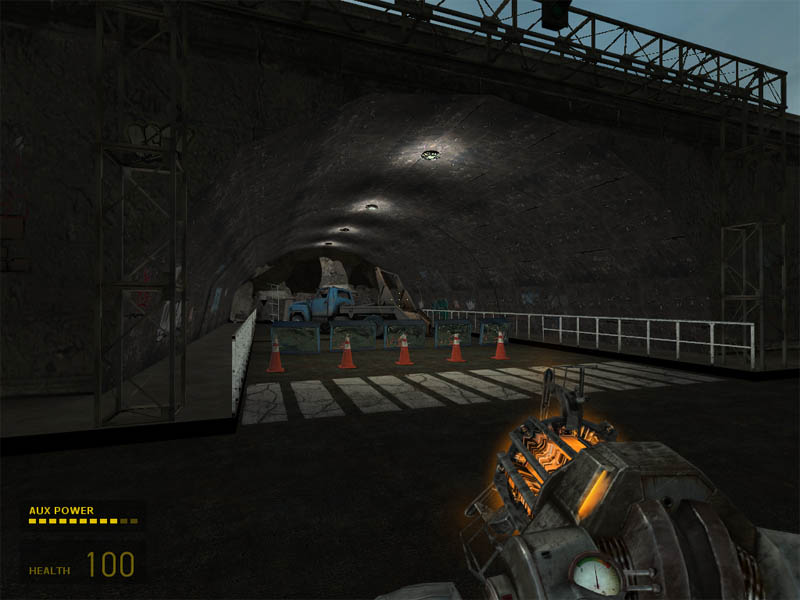
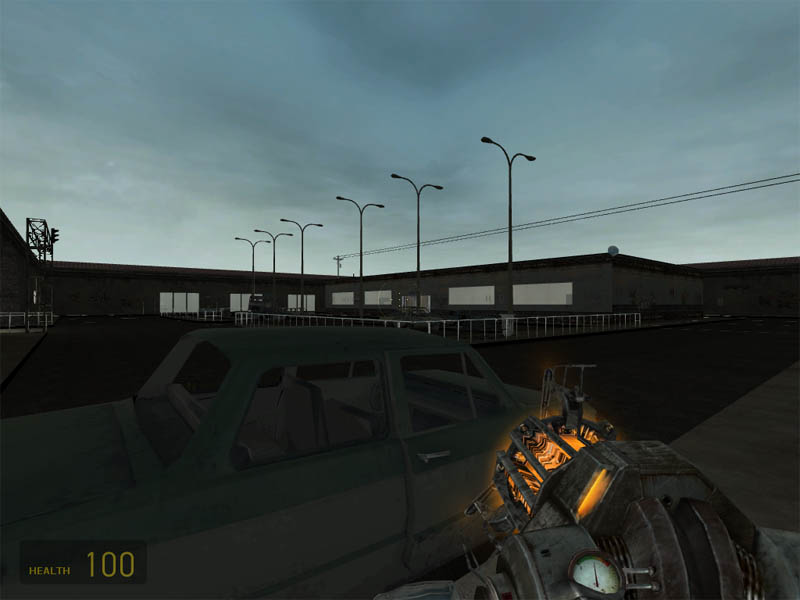
Try to get used to using the light_spot entity instead of the light entity, it looks infinitely better and more realistic then having blobs of light on ceiling. It took me 2 maps to start doing this, the sooner the better. The row of street lights in the building shot looks a little awkward, look down your street and see how often the street lights come up. Also, try to light them up a little so they don't look so dead. And I would also add a couple of more utility poles for your electric wires.
Looking really good for a first map. My only suggestion- every so often stick in the env_cubemap entity... makes stuff look pretty.
Posted by Captain P on
Thu Dec 23rd 2004 at 10:40am
Only thing I've got to say at this point is that the map's geometry
looks too dark compared to the sky you've used. Use a light_environment
to brighten things up outside.
Apart from that, this looks promising for a first map. Keep up the good work!
Well done! You released your first map and it is not utter s**t! This is rare, you can come far if you keep on learning.
Posted by Mike3006 on
Thu Dec 23rd 2004 at 10:12am
[Author]
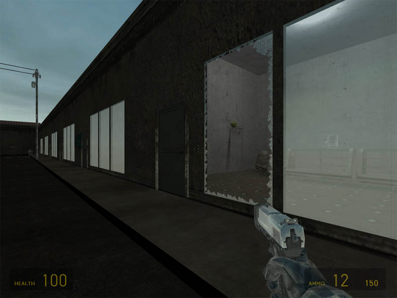
thx for that, i'm yet to prop out my interiors, so the supermarket type
thing in the middle is empty atm, i have trouble texturing things too,
i can never get things to fit properly, is there a good texturing
tutorial other than the ones on this site or the
Basic_Room_Video_Tutorial which is hovering around?
Another thing i wanna know is whats a good way to work, coming up with
an ideal concept and working towards that, or working towards an idea
within Hammers boundaries (ie only making maps which are of the style
which the preset textures depict) because i would really have liked to
make this map a more modern futuristic kinda map, but i found the
textures available to me somewhat limited what i could do.
A great map always finds a balance between asthetics and gameplay. But you are on the right track, if you have flow in mind from the start, as it's probably the last thing that new mappers think about. Study good maps, and pay attention to connectivity, flow, weapon placement, verticality..etc. If you get these things right from the start, the asthetic 'icing' should fall into place. It's much harder to rip apart a good looking map that plays like s**t, than it is to spice up a solid layout with fancy architecture.
If you want specific critiques on your map, host the bsp file somewhere, so we can download it and take a look on our own time.
Study good maps, host a bsp for us to download, read everything you can here, listen to the vets, and you'll be fine.