dm_Void by W01f

Map Rating

  • 0
  • unrated

Map Download

Map Info

Map Description

Should be a good competitive 1v1 map, and good for small team matches. 8 player DM will probably feel crowded.

Discussion

Posted by BoomWav on Mon Jan 24th 2005 at 5:31am

Personnaly, I kinda like the athmosphere. I'm not a player.. but a mapper/texturer. You only use few textures... and there's no real.. goal to your map. I mean.. Why did they even built this building? That's the kind of detail I look to. However.. It's good and well done. Good luck for your futur maps.
Posted by zeekmond on Fri Jan 21st 2005 at 6:02pm

oooh, the lighting, the lightning, the sounds, the effects, the sexy... I felt like i was really there. I will be joining a server with this on it tonight... definitely.

-Zeek
Posted by W01f on Thu Jan 20th 2005 at 9:13pm
[Author]

Just had a quick look; how in blue blazes did you keep swapbuffers so low?! :sad:
It's quite small, probably comfortable for ~4 players and I imagine it
would be quite fun, though I really don't like that glass tunnel
:/
I'm not sure how I kept it so low. Back during the betas,they were
skyrocketed..but for some reason now they're not. I don't recall making
any effort to lower them (aside from removing a few cubemaps)...just
kinda fixed itself.

thanks for all the comments.
Posted by diablo on Thu Jan 20th 2005 at 4:17pm

First custom HL2DM map I downloaded! Not a bad effort at all! Bit small for my likeing, but as lep said, would be good map for about 4 people.
Posted by ReNo on Tue Jan 18th 2005 at 4:43pm

I think you could have benefitted from making it symmetrical so that
both sides took you up to the top floor. I also agree with Lep that the
glass tunnel looks a bit out of place. Not a bad little map though.
Posted by Leperous on Tue Jan 18th 2005 at 10:54am

Just had a quick look; how in blue blazes did you keep swapbuffers so low?! :sad: It's quite small, probably comfortable for ~4 players and I imagine it would be quite fun, though I really don't like that glass tunnel :/
Posted by W01f on Tue Jan 18th 2005 at 1:09am
[Author]

No feedback? Hows the layout/gameplay?
Posted by Tactii on Sun Jan 16th 2005 at 3:28am

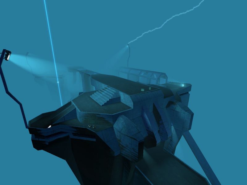
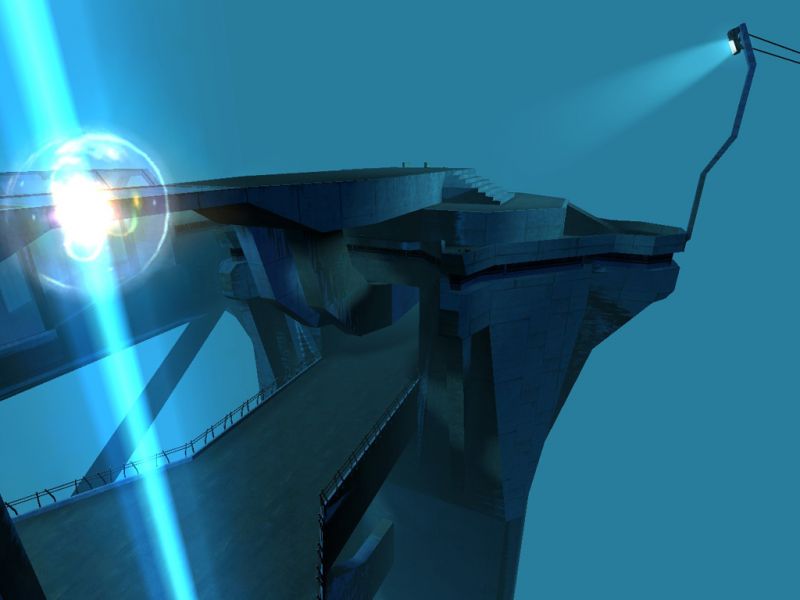
This map looks nice, and the gameplay isn't half bad imo. You seem to have thought about where you put everything, which is more than can be said for many mappers. And there is a lack of physics objects, which is inevitable since they can be thrown into the void, so I won't hold it against you. But there is no place in this map that runs above 21fps for me, and who cares how beautiful a map is if it's unplayable?

A quick look at the budget and mat_wireframe revealed why:
  • You are using way too much dynamic light. Make sure all your point_spotlights have the dynamic light flag turned OFF. This might also fix the shadow rendering budget.
  • There is a huge box around your level that is being rendered at all times. This won't work. Experiment with the fog z clipping plane or change the walls and ceiling to skybox.
4 for unplayable but fairly coherent artistic presentation. I think you'll do better with a more conventional level.
Posted by cbk on Sun Jan 16th 2005 at 3:12am

Very good
Posted by omegaslayer on Sat Jan 15th 2005 at 10:10pm

Very Halo style brushwork (looks good), nice sounds, good weapon placement, the portal could have tranported you to different places (but not a big deal)l, overall I give it a 9/10