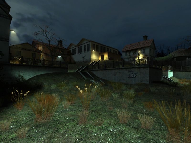
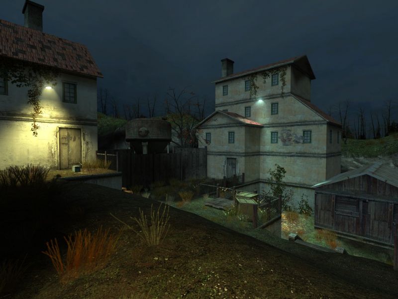
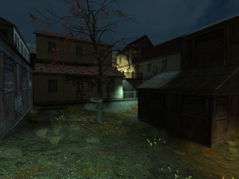
Obviously designed after the Ravenholm section of HL2, I built this map for Valve's mapping competition. Even though I did recreate one of the sections of this map directly after the original Ravenholm, 80% of the map is originally designed by myself.
WoW....this is really an excellent map. I started running it on my [K-9] Kibbles and Bits! HL2 TDM 16 person server, and people love playing it. It is one of the few larger maps that runs great without any lag even in a full 16 person server. That is also one of the best traps I have ever seen in any map.
Congratulations! I made a new topic post about the map on the steam forums.
It's a bug with the Source engine when you ALT-TAB outside the game,
some textures look pink :smile: I had it a couple of times before too.
Nothing to worry about imho.
Looks pretty nice too!! Keep it up
GrTz
Posted by KornyBizkit on
Sat Jan 15th 2005 at 5:41pm
I know you put a final version out, but it's extremely easy to
gravity-gun jump behind one of the houses and into the scenery. I
could even see someone stacking crates and climbing in without too much
trouble.
Posted by Junkyard God on
Fri Jan 14th 2005 at 4:31pm
Top class m8, realy good i'll defenatly play this when i get my new pc ^^
Posted by Vassago5kft on
Tue Jan 11th 2005 at 3:16am
The brush work looks really nice. I think the overall ambient lighting is a big too bright though. It's making your spotlights get really washed out. If you bring the overall brightness down a few notches, I think it'd look a lot better.