TRY_THE_HIGHWAY!!! by SVIN

Map Rating

  • 0
  • unrated

Map Download

Map Info

  • 0 ratings
  • 2140 views
  • 0 downloads
  • added Sat Jan 22nd 2005
  • updated Sat Jan 22nd 2005
  • more content for: Counter Strike Source

Map Description

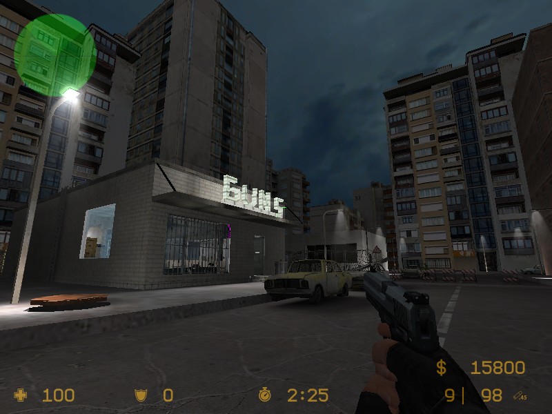
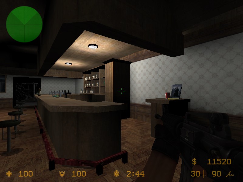
terro start at the gunshop and ct at the bar....its many cool camping places. looks better in game

Discussion

Posted by brett5010 on Tue Jan 25th 2005 at 1:28pm

ROFL I like the matrix DVD texture. . .XD
Posted by Wakkawa on Sat Jan 22nd 2005 at 2:19pm

Or you could totally just open up the maps that were included in the SDK....
Posted by SVIN on Fri Jan 21st 2005 at 8:54pm
[Author]

what more should i do? ideas plz
Posted by habboi on Thu Jan 20th 2005 at 4:50pm

Use google or you could download some pro maps here!

There are loads here but there bsp only :sad:
Posted by SVIN on Thu Jan 20th 2005 at 4:39pm
[Author]

could someone send me a "pro" map i wanna see how to do some things
Posted by rs6 on Thu Jan 20th 2005 at 3:25am

Not bad, but could look a lot better.
Posted by DrGlass on Thu Jan 20th 2005 at 2:27am

How do I upload one of my own maps
not the place for a question like that. and I dont think you can upload maps.

The map looks like I needs some brush work, and the lighting has far
too much contrast. In a room like that one in the scond pic there
should be some bounce that fills the room with a little bit of light.

as for the " that is kinda low. The whole name makes little sence for a CS map.
Posted by French Toast on Thu Jan 20th 2005 at 1:57am

Hey, not having mapped much at all, I think that looks sweet. But thats that. I'd play it, who cares if you have " in front.
Posted by Mikee on Wed Jan 19th 2005 at 10:34pm

The simple fact that you had the gall to put " in front of your map just so it would be at the top of the maplisting says more to me than any picture could.
I was wondering why.....that is pretty sad.
Posted by Yak_Fighter on Wed Jan 19th 2005 at 10:07pm

The simple fact that you had the gall to put " in front of your map just so it would be at the top of the maplisting says more to me than any picture could.

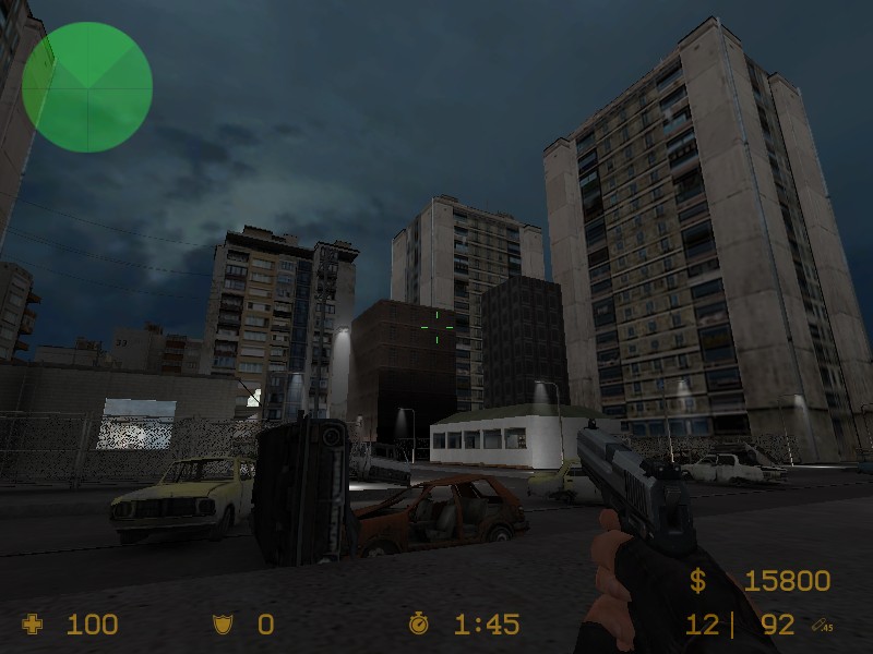
Oh, but the pictures do tell me something. The outside looks bad, as you're heavily relying on props for detail. The buildings you have made look very simple and blocky, and to put those detailed skybox props right next door makes that contrast that much more obvious.