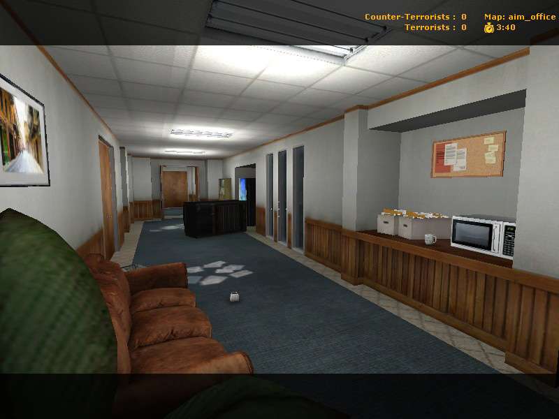
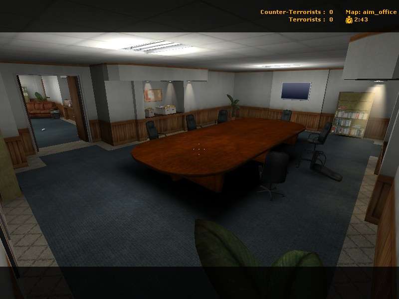
When adopting a theme used in other maps (in this case cs_office), you have to do something special to distinguish your map. Right now, I feel like you're doing a good job of prop placement and creating a believable environment... but it's nothing above or beyond or very different from cs_office. I feel like you need to create some outstanding, unique, and captivating level architecture in order to differentiate your map, aneurysm, from office. You're taking steps in the right direction with the light recesses in your "board room" in the third picture, but I'm interested in seeing something more eye-catching.
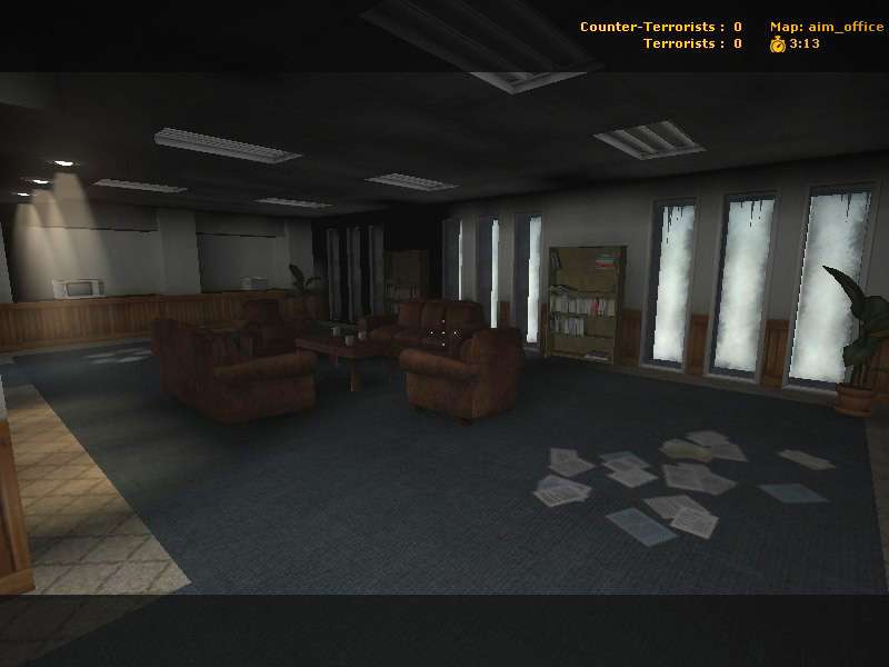
Office functions very much on one level, without much vertical gameplay, and I think if you chose to incorporate some height variations to your office, you could make it stand out. Perhaps a board room that opens up to a larger room with multiple levels and recesses. This would be more in the direction of a corporation map, instead of an office map.
If you're using this map simply as an excercise to familiarize yourself with the entities, props, and lighting... then good job. Everything looks correct. But if you're looking to create a map that will stand out on its own, consider making a break from the long corridors and rectangular rooms that seem to mark your office. Go for some unique geometry, with perhaps an emphasis on multi-level gameplay.
Just my opinion. Keep it up.