dm_veikko by ishbog

Map Rating

  • 0
  • unrated

Map Download

Map Info

Map Description

July 27 -- Screens, finally! www.freepgs.com/ishbog/veikko
July 7 -- RELEASE! well, it was put onto Snarkpit.net DM server, so im calling it done, and im in japan for another month and cant work on it... good times! down load at www.freepgs.com/ishbog/veikko/dm_veikko.rar
no screenshots at the moment, they are all old.. and im in japan... soon though, soon.
-May4
Posted the beta .bsp, check it out, tell me what you think!
-may 3
Hopefully getting some of the more intricate pieces of brushwork made into models, for faster rendering, but lag has been decreased in huge room without that. 30fps on a shi* comp ain't bad, i guess. and thats in only one place. I have a few things to change, and then i think i'll put the bsp up here for people to try out. new screens!
-may 1
Well, lots closer to finishing this map, yet farther away. im afraid the large room is creating too much lag, so i may choose to replace it with an outdoor area or more complex-style offices of some sort. not sure yet, but i may put a public beta out soon, instead of just waiting out a lan party. all comments appreciated!

Discussion

Posted by ReNo on Thu May 12th 2005 at 4:26pm

Habboi, I think Orph means if you click the links provided in the
snarkpit profile they don't work. They work if you visit the URL he
provided though.

Map looks really impressive for a first effort - refreshing to see
somebody new coming along that obviously put time and effort into their
first release. Good job :smile:
Posted by habboi on Thu May 12th 2005 at 4:11pm

They work fine for me?
Nice map!
Posted by Orpheus on Thu May 12th 2005 at 2:10am

I so love to see a map "Orphinated" :heee:

@ Ishbog, and I do not think you are allowed to hotlink your images from that site. They all seem to lead to dead links :sad:
Posted by DrGlass on Thu May 12th 2005 at 1:40am

Great looking map. I like (for the most part) how it fit together. Also, the mood and lighting were well done.

As for the review:

User posted image

Grass prop hanging over the edge.

User posted image

Alot of your door ways and windows lacked any kind of trim. When
two diffrent textures meet at an edge it can look very tacky, try to
add some more detail brushes.

User posted image

This is a big issue to me, the skybox. This shot is showing me
toss an explosive barrle out the sky light. It hits the skybox
and blows up, and that looks horrible. remeber always make your
sky box very high so props dont run into it, you can always use a hint
brush to to cut down the vis leaf.

User posted image

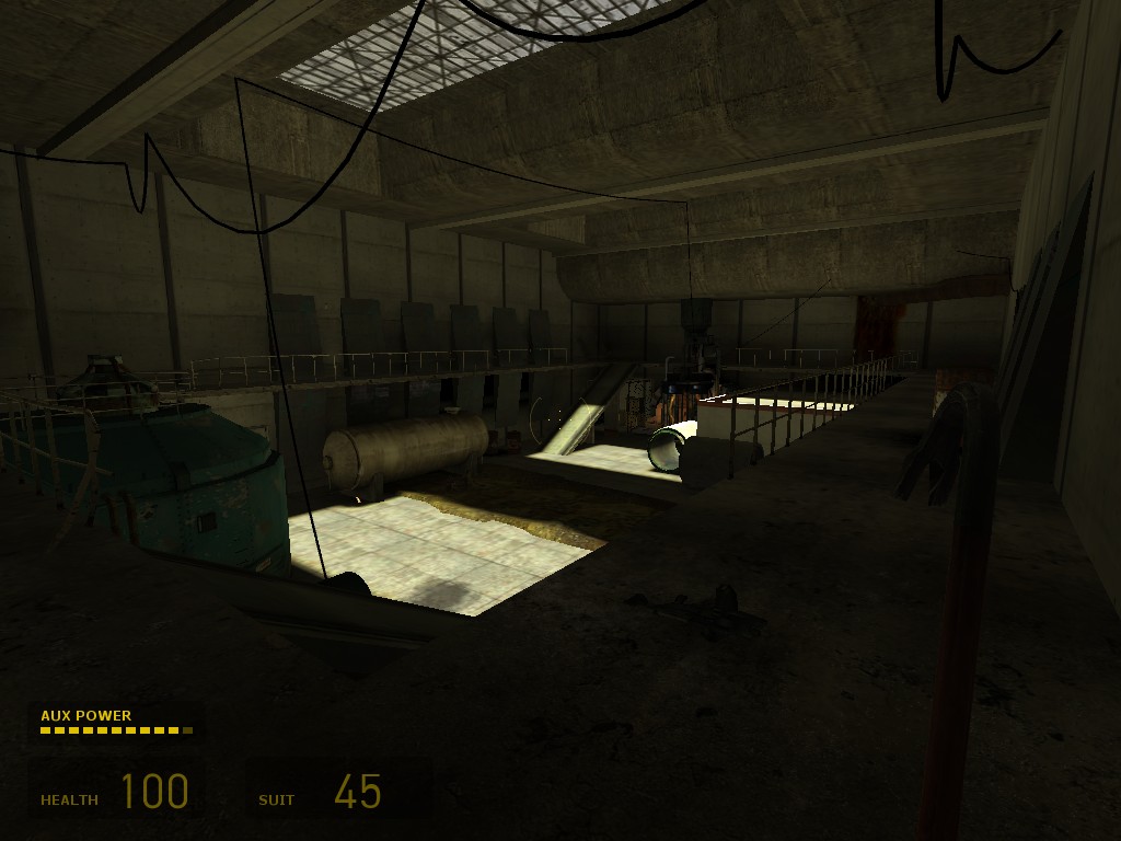
This place just didn't feel right, just looks like a bunch of props slapped together.

User posted image

That prop isn't a spot light, it should be casting light all around it, not just down.

User posted image

Use env_sprite and not env_light_glow for small lights like this one
(near the room with the gas pipe) env_light_glow fades as you get
closer to the origin, which looks very strange becuase light halo's
dont tend to do that in real life.

User posted image

I dont think that charger should be there.

User posted image

Your lift stops a bit short, I would try and figure out a way to get some doors in there so you dont see the lift.

Very nice, though there may be some game play issues I though that the
map fit together very well and apart from some visual flaws looks very
nice.
Posted by ishbog on Wed Apr 27th 2005 at 2:01pm
[Author]

Yeah, that was from the original, never did move it. i may turn it into an overlay and rotate it. as for the huge room with shadows, what do you think of this screen instead?

http://www.freepgs.com/ishbog/veikko/dm_veikko0465.jpg
Posted by Addicted to Morphine on Tue Apr 26th 2005 at 3:26am

I really like the clean shadows in the third picture, but the blood stain in the light in the second picture, while artistic, seems too perfectly centered in the light. I'd either move/rotate the decal or shift the light or make it a bit weaker and fuzzier around the edges.