Generally iam trying to improve my mapping skills i would be gratefull for abit advice on the map. Ive just started making basicially its plains are to be a supermarket callled tesco. It consists of a car park underneath the shop and elevators and lifts up to the shop floor. At the moment ive bult a basic structure of the car park and need to work on it further just send your ideas and advice.Also if you know slough thats great youll know the setup of the tesco building.
With the pipe supports instead of making them curl round with loads of verticies, make 1 block that is a func_wall, and make it going through the pipe verticie, I'll try and show you with lines...
Currently: .........__
.........--
What you need: ........__
------|---|------
------|---|------ .......|__|
But its improved at the moment iam working at the ceiling creating something interesting but iam going to start doing the chop vertex tutorials when i can.
You've created too much minor detail- in particular the lines on the sides of the roads, but also the pipe holders. Most of these problems are consistent with mapping large, open, indoor areas.
Hey give me some advice you all ran alway but i suppose theres alot maps in progress well anyway.Still spicing the area up hoping to be car park soon which looks interesting.
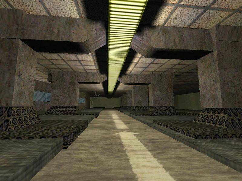
Abit of changes to the area hoping to make into the tesco car park which is underneath and the building is supported above. As you see i need to get rid of the repetiveness in the lighting and do something to the general texture.The tutorials are sure helping though.
Bascially we can tell they don't line up because of those tiny dark shadow lines around the edges of your manipulated (edited with the edges)/clipped (cut) solids.
Now might be a good idea to tell you about vertex manipulation and invalid solids... Check the tutorials for clipping, vertex manipulation, and you should learn everything about it. Basically the lowdown is that you can't have concave shapes, only convex. No point of 1 solid can go inwards on the solid. If you find yourself in the situation, use 2 convex solids to make the 1 would-be concave.
Highlight the pic to reveal the text (originally on a white background page).
Watch your placement. The solids do not seem to be matching well.
Those textured lights. Each one counts as 6 entity lights when you compile. So, the map will compile longer with each addition. I hope you have a big machine.
Its always best to have a texture in mind when making creative architecture. Its not imperative to use it right off but make sure it will fit eventually.
Looking at the second screen you've added to the map profile, it looks
like the walls aren't lined up correctly, and they don't touch the
floor or ceilings. Are you working on a small grid size? It
might be easier to make your walls line up if you're working on a grid
size of 32 or even 64 for all the basic geometry.
Good improvement, you're clearly beginning to get to grips with the architecture side of things. The other main problem you seem to have is with texturing, and if you work on it a bit things will look much better. Avoid using the same texture across more than one surface; eg. don't texture the floor the same as the walls, or the walls the same as the ceiling. The huge light you have is also a worry point here, as the texture repeats far too much and it looks bad. Break up the fixture into several smaller fixtures, with only one face using a single instance of the light texture, to illuminate the room instead.