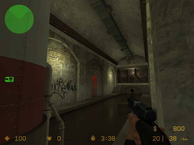
This is a small defusion map set in a sewer. I wanted to make a map with quick action and a sense of claustrophobia. There are gloomy areas and industrial areas, and some piping. This is my second real Source map, so I was trying to master indoor areas.
There are two bomb sites and three mixers, with good flow and variation in combat distance. If you see any bugs, feel free to let me know. Thanks and have fun.
You guys are all right about the missing polish. I think I'm gonna vault most of the ceilings and change up light appearance everywhere. I also have a bunch of props and overlays to complete. I guess it needs more beautification than I figured. Thanks for the tips.
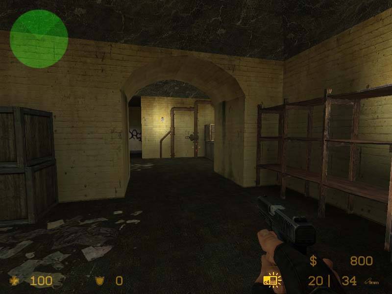
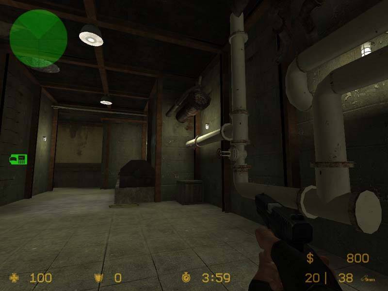
I like the arches but texturing and lighting need some work! Take the 3rd picture, it looks like the room is upside down with almost the same texture one the ceiling like on the floor. Try to change that and add a bit of brush geometry to break up the squarish shape of the room (wall columns?). Also in the second picture the transition between the wall and the ceiling texture is very unnatural. The small door in the first pic needs at least a border. It's the most important visual focus in the corridor and for that it looks way to bland. The lights fit the theme, but make them a bit more varied. Add some neon lamps, lightbulps to the ceiling ect. Right now it's the same lighting for every room and that gets a bit boring after a while.
There's enough stuff I like, just polish the details.