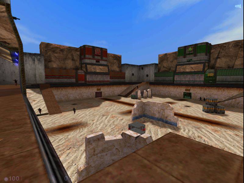
After seriously wanting to create a defense styled map for Sven-Coop, and having all of my attempts fail miserably due to the lousy setup of the scripted_sequence entity, I came up with the idea of TFC style defense map for Sven. Players must attack and destroy Green, Red, and Gold's Generator, while defending their own and making sure it is not destroyed in the process.
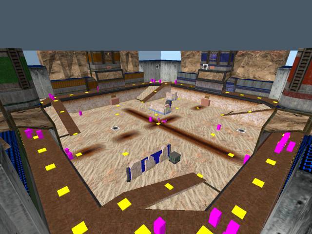
I think the cliffs look strange, being too squarish. Why not extend them all the way around, instead of just near the red/blue/green/yellow entrances? The concrete corners look strange without cliffs over them. Also, the top of the rocks seem too flat, don't you think?
Posted by G.Ballblue on
Fri Jul 7th 2006 at 6:37am
[Author]
Okay. I promise this chapter won't have fifty billion screens, unlike last time :razz: This is really just a simple update letting everyone know that the scripted_sequences are in apparent working order, but I still have about another 50% of them to add!
Older Screens
Most Recent Build
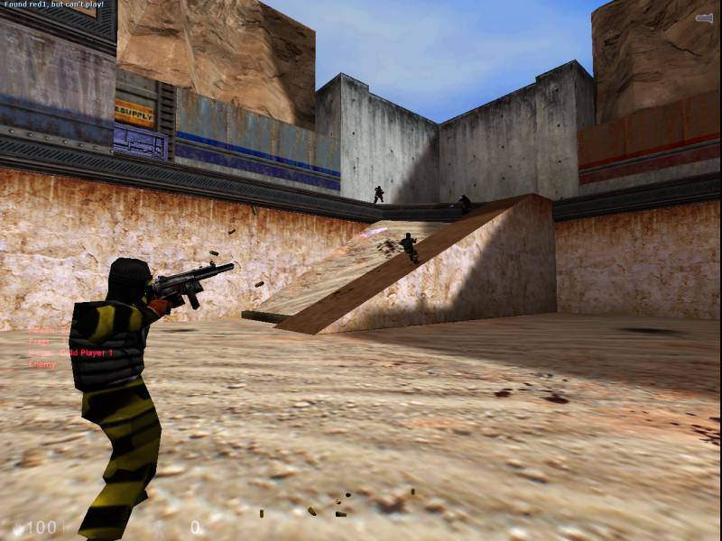
Sorry for not having any Raded screens, but I've been busy beating my brains out with the scripted sequences... and fixing the Name/Target/changetarget problems with them :heee:
I have also added some cover to the playing field, (oddly, the best architecture is off camera!) and I have slightly tweaked the cliffs a bit. :wink:
Posted by G.Ballblue on
Sat Jul 1st 2006 at 7:43pm
[Author]
I actually posted that many shots due to the different colored lighting :heee: I was looking to see if anyone felt that the lighting was too extreme/dull for a particular base, but note taken about the quantity of images :heee:
I believe I can tailor the cliffs up a bit by dropping the height of the ones that "jut out". Luckily, the cliffs are func_illusionaries, so I don't need to worry too much about sewing the architecture up properly. I should be able to futz around with them a bit and get some fairly better results.
Orph: By goals, how do you mean? I'll gladly fill you in (and keep it rather consice) if need be :smile:
Uhhhh, next time don't post so many screenshots please! You might have kept them to small file sizes but that many is just ridiculous and totally undermines the point of keeping them small :biggrin: Given that the map is 4 versions of the same area with different colour schemes we simply didn't need to see more than one of them.
Map looks not bad. Some nice basic room shapes and a good classic HL feel to it. Some feel a bit too empty though - I'd be tempted to put something in some of those larger rooms. My biggest complain is those cliffs. They are higher than the walls to the sides of them yet when they reach these walls they just stop - it looks bad and awkward. Make them extend along behind the walls, or smooth them down to meet the walls, or curl them back so they continue back behind the bases a bit. I'd encourage you to go with some triangle based cliffs but if you don't then at least do something with them.