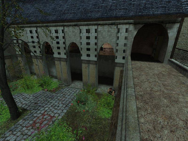
Those terrorists are at it again, this time aiming to destroy the grand courtyards of this castle. The Counter-Terrorists have had an anonymous tip and have been sent in to investigate.
This map is finally at a releasable stage, enjoy.
Inspiration from just about everywhere...
There is a chance of an etape2 down the line with better brushwork, a more established theme etc... keep an eye out.
Obviously go to the related link for more info/gameplay tactics.
Just to revive an old thread... being mine of course. :smile:
I haven't posted updates in ages, yes I know... don't give me that look.
Things are being reworked, I'm scrapping practically everything and turning in a new 'cs_' direction, bringing in hostages and new locations with a slight twist and much better lighting.
It practically wont be etape2 anymore, it's more of an extension of what I planned there.
I'll let you hold off for screens, hopefully not for months.
Posted by 7dk2h4md720ih on
Mon Aug 14th 2006 at 1:22pm
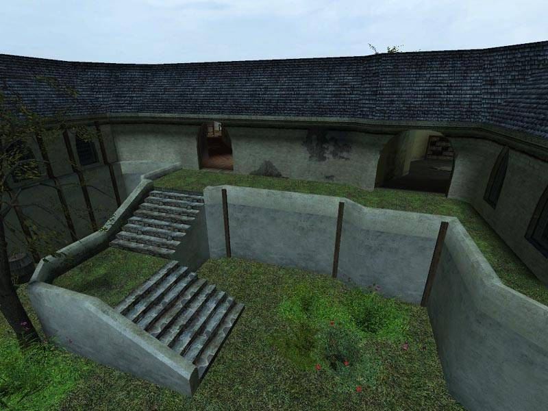
The balconies on your building look like they could use some supports and perhaps you could make the railings a little thinner. Other than that and the flat tire on the car it's looking excellent. I'd also like to second Renos' suggestion for adding some height variation to the actual ground as opposed to just adding second floors to the buildings.
Posted by reaper47 on
Sat Aug 12th 2006 at 10:09am
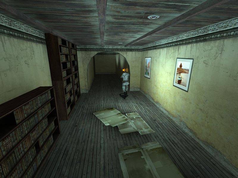
The architecture looks very good so far! Those pavements are a little to high. Or otherwise out of scale. They look a bit too big. Also the balconies look a bit too blocky. The little arches in picture 2 and 3 look a bit unstable. It's either the not-so ideal brick texture or the fact that they go right up to the ceiling. Or the shape is a bit to oval.
I like the feel of the map - rather old fashioned - especially the second screenshot. Except for that shiny new car - it really seems out of place in this old village area. Is it just to show scale or something? Really doesn't fit.
I like how the road curves up towards the edges, that's nice. :smile: Buildings have cool details.
The reason the last map isn't detailed is mainly because I didn't set it upon a major theme.. that's the whole reason for this second version. There were many things I should've/could've done and I want to try them now in this. Besides...the layout will probably stay the same...
I think your last map could've have been much better. You should really go back and finish detailing your last map, it could look so much nicer. You really had something going there.
 <br style="color: white;">
 <br style="color: white;"><br style="color: white;"> :smile:
