Its a snow/ice map but with a house/office, stairwells and whatnot. its a bomb defusal map and im a rather noobish mapper so please bear with me as i noob my way through the whole mapping process..
Doors are weirdish, you have to use a few certain doors or they won't work right. I think like Door01_animated.mdl or something like that. Have a look.
If you're not confident about your abilities you probably won't get very far. You should experiment with whatever you don't feel you know enough about in a separate map so you can experiement around and learn the technique, and then apply it to your map. :smile:
ya, its something ive been wanting to do for some time now, and now
that im doing it i dont think that its going to be a good map. well its
not that i think its going to suck its just that im not confident in my
ability to make a relatively visually pleasing map. ive made fy maps
and all that and theyre really fun (for me atleast) but this one just
seems like it might be more trouble than its worth. i think that i just
doubt my ability too much, but then again i tried to make a door and i
couldnt find the origin (there was no circle, there was a line that
came out of the middle of it, but no circle that i can move to the
edge) so i had a door that rotated in the middle of a doorway.. very
usefull.. ugh, this blows.
It'll go somewhere if you want it to, you just need to get used to getting some honest feedback and appreciate it. :smile: It'll really improve your map by the end if you consider all the suggestions you're given, they can really help. It's certainly helping me.
I agree with Morphine here - you should probably try a few more smaller experiments to learn a few things about Hammer. I also think you should at least have rudimentary lighting here as you go along. I personally like to do the lighting as I work on new areas so I can tweak the mood and feel of areas/the entire map as I go along; lighting is important! Even if you only set up a light_environment so you can get some sunlight and maybe a few lights around the interior, at least it'll be much easier to look at and discern. Fullbright makes it hard to look at and hard to see what's what exactly.
Keep at it, even if you're having trouble with anything.. you'll learn a lot about Hammer and gameplay. :smile: Welcome to the Snarkpit!
Its not nearly donw. i just made the basic layout for each area. im
going to put alot more stuf in there. and i always add lighting and all
that after i get the map looking how i like it. textures and shapes and
entities and all that. there will be lighting i just have to finish
making everything else. meh we shall see how this map goes.. i
might just trash it cause it seems that its not going anywhere at all.
meh
The links don't work, as the files seem to have been removed?
Anyway, from the 3 screenshots I can see, there's a few things I want to comment on.
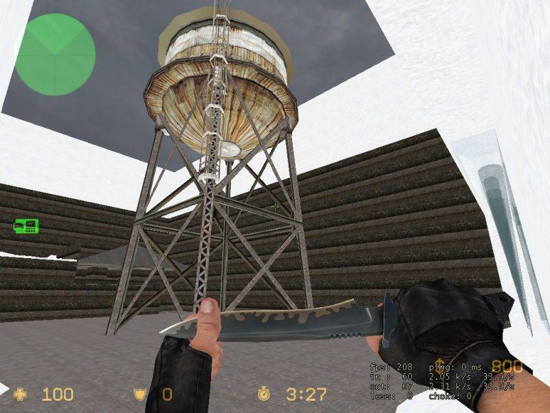
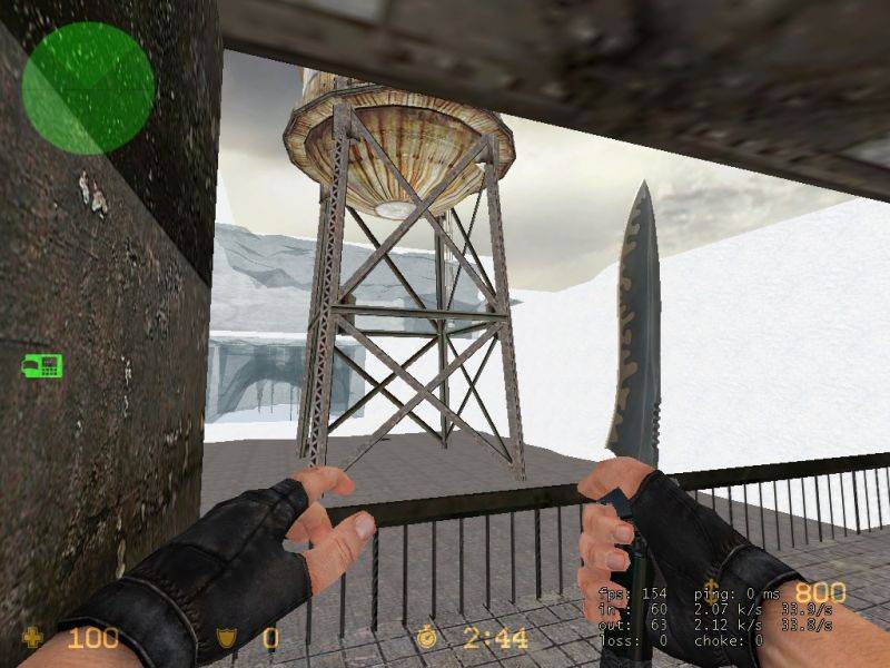
First, it's looking pretty inconsistent right now. The water tower looks totally out of place with all the snow and ice. The concrete-ish structures don't look like something I can recognize - adding light to define the shapes better would surely help.
Second, as mentioned already, it lacks lighting. Light works to define shapes better, and can really create a strong athmosphere, using bright and dark area's. You can draw a players attention using bright spots, providing trap locations using dark area's, and so on.
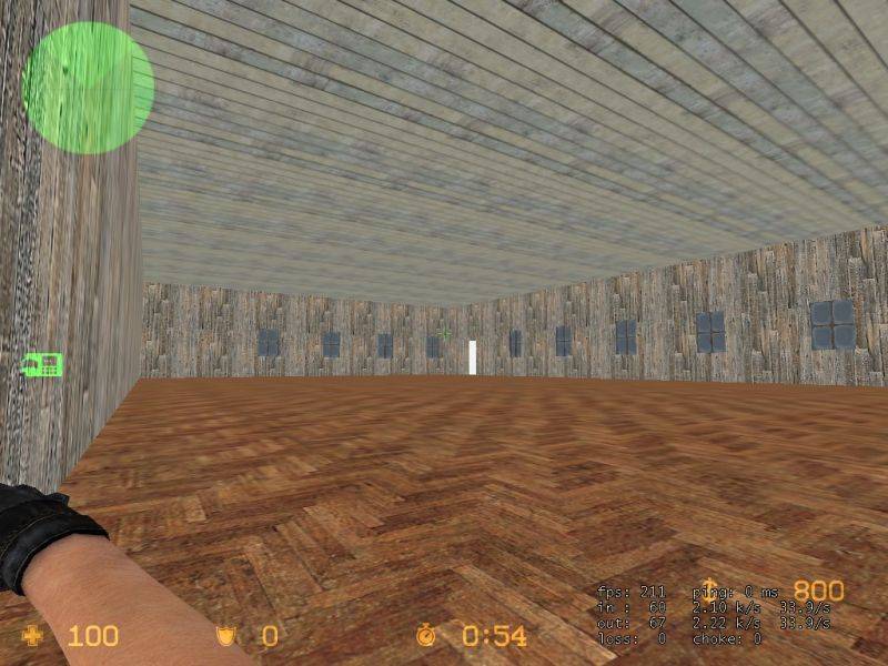
Third, you seem to go with over-sized area's. The last shot especially shows a long, boring room. Yes, it lacks details, and you could fill it up with some (carefully chosen and distributed) props, but that's not the only thing 'wrong' here. The basic architecture is flat, as it's basically just a box. How about an L-shaped room or such, and how about adding a /\-shaped ceiling with wooden support beams? Combined with good lighting, it can really spice up that area. Oh, and of course, the room's too big for such houses.
All in all, it looks like a typical CS/CSS map, void of lighting and so on, so I think it's more a matter of having seen bad examples than lack of skill. I'm interested to see how you're going to improve this map. Good luck. :smile:
I can't really understand what's happening in these 3 screenshots you've uploaded.
I don't know why this map is fullbright either.
What I would do if I were you is go through a bunch of different tutorials, as many as you can find, starting from beginning techniques and working your way up to advanced, and just learn different skills like displacements and entity work, and 3D skyboxes, and the theory behind brushes, and compiling maps, and how VIS and RAD work etc etc.
I'd try to learn all the little details before you take on a proper map. Make a bunch of little test maps, experimenting with lighting and architecture etc.
Posted by Pvt.Scythe on
Wed Aug 2nd 2006 at 12:36pm
Lights. It needs some lights in it. Lights so it wouldn't be
fullbright. Fullbright is bad m'kay. There's a need for shadows so
people can make out the shapes better from those images. There's not
that much to comment on, but you need to add some more detail indoors
and the outside area is very boxy, try breaking that up with
displacements.
Also your links seem to be dead, but the uploaded images work.
I'll take a look again sometime and give more commentary. :smile: Welcome to the pit.
Oh and if you have somekind of a layout plan it might be good to post it here.