de_silica by P37r1

Map Rating

  • 0
  • unrated

Map Download

Map Info

  • 0 ratings
  • 692 views
  • 200 downloads
  • added Tue Dec 19th 2006
  • updated Tue Dec 19th 2006
  • more content for: Counter Strike Source

Map Description

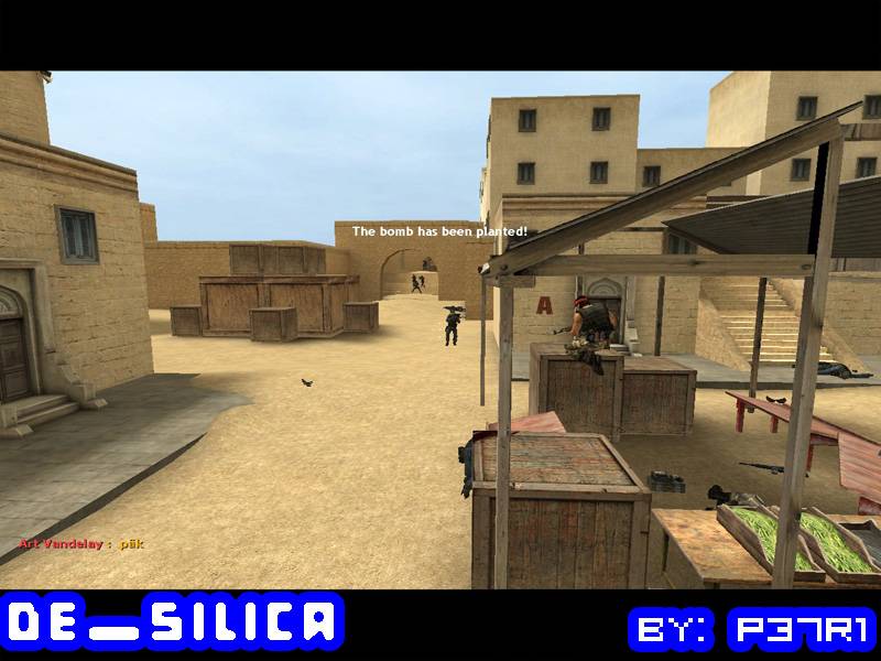
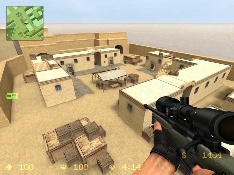
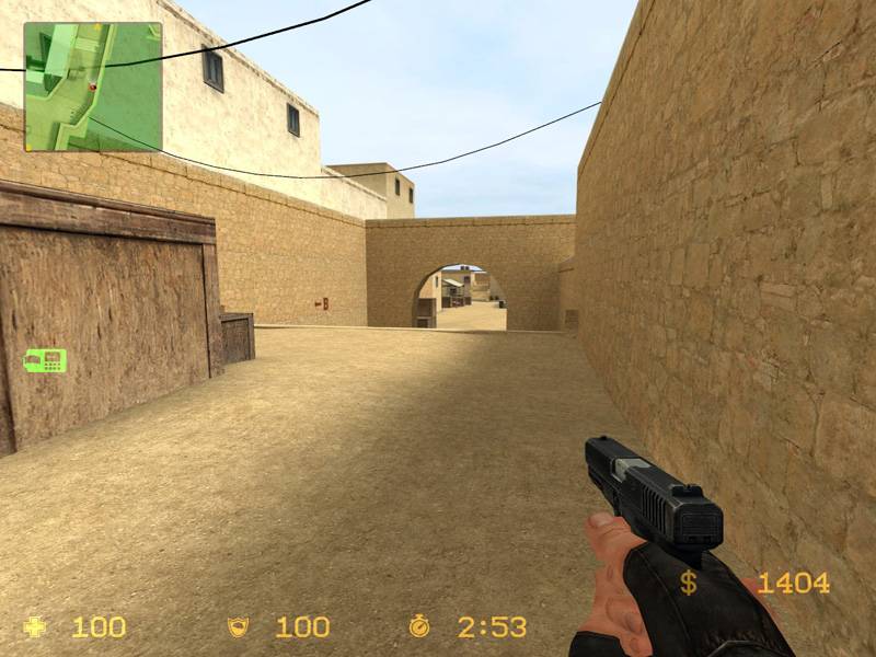
Well, de_silica is a bomb defusal map for 32 players. It is my first attempt to make a map with dust theme, and probably the first decent map I have made to Source engine.

The map is almost ready, but I will upload a beta version soon. Suggestions and comments, even based on the screenshots, are welcome.

Oh, yes, forgot to mention.. There is a tunnel network below the ground, I'll add at least one more exit after Hammer finishes compiling.

UPDATE:
Added the compiled map that completed last night, I already have made some changes to some objects' angles and also tried to break the boxed feeling, but I won't probably upload that or any newer until the map is completely finished. .nav-file also included, I haven't made any modifications to it yet. Thank you Arzie for hosting!

Darn, forgot the cubemaps, entities are present but I didn't run buildcubemaps...

Discussion

Posted by P37r1 on Mon Dec 4th 2006 at 5:48pm
[Author]

Beta version now available for download, suggestions based on actual map will be greatly appreciated. :smile:

I'll think about it $loth, there is plenty of space for side streets.
Posted by $loth on Mon Dec 4th 2006 at 3:15pm

Just to add to the 'level feel' point, I find that adding blocked off hallways or side streets gives the level a realistic worldly feel.
Posted by P37r1 on Mon Dec 4th 2006 at 1:04pm
[Author]

Thanks for the comments!
I will add 3D skybox in the final version, I'm not too good in making them so I will focus on the map itself first. :smile:

I just finished compiling and I will add that version later today, and then start refining the details.
Posted by Captain P on Sun Dec 3rd 2006 at 11:35pm

Way too square, sterile and boxed in (e.g. walls around the playable field, giving a confined feeling). I kinda like the building style, and the market stalls, though their placement feels very artificial.

Don't be a afraid to rotate some stuff. It may not align to the grid and all, but it'll make the level look more normal, more realistic. Oh, and think about adding a 3D skybox to give the players the idea they're actually running around in a part of the world instead of just a small level area. Replacing those walls by buildings or other obstacles will help, too, and finding some replacements for the overused crates would be a good improvement as well.

Having that said, I think the lighting is fine - I like bright maps anyway :wink: . Cool (pun intended) avatar bytheway.
Posted by reaper47 on Sun Dec 3rd 2006 at 11:25pm

Hmmm... another dust map :smile: The outer walls and the sandfloor look a bit too sterile, I also miss a 3D skybox, some buildings in the background.