DM_kowloon by popcornjake

Map Rating

  • 4
  • 2 ratings / 4 stars

Map Download

Map Info

Map Description

This is the first map I've released and I've been working on it for a good few months now, after months of procrastination since beta 5, I've finally dusted off the final version(which I never actually envisioned happening). It's a medium/large map with a somewhat symmetrical layout.

The name doesn't actually have anything to do with Kowloon, or the walled city of kowloon, the map started out as a map on the rooftops of that city but it eventually changed to what it is now, though the name stayed the same.

I don't really have any clue as to how to organise some sort of a play test session so if somebody could pretty please push me in the right direction i would be very grateful.

Discussion

Posted by popcornjake on Sun Aug 2nd 2009 at 3:15am
[Author]

I come back from my little school-infused hiatus with the final version of the map. Most of the changes are cosmetic, but pretty much everything has been tweaked in some way.

You can get it from the snarkpit servers or at filefront here: http://www.filefront.com/14175691/dm_kowloon.rar

Some of the larger changes involves changing this:

beta 5:
[IMG]http://i182.photobucket.com/albums/x173/jakey5027/old3.jpg[/IMG]

to this:

Final verson:

[IMG]http://i182.photobucket.com/albums/x173/jakey5027/kowloon_new1.jpg[/IMG]

The only gripe I'm having now is the inability to change the #1 image uploadeded here, whenever I attempt to upload the new version of the image it refuses to change.

This is the image:

[IMG]http://i182.photobucket.com/albums/x173/jakey5027/kowloon_new4.jpg[/IMG]

As you can see I really made an effort to try and get things a bit brighter - looking back on the old b1 screenshots I find it funny that I had managed to find that acceptable, you guys have taught me well.

Anyway, download it and check it out, I won't be making any more changes though as real life tends to interfere and I really need to move onto a different project anyway.

Thank you guys for the help along the way :D
Posted by G4MER on Thu Jun 18th 2009 at 7:54pm

From the Screenshots it looks really dark. From the movie it looks great. I have not had a chance to DL it and play it, but this almost makes me want to reinstall Steam again so I can run around in it. :flail: <- Run Around

Anyways nice work.
Posted by reaper47 on Tue Jun 9th 2009 at 10:59pm

Totally missed this splendid map. Your first release you say? Damn.

I love the gritty look. If you keep the standard texture palette, keep the classic "HL look" as well (like you did). Nice lighting, also. A bit blue, though.

Layout seems simple but well connected. Slightly "boxed in" with an attractive center enclosed by a circular surrounding (dm_overlook style). That doesn't always work and isn't very exciting, but in your case, it's OK. I especially like each of the individual buildings with their little details that sets them apart. Some of the outer areas (around the map border) are semi-dead-ends. Feel free to cut off some outer bits to concentrate the flow more to the center. Some trimming would be a good idea IMO. Some parts are a little redundant.

You're still way too dark. As a rule of thumb, look at any 128x128 sized patch (especially around corners or long walls) and if it can be described as "in the shadow" (not ever dark, just shady in general) - add a light! Don't be afraid to "over-light" your map. It is impossible. Look at the screenshots. You might think they look darker in browser than in-game, but don't fall for that trap. Nobody plays dark maps, always remember that (I had to learn it the hard way).
Posted by popcornjake on Sun Jun 7th 2009 at 2:03am
[Author]

Thought I would make a video for anybody checking the map out here, seeing as I couldn't really be bothered taking any screenshots to replace the old ones.

[youtube]<object width="640" height="505"><param name="movie" value="http://www.youtube.com/v/jcL2siWI4hI&hl=en&fs=1&color1=0x402061&color2=0x9461ca"></param><param name="allowFullScreen" value="true"></param><param name="allowscriptaccess" value="always"><param><embed src="http:/www.youtube.com/v/jcL2siWI4hI&hl=en&fs=1&color1=0x402061&color2=0x9461ca" type="application/x-shockwave-flash" allowscriptaccess="always" allowfullscreen="true" width="640" height="505"></embed></object>[/youtube]

http://www.youtube.com/watch?v=jcL2siWI4hI
Posted by popcornjake on Tue Jun 2nd 2009 at 4:20am
[Author]

Beta 5 is go with little improvements to the lighting (again), tweaks to prop fades and hint brushes and cubemaps and clips and all other seemingly menial things.

I also added a 3d skybox as aaron_da_killa suggested, not sure how I feel about it though:

[IMG]http://i182.photobucket.com/albums/x173/jakey5027/3dskybox1.jpg[/IMG]
[IMG]http://i182.photobucket.com/albums/x173/jakey5027/3dskybox2.jpg[/IMG]
[IMG]http://i182.photobucket.com/albums/x173/jakey5027/3dskybox4.jpg[/IMG]
[IMG]http://i182.photobucket.com/albums/x173/jakey5027/3dskybox3.jpg[/IMG]

This might be the last version for a week or so until my exams are over but in saying that I'll most likely find the time to work on it anyway.

Thank you yet again for the criticism, without it I wouldn't be able to make improvements.

Oh and in response to the request for more white light, I don't really want to do that, white lights simply look bad in source IMO and I built this map with blue lighting and what not in mind (though at first it started out with green lighting)
Posted by Le Chief on Mon Jun 1st 2009 at 7:47am

Here's a summary of the points I had:
  • Seemingly solid map, nice visual style, quality is consistent throughout level, seemingly good layout/design - fit for multiplayer.
  • Big poo poo for you for not having sufficient ambient sound, would be much better with good ambient sound, get to it!
  • A bit too blue for me, would look better if there was more pure white, maybe difficult considering fog and light environment colour, perhaps white artificial light sources are in order and need to specify a minimum fog distance like 300/400/500 units so fog does not drown out the white light.
  • Some areas are possibly a little too dark, consider lighting these areas some more.
  • A 3D Skybox with a lower than default ratio (maybe 1:4, normal geometry, 3d skybox geometry) with a mix of subtle industrial and residential constructs to instill/reinforce a feel of dystopia and create a sense of depth in the space.
I think that was all of my points. ;)
Posted by haymaker on Sun May 31st 2009 at 10:58pm

You are welcome popcornjake, trying to maintain other's interest in this game helps keep it alive longer! Plus I like seeing the level of expertise you've attained, for this game as well.

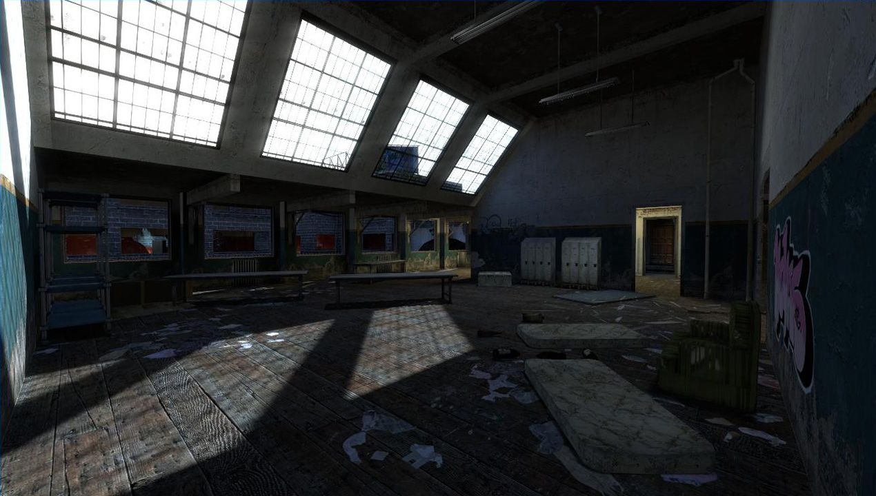
Vast improvement in the lighting scheme. Just a few more tweaks here and there in that dept I'd say.

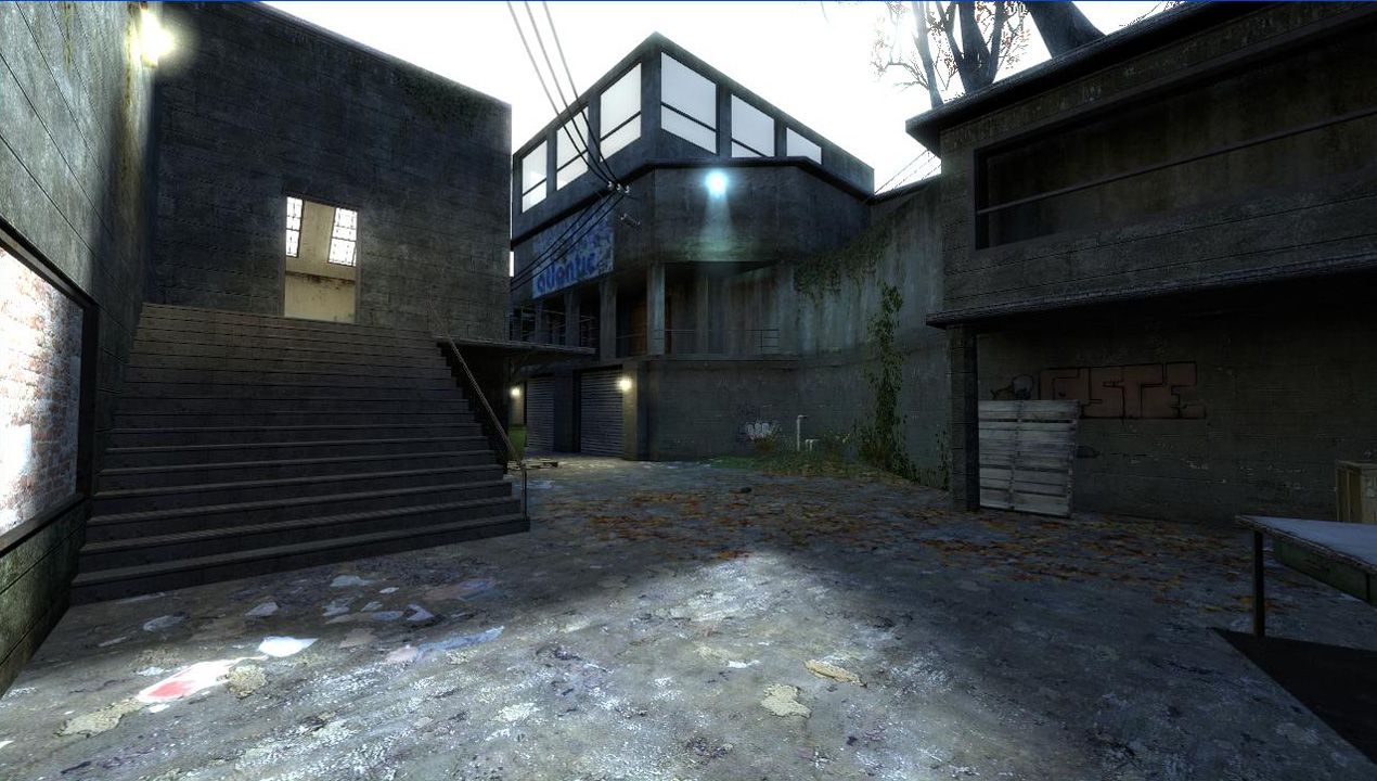
Again I'm going to nag you about propfades and collisions ( I noticed you did not specify a startfade distance, which causes the engine to do just that much extra work fading over a long distance. Ive gotten in the habit of making the startfade just a few units from the end, unless it becomes really obvious that way ). Some candidates I found very quickly:

[URL=http://s546.photobucket.com/albums/hh409/bc_haymaker/?action=view&current=dm_kowloon_b40003.jpg][IMG]http://i546.photobucket.com/albums/hh409/bc_haymaker/th_dm_kowloon_b40003.jpg[/IMG][/URL] [URL=http://s546.photobucket.com/albums/hh409/bc_haymaker/?action=view&current=dm_kowloon_b40004.jpg][IMG]http://i546.photobucket.com/albums/hh409/bc_haymaker/th_dm_kowloon_b40004.jpg[/IMG][/URL]
[URL=http://s546.photobucket.com/albums/hh409/bc_haymaker/?action=view&current=dm_kowloon_b40005.jpg][IMG]http://i546.photobucket.com/albums/hh409/bc_haymaker/th_dm_kowloon_b40005.jpg[/IMG][/URL]

There are more I'm sure. One thing easy to cheat on is wherever there's a light sprite, get more aggressive with the fade because the sprite flare is more distracting anyway.

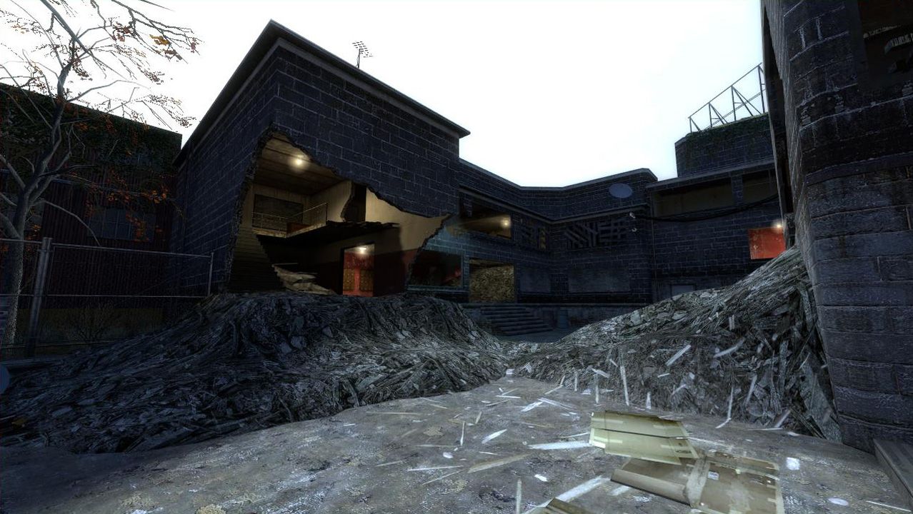
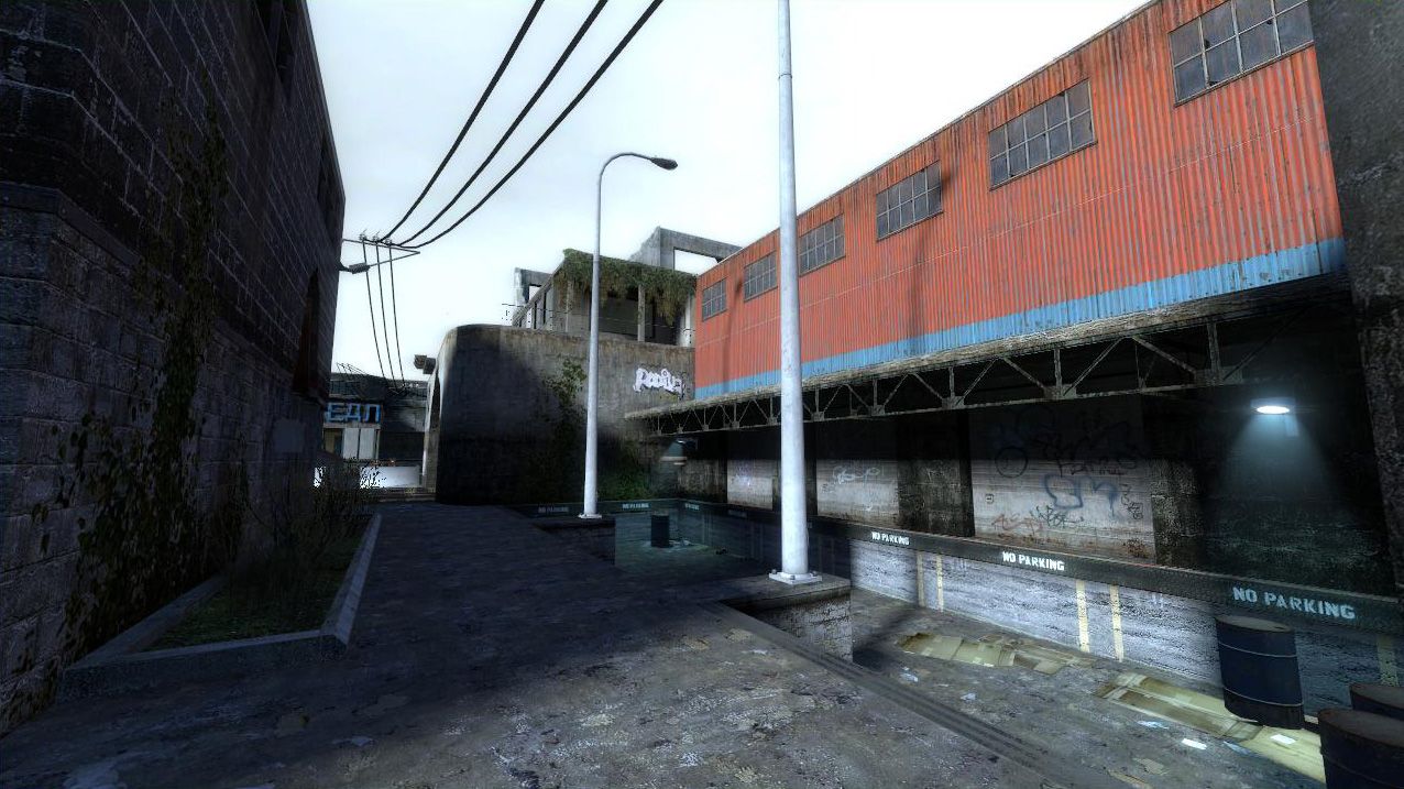
More seriously, make sure you double-check all clips, there are ways of getting around in this game that might surprise you:

[URL=http://s546.photobucket.com/albums/hh409/bc_haymaker/?action=view&current=dm_kowloon_b40000.jpg][IMG]http://i546.photobucket.com/albums/hh409/bc_haymaker/th_dm_kowloon_b40000.jpg[/IMG][/URL]
^Took very little effort to get there.

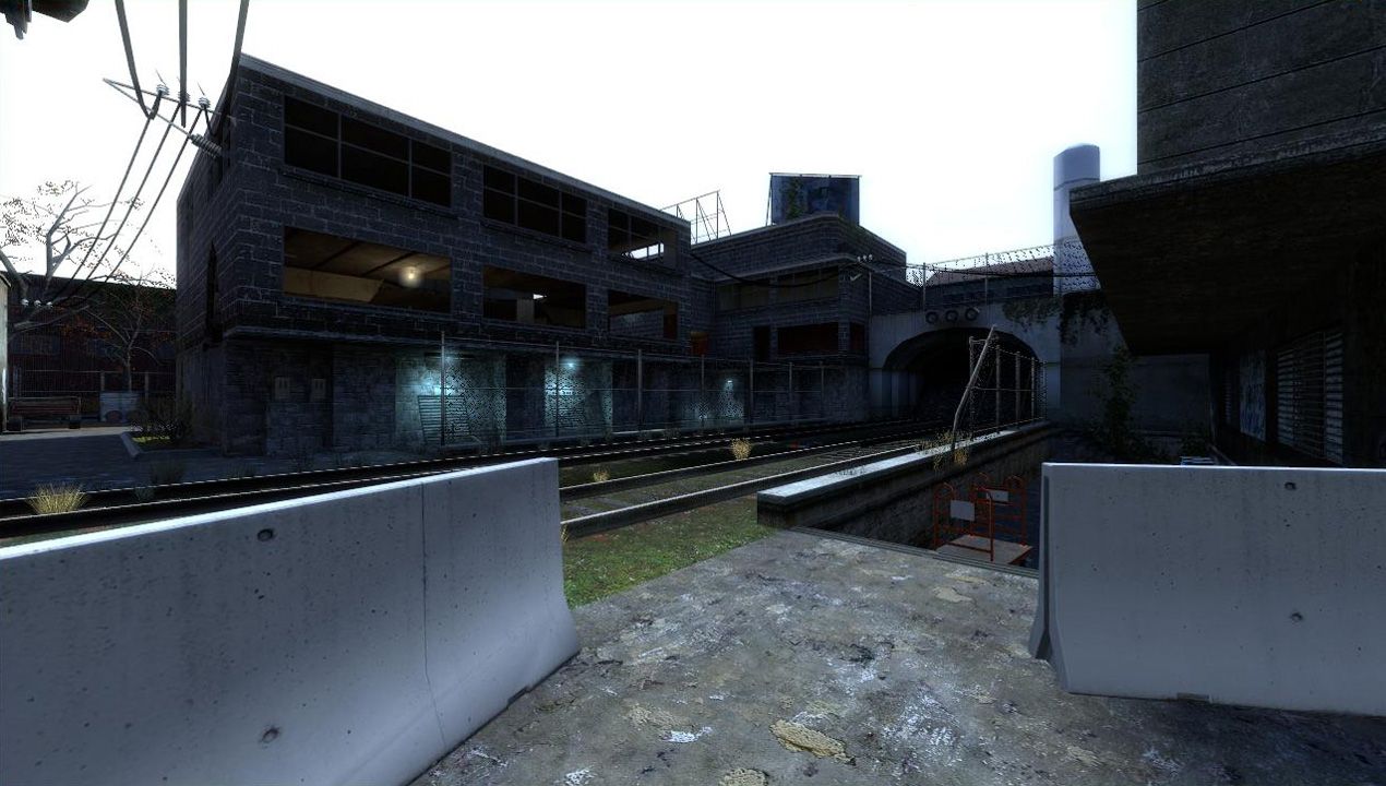
One thing that is causing frame loss at ground level is the extended sightlines. It's a big geometry change but if you're serious about cranking that up, here's one solution:

[IMG]http://i546.photobucket.com/albums/hh409/bc_haymaker/dm_kowloon_b40008.jpg[/IMG]

[IMG]http://i546.photobucket.com/albums/hh409/bc_haymaker/dm_kowloon_b40006b.jpg[/IMG]

Note this only works with a horizontal hint at the top of the wall, map_wide. Player and engine will lose sight of the railway and everything beyond. Above the hint line performance will stay the same. There does not even need to be a ceiling on the new walls ( I screwed up the artwork in the second shot, it doesnt amtter as long as the vertical hint works out to terminate at a 45 deg angle ).

It's just an idea, and one that has big effect on the aesthetics, but it will definitely improve performance, and possibly gameplay too, as it traps the rpg a little better. Don't think I'm insisting you do it :geek:
Posted by popcornjake on Sun May 31st 2009 at 12:07pm
[Author]

Firstly I want to thank you guys for all your criticism, helps me sooo very much when it comes to updating the map as i take all the advice to heart.

I integrated almost all the suggestions, including both the interior and exterior artificial lighting, tweaking the balconies and I also tweaked the light_environment a to be a bit brighter too.

To be honest I'd never properly optimized a map until now so I hadn't found out about occluders until today and i must say they are brilliant, I used them in conjunction with more hint brushes all over the map with my fps increasing up to 30 fps in some areas.

I tempted to call this one finished but I'll wait and see what you crit you guys have for it :hee:

You can get b4 on the map profile page or here: http://files.filefront.com/dm+kowloon+b4rar/;13831796;/fileinfo.html

Thank you for all the help so far, enjoy the map!

Oh and I almost forgot, in regards to the map's place in the first page spotlight: thankyouthankyouthankyouthankyou
Posted by Le Chief on Sun May 31st 2009 at 2:01am

Great :mad:

I just lost my post I typed up on this map because of some error "I must wait one second before making another submisson"! What the hell? Riven, Larchy?

:zzz:
Posted by Juim on Sun May 31st 2009 at 1:15am

Haynaker is on to something here. I have a few similar comments, w/pics. Some are repetetive versions of his comments, so bare with me here.
pic #1:
User posted image
Light this area. Artificial light sources would look awesome, and brighten up the area.

Pic #2:
User posted image
Here's the 2 balconies I keep mentioning. They need goodies.

Pic #3:
User posted image
See the floating brushes in the window?

Pic #4:
User posted image
As Haymaker said, way too dark, Artificial light sources would ewnhance this area soooo much.(PS, too many radiators there for my tastes).

Pic #5:
User posted image
I want to be able to get in and out of this little grass area(Hint, so there should be some kind of treat in there as well.)

Pic #6:
User posted image
Same here!.(Just IMO though)

Pic #7:
User posted image
Alittle redundancy here, light it!, light it!, light it!. He-he-he.

So this version (B3) is the best by far. You obviously take notes and consider them. I like it the most so far, which means it's improving. As for the technical optimizing stuff, take Haymakers word for what he says.