Well, here's a beta of the map, some of the rooms will be darker as they're unfinished. Anyway, enjoy, hopefully. You can't play multi-player yet either since I haven't decided which gameplay route I want to take (objectives like defusing a bomb or just plain-'ol killin'.)
Nah, that first pic doesn't suffer from angle-related architectural deficiencies, I just can't really think of any good details for it (as you have noticed). I'll adjust the fades, though (again.) :smile:
Posted by Tracer Bullet on
Sat Apr 17th 2004 at 6:20am
I absolutely love screens 2 and 3. However, # 1 is lacking. the glaring thing that bothers me is those fades you have on the lights are WAY to obvious. other than that, it just feels lacking in terms of architecture, but that may just be a function of the angle from which the screen was taken.
No, there's nothing embedded there, that's just my crappy video card. :sad:
Posted by 7dk2h4md720ih on
Sun Feb 22nd 2004 at 10:42pm
Hugh, there seems to be something embeedded in the middle section of the wall in screen 2 in two places. One is under the window thing and the other is on the wall perpendicular to it.
Pah, updated only one of the screens, but I believe it got transformed from the ugliest picture to the prettiest one, so hey. :smile: I've made progress on the other two, but there really hasn't been enough difference to justify a new screenie just yet. So yeah, hope you like the new screen, #2 in case you couldn't tell. :wink:
Danke schoen. :biggrin: I've tweaked and added a bunch of stuff now, so I'll probably update the screens on Friday/Saturday, depending on how many of your ideas I decide to implement (before Friday/Saturday, that is; most of 'em are good :smile: ).
Note that the lighting in the pictures doesn't look like that in-game, I just tweaked the gamma since they looked obscenely dark...
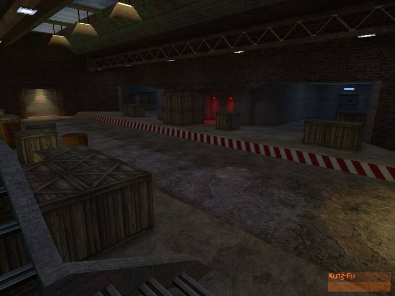
func_illusionary additive light things are too "intense". Tone down the render amount.
Since the ceiling is reasonably boring/plain, I assume you don't want people to see it. Try to direct your lighting downwards. Use light_spots for this, preferably. Texture lights can't be controlled very well (compared to lights and light_spots) - if you have a few, they can easily saturate an entire room.
Wasted opportunity along the middle road thing. Again, use light_spots along important areas (doorways, windows, signs, important walkways) to put more emphasis on them and build contrast with the lighting.
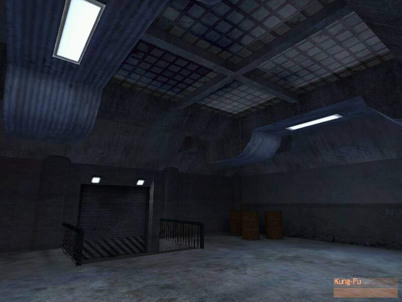
2nd Screen:
There's some sort of mapping error on the right? Lodged inside the grey-ish concrete thing.
Don't place lights haphazardly; many texture lights do very little for a room, but a few strategic light_spots can do lots more for atmosphere.
Seems kind of strange for a small red flourscent light to cast such a strong light on the crate.
Add more interest on the floor (height variation, broken tile, different floor textures, etc.)
Add more interest along the walls, mostly the top area of the brick walls. Perhaps pipes, or concrete support pillars, or whatever.
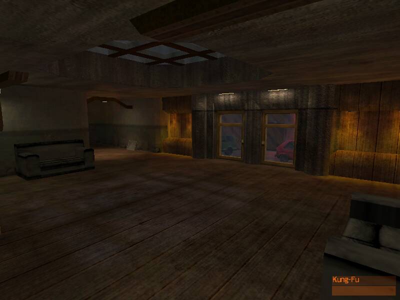
3rd screen:
Get rid of the wires holding the lights (waste of wpoly that could go to other things) or make them thinner (maybe 2 units thick?)
Wood paneling on the ceiling doesn't seem to fit the ceiling / shape... I don't think it's really possible to even place the wood panels like that! Possibly replace with concrete instead and accent it with wood supports?
Get more contrast from the four lights in the middle of the room. Look at the floor area below the lights, and it seems to be uniform with the rest of the room.
Far back wall (partial shadow) needs something there, maybe a picture or a vent or a support or whatever.
General:
How many bounces are you doing in RAD? Don't do too many, because it'll just wash out the lighting in your rooms and rob them of contrast. I find 2-3 is generally good enough to get smooth but okay results. Experiment.
Texture lights are not the end-all solution most people claim them to be. You can't direct where they shine very well, and as I said before (combined with light bounces) can end up lighting up an entire room. Lighting isn't something you throw around a map to make it playable; it has a direct effect on gameplay, influencing decisions on an almost subconscious level. Players will naturally hide in the darkness if they're low on health, or walk through doors that are lighted stronger than the rest of the room. Basically, the brighter, the more "important" it is.
I agree with Gollum; the map overall lacks interesting set pieces or something really unique or eye-catching. While it's not terribly bad, it's not terribly good either. Try working on getting some more interesting shapes and forms around the map. A lot of it seems pretty boxy/rectangular, which isn't terribly interesting.
Phew, that was long. But you said you wanted it. Whatever. :smile: