Say hi to our newest member, RichardELDEN!
Gollum said:Or any other killbox variants (eg. Most custom CS maps)
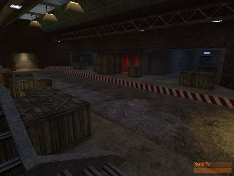
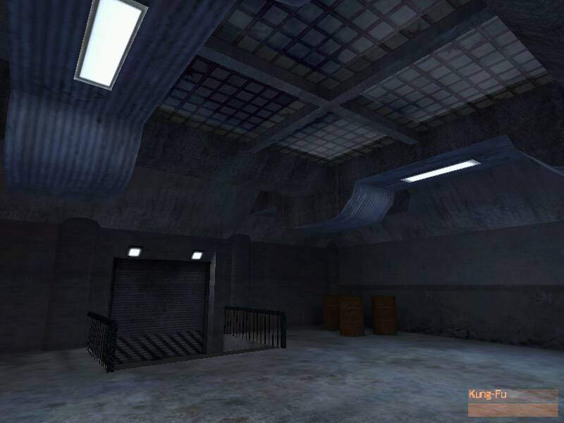
It's only the first and second screens that look boxy. It may not be practical at this stage to redo the architecture, but you could try breaking up the outline a bit. Try getting some ideas from your favourite custom levels (as long as it's not "Killbox" :wink: ).
Hugh said:Rofl
Pegs: I'll have to get dh_sunken to understand what you're talking about. And I'm not even sure I can release it for criticism, at least not publicly... hopefully private beta-testing will work... especially since they won't know about it...

