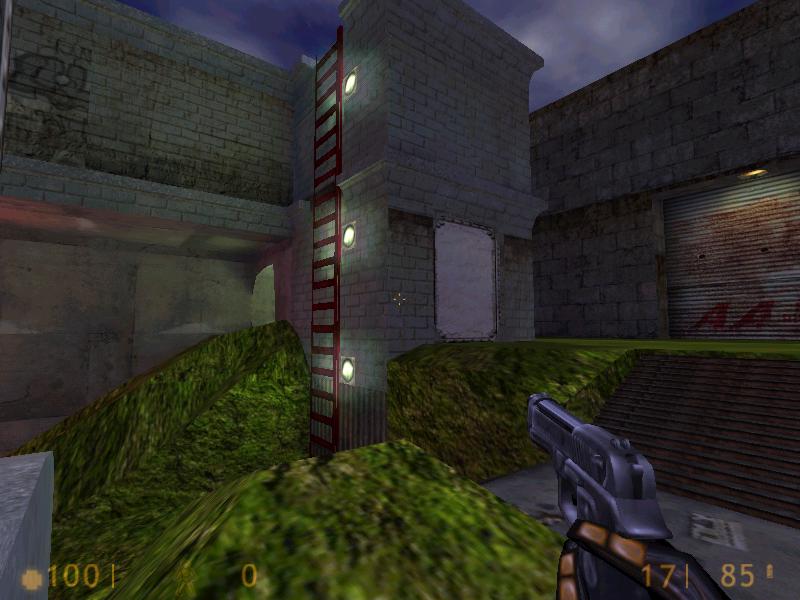
Too many different textures, the map seems to lack coherence still - but it is looking a lot better. The texture on the right hand side of the shot is definately out of place! It looks far too "ancient" or medieval to be in this industrial setting :razz:

This fence texture is horrible - change it something a bit less subtle than red/brown and perhaps put some fence posts up as well - it looks strange with nothing supporting it. I also suggest simplifying or reworking the grass.
Check the tutorials for the triangle terrain tutorial if its still here, it's a nice method of creating realistic yet low r_speeds outdoor areas :smile:

Four breakable windows? I am dubious about breakable windows in maps at the best of time, but if you want to incorporate them don't put so many in! It just chops up the architecture and increases r_speeds, and the top 2 are pretty much useless! Stick with the bottom ones :smile: Nice work on detailing a good roof trim though, a usually neglected error out of lots of mappers :smile:

I like this area now, although it still seems a bit too light - and im not really sure why this tunnel of water is here, as it's not exactly a sewer of sorts? Darken it a bit, and possibly expand to the sides and make something for the water to do.. It's all a bit odd and disjointed, but nicely constructed.

You can see right into this room because of the now broken windows, it hits r_speeds a little harshly. Also, the texture changes from large stone blocks into wooden planks (what they look like, anyway) - very bizarre indeed.
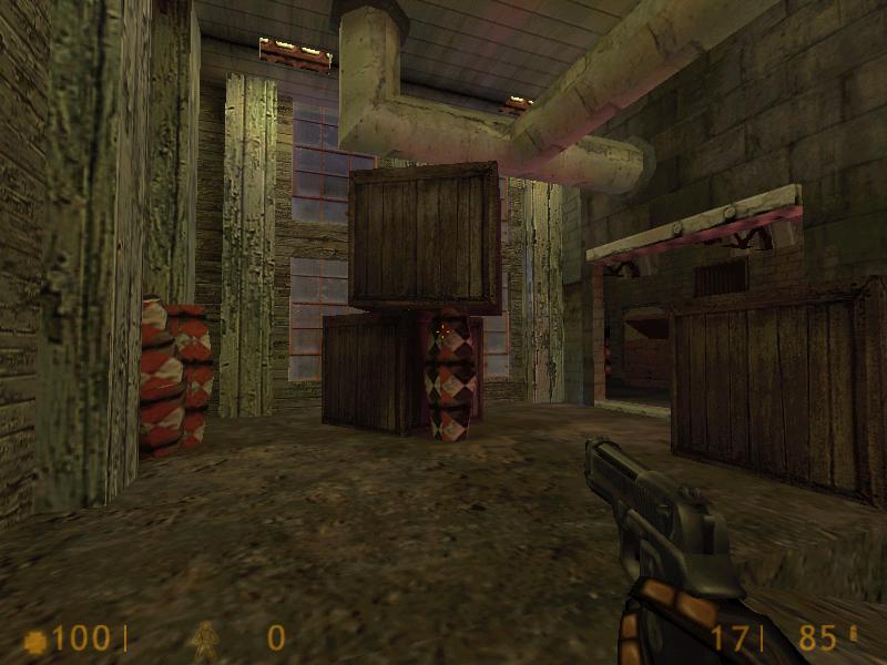
This wood texture looks wholly out of place as well, far too rustic and theres too much fire in this factory for it to be physically safe :razz: Make it a stone one, and tidy up those windows with a frame, and a good transition between indoor/outdoor textures.

Erk! This room is more or less useless, the structures in the middle whack the r_speeds up to high levels (considering the size/detailing of the room) and also fill too much floor space. I can only imagine this is down to construction methods/untidy brushwork, but this is something you'll clean up over time :smile:

The r_speeds go loopy round about here - that door in front of me opens into the sewer, I can see through the openable door down on the left, and see down the right hand path of the map! The layout needs some tweaking and enlarging, to incorporate twists and turns into the map. Not only will it make the action a bit more interesting, it will cut the high r_speeds as well!
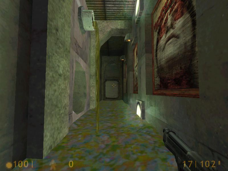
These straight lines through the map simply let us see pretty much everything, slowing the action right down :sad:
Also, the graffiti on the left hand side - who painted that up there? Goliath? :razz:
Generally it seems you have grasped how to make an interesting map, and the industrial theme seems to work fairly well - I liked the use of clangs/bangs and steam hissing, even if there wasnt any obvious source for the noise :smile: The map felt alive :smile:
If you expanded a little more to the sides and made less of a rectangular layout, you could have an fairly decent 4-6 player map here. As it stands, theres a few things to pick up on overall
- Texturing - scaling and mismatching textures still. things do look better, but theres still some bloopers in there. try limiting yourself to 2/3 specific, similar wads at first - or particular sections in the HL wad.
- Brushwork - the r_speeds seem choppy sometimes, I can only attribute this to the func_doors and long vision lines tbh, as I didnt do a gl_wireframe. Perhaps focus on making clean brushwork, and trying alternative methods for making your outdoor terrain!
- Layout - this is contributing to the r_speeds. Add some blocking walls, kinks and turns in paths. It's a little straight at the moment :smile: