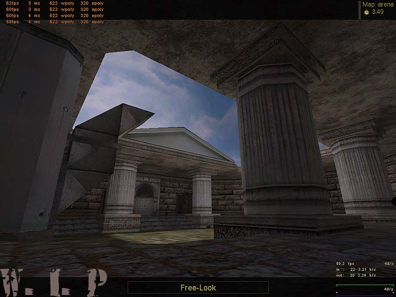
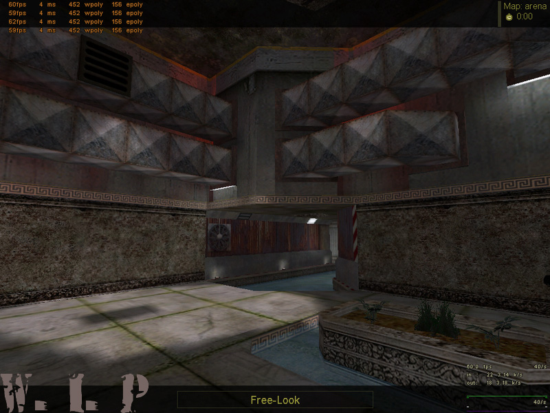
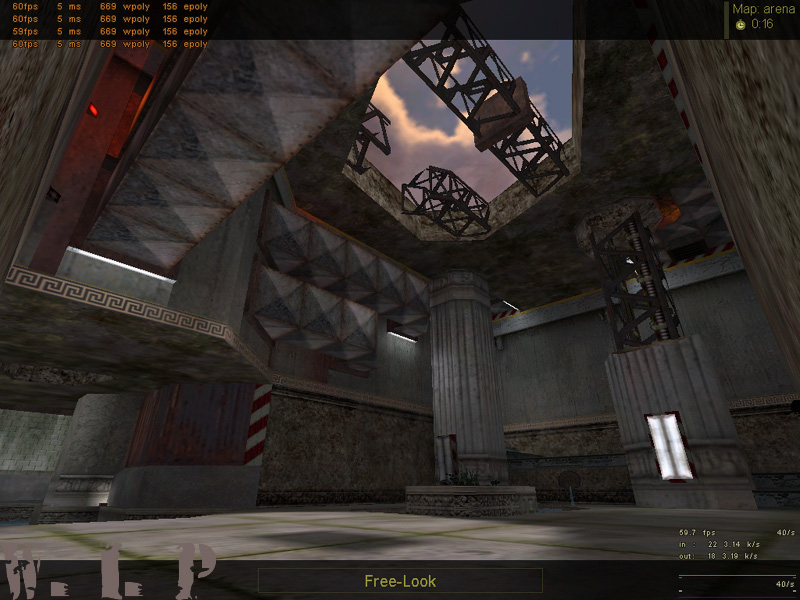
My newest WIP is a map with a crazy setting! The setting is a mix from Old Greece and Industrial Style , which means : Big greece temples next to rotten machines and industrial buildings!
From other Forums i know that it`s style causes different oppinions! Some like it , others don`t. One point , u can`t talk away , is , that it`s not a REALISTIC MAP for a REALISTIC MOD, but : WHY NOT? Does that fact kill the fun ? Not for me!
Gameplay: The map will be a DE Map with two Bombspots! After is finished , i maybe`ll release gameplay-modified versions ( SCout only , Shotgun Only , Mini_Zeus....we`ll see! )
Some new Beta Pics from a compile few minutes ago!
On pic two , you can see , where the piece of the "S?ule" in front of the tunnelentry comes from!
C&C!
Posted by 7dk2h4md720ih on
Thu Jul 29th 2004 at 11:22pm
That broken piece looks really silly lying there. The rock texture on
the ends probably isn't helping it. Those sort of pillars generally
have square bases, so maybe you could build the base so it looks like
it fell from somewhere.
Looks really nice, the rocks are well done. You might consider tweaking the outside lighting a bit so you get some shadows.
Personally I like the look of this. While I can certainly appreciate the opinions of Ferret and CJ that the themes perhaps don't compliment each other, I feel you have tried something remarkably different and pulled it off nicely. I second Tracer's comment that the second shot is the least impressive here - reliance on textures rather than architecture on the Greek theme in this area, next to the interesting brushwork of the "future" part, makes it look odd and clashing, while for the other areas you seem to have integrated the two themes much better.
My main criticism here isn't to your map at all, but to you posting style - I suggest less screenshots in the future, as we do have quite a lot of modem users, and many of the ones you have posted are just different angles of the same room. I sympathise as it can be hard to pick between angles at times, but its really not necessary to have quite so many - you aren't trying to show us ALL the map, just its most impressive views, to sell us it if you will.
Anyway, welcome to the snarkpit mate, the three maps you have posted this evening all look really interesting and I'm sure you'll be able to help out others around here as much as we will hopefully be able to help you :smile:
I'll have to second (or third?) ferret's thoughts - it seems rather unfocused / unorthodox. However, I can easily see why people would like it though. Maybe I just have a natural bias against Steam-punk?
But it just seems like a mish-mash of various pieces of maps; doesn't look "right" to me. You have some Roman-looking columns next to all of these industrial girders and vents... "Unfocused" is the word I would use, yes. Certainly not my cup of tea. Good job on keeping the wpoly down, anyways. :smile:
Posted by beer hunter on
Tue Jun 22nd 2004 at 6:46pm
Nice looking screenys, tho' i would like to DL the map to see if it lives up to them.
certainly is original! In the 3rd and 4th pics the lights built right into the pillars looks kinda strange to me. In the 6th pic what is causing that shadow? Looks rather odd but maybe its something offscreen. In the 14th pic there seems to be a strange pink goo coming out of the ground. Might want to call a plumber.
Ferret said: am I the only one who notices like 3 different styles ranging from industrial to zeus? it makes no sense what so ever. Architecturaly or not I dont like it personaly.
Damn, I thought it owned. Almost on the verge of steampunk... very nice indeed :smile: