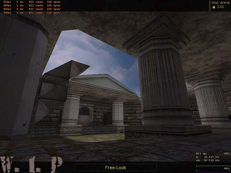
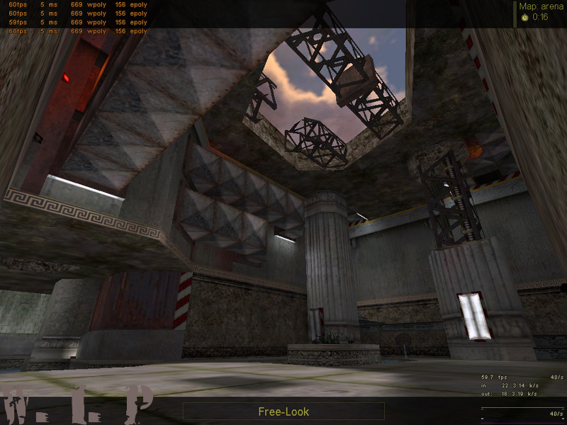
My newest WIP is a map with a crazy setting! The setting is a mix from Old Greece and Industrial Style , which means : Big greece temples next to rotten machines and industrial buildings!
From other Forums i know that it`s style causes different oppinions! Some like it , others don`t. One point , u can`t talk away , is , that it`s not a REALISTIC MAP for a REALISTIC MOD, but : WHY NOT? Does that fact kill the fun ? Not for me!
Gameplay: The map will be a DE Map with two Bombspots! After is finished , i maybe`ll release gameplay-modified versions ( SCout only , Shotgun Only , Mini_Zeus....we`ll see! )
Discussion
Posted by Forceflow on
Tue Jun 22nd 2004 at 5:48am
Nice merging between the ancient and the industrial theme.
Posted by Tracer Bullet on
Tue Jun 22nd 2004 at 5:22am
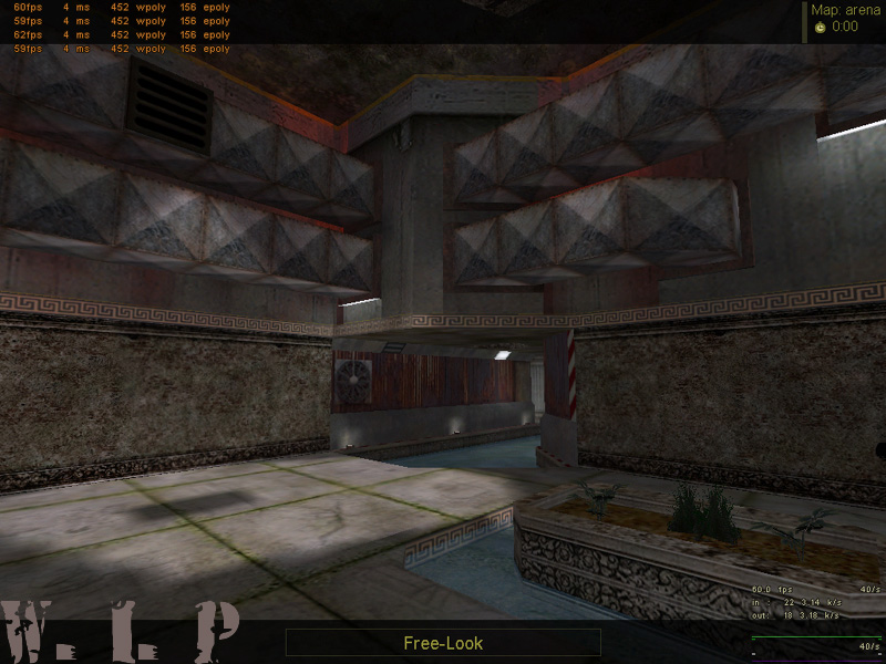
Damn good work for the most part. the only screen which sticks out as having a problem is the second one down. all the other screens give the feeling of a real place that might actually exist. I admit your mix of themes is a bit odd, but I think you have done well with it. the problem with the second screen, is that it looks like a map, not a location. I can't really explain it better than that, I think maybe it's bad proportioning. those pillars are way to big for the size of the area... etc.
am I the only one who notices like 3 different styles ranging from industrial to zeus? it makes no sense what so ever. Architecturaly or not I dont like it personaly.
correct me if i err... but all three of these maps look completed.. if so, they belong in the profile.. threads of the dozen screenshot variety, should be reserved for work-in-progress mapping.. or posted by other that the author as a critique..
being new to the site, makes this oversite less of an issue, but take it into account on your next visit..
we, are not as enthusiastic about completed maps as we are about work-in-progress ones.. and we are even less enthusiastic about authors whom don't incorporate our best suggestions..
i think, of the three i have seen, this one is best architecturally.. although, i would have much preferred a nudie of a female :rolleyes:
keep up the good work.
Posted by scary_jeff on
Mon Jun 21st 2004 at 10:08pm
Fantastic looking textures, and I really like the lighting detail around some of the ducting.
Looking at the first screenshot, the sky looks very cloudy, then in the second, the sun is casting quite a strong shadow, which doesn't seem quite right. It might look fine in-game though.
Also, I think the indoor parts of the map seem overall a bit bright. Perhaps you could change some of the striplights for spotlights to give a bit more contrast in the lighting. The lighting isn't bad, not at all, but looking at the 12th and 14th, it does seem a bit washed out in places.