For you, I keep it. I'll just have to reorganize the level a bit, but eh, it needs work anyhow. :smile:
Posted by beer hunter on
Wed Jul 7th 2004 at 12:17am
I'll kill you if that office section is scrapped - its got some interesting stuff going on with the curves and skylights :smile:
Back to the lighting...
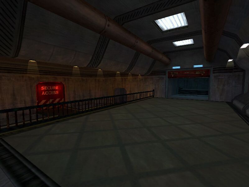
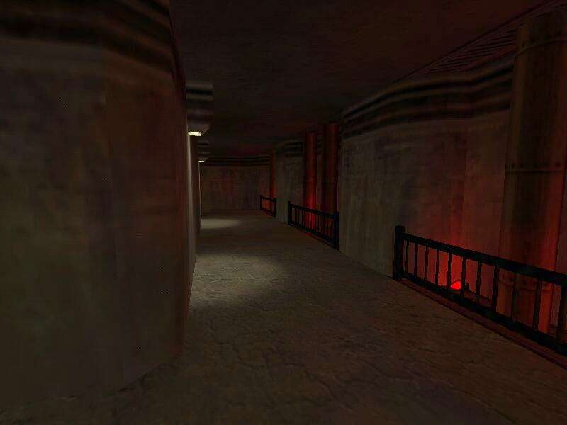
Its messy when some rooms have so many different light styles - that area with the two big red doors has 6 different light types (in the old map version anyway), it can look crappy when so many are used with several different colours in small-ish areas.
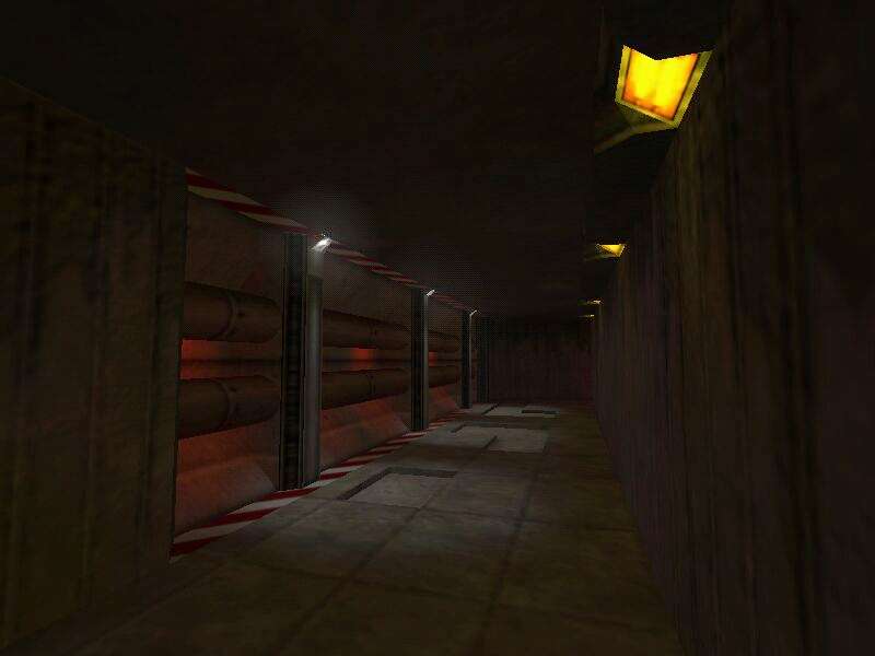
The lights in the HEV charger room are better but theres both wall and ceiling lights which looks odd. Rip out the ceiling lights and put beams across the ceiling and it'll prolly look better or... maybe not :smile:
Hard to say how to get the office area to match in with the rest but i would try and keep it in.
I updated my screenshots, ooh boy... the office-y area might be scrapped even though it finally looks half-decent simply because it doesn't much match with the rest of the level.
To everyone who says the lighting is blah cough Tracer_Bullet :wink: cough turn down your glare reduction to the bottom, then it looks nice. Yeah... I left mine all the way on the bottom, so now I'm just readjusting lighting... I was wondering why everyone was making fun of my lighting. :smile:
Posted by parakeet on
Fri Jun 25th 2004 at 10:52pm
u dont need the volumetric light in the grey room and in teh yellowish hallway the volumetric lighting may look interesting
Check his profile, it isn't his first map, just his first DM map I think its looking pretty cool though somewhat generic, I'll reserve full judgement until I've played a beta version.
Well, it is beta, and not in the sense that every room's completed. :smile: The room with the tableish things is very blah, I know, I can't quite get any inspiration going on it. Now to answer your questions. :biggrin:
The tableish things... are indeed tableish things. Basically they're there so I could see how much of the player is covered when they're crouching behind it. Originally gonna try to do some nice architecture around them but then realized that everything I came up with would block a lot of the view to/from the balcony.
The house plants are there because I felt that something needed to be there, and I couldn't come up with anything else... though maybe one of the little diploma posters behind some glass would look nice.
The sand's there because, again, there's gotta be something there. :smile:
The lighting's bright because I (read: most everybody) prefers dark moody maps, so I thought I might change it up a bit, but I did tweak it some, so hopefully it'll come out a bit darker.