I am a bit late on this, but whatever. Here goes.

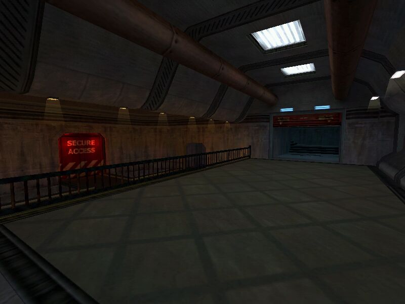
First of all, let me say kudos for the nice curvy architecture. Although you have used curves throughout, this is by far the nicest area. However, as I said before, that floor texture has to go. I also feel that you should do something more interesting on the left hand wall than just that one texture.

This image illustrates something which bothered me about the map over all. it seems to be slightly under scaled. Nothing that effects the playability or anything, I just feel like I?m going to hit my head whenever I go through a doorway. Your architecture suggests grand scale, yet the map does not live up to it.

This is a really big empty space, with nothing of interest really. I do like the skylight and the nice pattern of light it makes on the floor, but there isn?t enough contrast to make it very noticeable. Also, that mixture of textures is pretty weird (cinderblocks-wood panels) and monotonous.
I also cannot quite figure out what those little tableish things in here are.


Te alcoves are very cool and all that, but house plants?

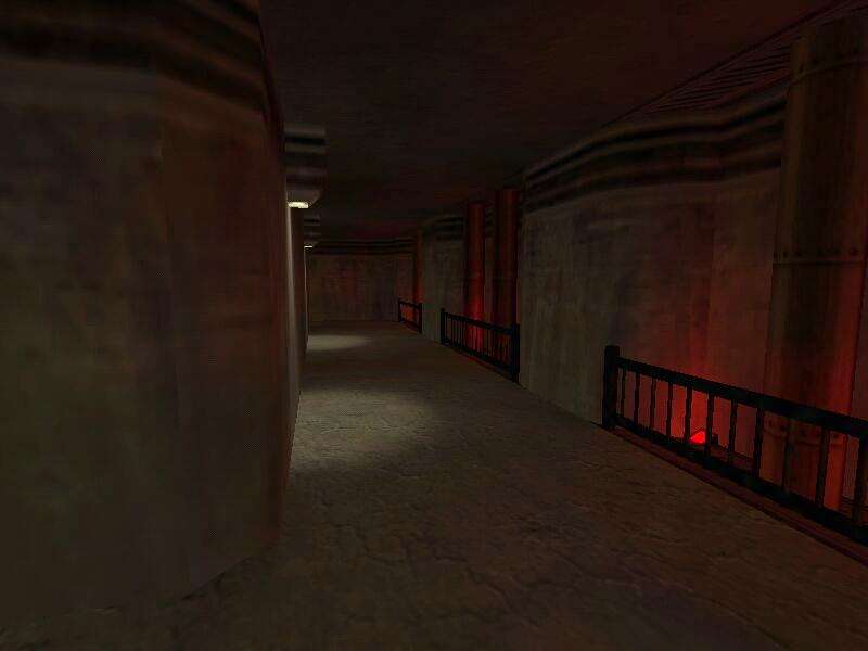
Very dark. a nice spotlight on this landing would make worlds of difference.

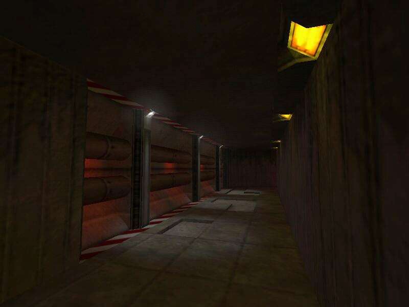
I very much like it that you can see into inaccessible areas, however again, this door is an example of under scale architecture.

You?ve done yourself a disservice in making this sand perfectly flat. I can?t imagine why it is there in the first place, but you might as well give it some height variation. (triangle terrain)
Overall I think the architectural style is great, but you have a long way to go on lighting in particular. The texturing was generally neat, but unimaginative (I have a good deal of trouble with this myself).
The lighting is simply flat. There is very little variation or interest. I may simply be biased towards dark moody atmospheres, but even if you intend it to be brightly lit, you still need more contrast.
Keep at it, I?d like to see how this comes out.