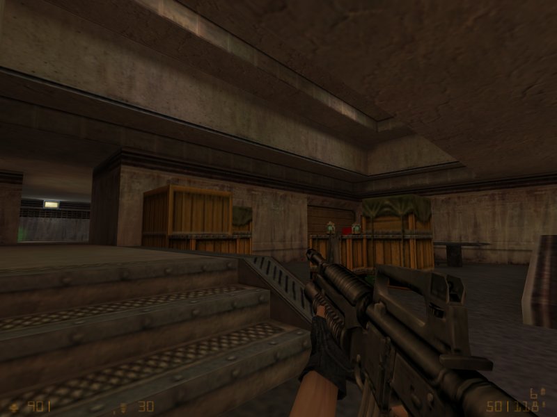
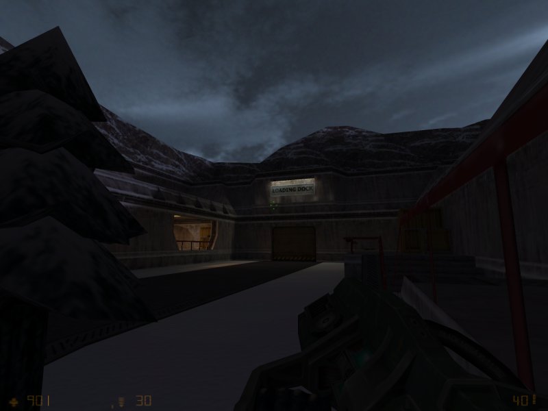
Repair Bay 5 by KungFuSquirrel

Map Rating

  • 0
  • unrated

Map Download

Map Info

Map Description

Released: November 2001

Op4 DM Version of Repair Bay 4

Discussion

Posted by RedWood on Thu Feb 19th 2009 at 6:17pm

It would be nice if after a page refresh it brought you back to where you were at on the page.
Posted by larchy on Thu Feb 19th 2009 at 5:57pm

reaper47 said:
Also the discussion topics are non-existent for all entries.
Database is just incomplete, will be fixed when we move everything over.
reaper47 said:
User profiles:
An option to manually rank your own maps would be awesome.
Added to the edit profile page - do let me know of any bugs.. I think I've covered any problems with the sorting order but it wasn't the simplest of systems and I may have made some mistakes that I haven't found.
Posted by reaper47 on Thu Feb 19th 2009 at 5:53pm

I like the new layout! I think that would also be a good position for journal updates.

It also made me curious about trying a few more changes, too:

First, I don't see why there are 2 spotlights now. There should only be one (maybe with an option to search an archive of previous entries). The two take up so much space and feel a little redundant.

I also don't like the small, red [map] tags to identify different entry types. To make it less distracting and more in line with the yellow/white text layout, I would replace them by simple, white, non-bold text of the same size with a colon in the end.

Example:

Map: Dm_Sadists_Pit

instead of:

[map] Dm_Sadists_Pit
Posted by RedWood on Thu Feb 19th 2009 at 5:51pm

When u upload images for a new map the text for the directory is barely visible. For a few seconds i thought it hadn't worked. I use the black theam if it makes a difference.
Posted by RedWood on Thu Feb 19th 2009 at 5:01pm

Can the "upload a map" button be made more accessible? It's kinda hidden in the control panel. Maybe place a "upload map" button next to the "new topic" in the map form.
Posted by RedWood on Thu Feb 19th 2009 at 4:36pm

That is a definite improvement on the home page in my opinion.
Posted by Riven on Thu Feb 19th 2009 at 4:24pm

User Journals should become part of the main news items. Then we can show more than 3!

Like it might say before the title of a User Journal:

User Journal Entry from "Riven"

Place Title Here

bla blablablablablabla

-And so on.
Posted by larchy on Thu Feb 19th 2009 at 2:20pm

hmmm, well now... how about this!
Posted by reaper47 on Thu Feb 19th 2009 at 12:28pm

larchy said:
Making a page longer isn't really an issue, but content lower down does tend to be less viewed.

How about if I move the latest maps section so it's along the left hand side under the spotlight stuff, extend the news posts, then have the recent posts/updates boxes and then under that have a news section for user journal updates?
Generally, moving more stuff to the left, maybe sacrificing some larger thumbnails would be a good idea, IMO.

How about only displaying the latest spotlight/map-update with a thumbnail and arranging the last 4 beneath it with text only? Kinda like the news are done now. That way there would be more room on the left, also.
Posted by larchy on Thu Feb 19th 2009 at 8:45am

I'm still working on the new map page and still need to look at the layout with additional games... obviously it's bugged right now and the elements are out of position :) If the css is out by a couple of pixels it knocks everything down...

I'm all for revamping the main page, the only question is exactly where to put everything.

Making a page longer isn't really an issue, but content lower down does tend to be less viewed.

How about if I move the latest maps section so it's along the left hand side under the spotlight stuff, extend the news posts, then have the recent posts/updates boxes and then under that have a news section for user journal updates?

Or would journal updates maybe go in the recent updates box?

The main reason for moving the latest maps would be to equal out the length of the content in each column if we add journals to the bottom... if we could just maybe add them to the updates box then I think it'd probably be better to keep the latest maps where they are as it kinda spreads the images around the page a bit better, rather than making one column overly text-heavy.