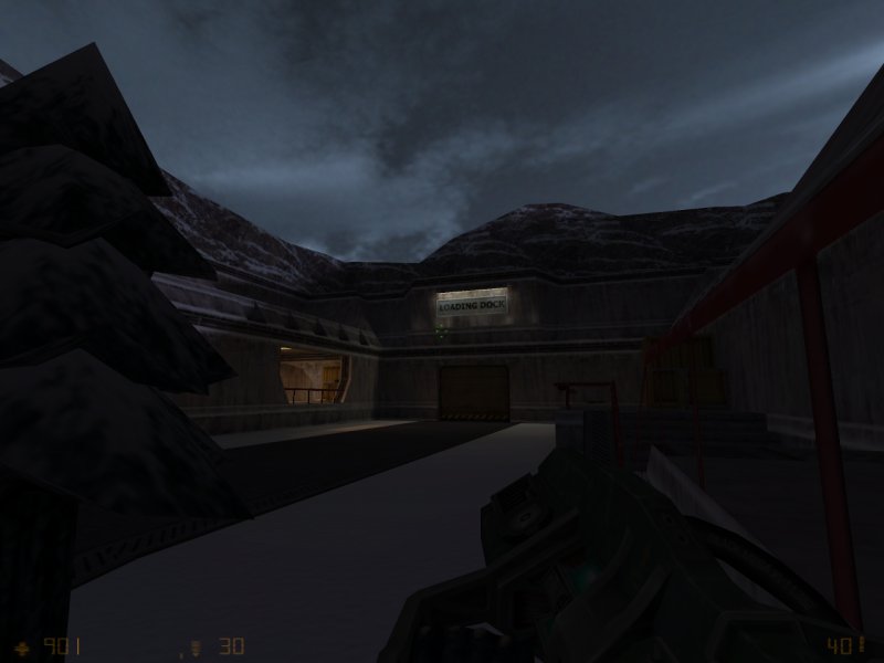
Repair Bay 5 by KungFuSquirrel

Map Rating

  • 0
  • unrated

Map Download

Map Info

Map Description

Released: November 2001

Op4 DM Version of Repair Bay 4

Discussion

Posted by Riven on Tue Feb 17th 2009 at 7:30am

If you have time larchy, you should give a read to this currently active thread going on over at Interlopers. Basically, they're talking about adding a rating system to their maps and having top rated maps filtered for a "great maps" section that users could look through.

It makes me laugh because I know SnarkPit has had this feature for years before Interlopers was ever conceived of and yet it troubles me to wonder why they remain popular and our site has died out so much. Because for some reason, I think this site gained the reputation for being "elitist" back in the day and therefore not enthusiastic for new users. Which has always been a misconception unfortunately.

Their discussion did bring up a new point though. I know we have our rating system, and we will have 5 star-rated maps next to obvious "godly" maps that have had that much more time put into them, but our system has no way of showing the 'spectacular' maps. I was hoping as one of the features for a Map menu page would be a link or listing of hand-picked awesome maps and downloads on the pit. You'd have '5 star' rated items, and then you'd have 'outstanding' items (filtered out by people [admins] who know what users are talking about and have experienced the content themselves and are capable of making an informed decision about content that is 'extraordinary').

There is no reason why our site (after the switch) can't handle 100 plus active users like Interlopers or MapCore. We have all the cool features and knickknacks (plus some) like they do. (not to mention a very active web god continuing to support us!) Can anyone answer me why?
Posted by larchy on Mon Feb 16th 2009 at 4:18pm

How's that?
Posted by reaper47 on Mon Feb 16th 2009 at 3:59pm

RedWood said:
My monitor is 1440x900. I'd like it, if possible, for the with of the pages to be dynamic so stretch to fit monitors better.
It's no joy to read a too broad text window. Even if you don't notice it at first, there are many good reason to stick to a maximum width. You don't accidentally skip lines and you have to move your eyes less. It's the reason why big news papers arrange their text in columns rather than stretch it over the whole page. That's why all professional layouts do the same for websites.

Speaking of typography: This forum text needs an additional 0.1-0.2 pt line distance. :D
Posted by larchy on Mon Feb 16th 2009 at 2:59pm

Overlay clikyness sorted :D

Cleaned up and improved the search results pages quite a bit!
Posted by larchy on Mon Feb 16th 2009 at 8:49am

no worries

I'll take a look at the overlay link thing... you're probably right about that needing changed.

Unfortunately variable width is troublesome because it makes laying out content far more complex. This isn't an issue for text based pages like these forums where you can just make the element widths a percentage, but it definitely is for places like the front page and maps pages where the layout is built around images which can't just be dynamically resized. If you look around virtually all websites, certainly the major ones and those dealing with dynamic content, are all designed in this centre aligned fixed width fashion for these (and other) reasons.

It is a shame to restrict the width so much, but when I widened the width with the current globat theme people started complaining it was too wide (about 1200px I think?), which is why this new site has it's current narrower width.

I did think that wider layouts could be added as additional themes in the future though, so there'll probably be some fixed-width widescreen layouts added at some point :)

Thanks for the feedback :)
Posted by RedWood on Sun Feb 15th 2009 at 10:27pm

Hello

I like the new fell of the site. It's a definite improvement over the old site.

Few things:

When browsing the maps section the text will pop up when u hover over it. witch is nice but if you click on it while hovering over the text are it wont click into the maps page. I'd like it if clicking on the text are also took u to the maps page.

My monitor is 1440x900. I'd like it, if possible, for the with of the pages to be dynamic so stretch to fit monitors better.

Your doing a fantastic job Larchy. I find it surprising you would do all this work for us considering you never really used the site before you came to help us out. Thank you.
Posted by larchy on Fri Feb 13th 2009 at 11:31am

Added country flags for England, Scotland, Wales and the EU, if anyone is feeling patriotic :)
Posted by larchy on Fri Feb 13th 2009 at 8:33am

I should also point out that the edit time does not apply to mods or higher.

I did have an idea that we could make removal of the edit limit an unlock once you get to so many snarkmarks?
Posted by Riven on Fri Feb 13th 2009 at 7:32am

reaper47 said:
You're changing those things lightning-fast, larchy
Hah, he does that. Things are rolling here! When you've got larchy on the job you need no other!

to make a list, you can use the list tag button at the top to form the two [ list] & [ /list] tags and then place your separate bullets between them using the [ *] button at the top. for each [ *] you get one of these: [list][*][/list]

If you use the [ list=] tag instead, each [ *] is listed as a number in sequence. until you close it with the [ /list] tag. Like this:
[list=][*]
[*]
[*]
[*]
[*]
[/list]Easy Peazy!
reaper47 said:
  • I don't like the idea of not being able to edit a post after 30 minutes. There are many good reasons why you should be able to do so (updating outdated information, links, fixing confusing errors, avoiding double-posts (such as this one) etc.). Identifying edited posts by a short warning (or maybe even archiving the originals) should be enough to avoid evil out-of-context edits.
Sure, we could remove the time limit, but I ask you to give it some time first. I think it just takes some getting used to. Having been using it for the past three or four months, I like knowing that the last post is the most up-to-date info, and not some post a page back someone edited. I might miss edited info and never know it. Double posts never bothered me. If I had to correct a mistake hours after making it, I can always copy + paste to re-iterate what I was originally talking about. The only problem I could see this causing is if anyone who was hosting a competition or similar, and wanted to keep the thread updated by using the first post, I think they should be able to edit that anytime they wanted with the "last edited XXXX" message appearing at the bottom of it. Same goes for links and whatnot. If you want to make a thread that you'd hope others could use for a resource, then by posting all the info in the first post, would allow you to update it and whatnot. subsequent posts after it are meant for discussion and should be permanent with amends later if the user made a mistake realization after the 30 min time marker. Forums are reflective of real-life discussions, and therefore, you shouldn't be able to re-write what you've said and screw the entire discussion over for anyone else who might be viewing it after the matter.
Posted by reaper47 on Thu Feb 12th 2009 at 5:42pm

larchy said:
No idea how lists work (somewhat worrying since I coded the function that makes them :scared: ).
lol, and I felt embarrassed for not figuring it out by myself. :D

You're changing those things lightning-fast, larchy... I feel like I just posted about them - now everything already done!

One more little polishing thing: Could you add some indent to custom code boxes (quotes, code, etc.)? They kinda stick too much to the border, visually.