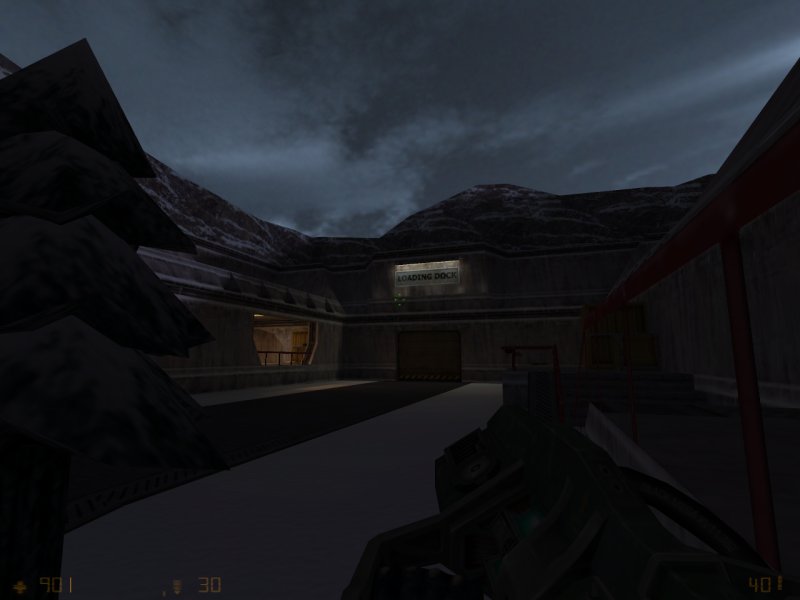
Repair Bay 5 by KungFuSquirrel

Map Rating

  • 0
  • unrated

Map Download

Map Info

Map Description

Released: November 2001

Op4 DM Version of Repair Bay 4

Discussion

Posted by Riven on Thu Feb 19th 2009 at 12:38am

reaper47 said:
I remember feeling intimidated the first time I visited the Snarkpit, not knowing wth a "pit" or "map profile" was, whether I needed to have frontpage-worthy maps to join and the whole theme had an "underground club" feel to it, like you needed to go through an initialization rite in order to join. Interlopers is just a big forum.
Well, perhaps we need a "new to the Pit?" Link on the front page to help any new members get acquainted. It only shows for anyone not logged in. BTW, thanks for the response on that question reaper. Very informative!
reaper47 said:
I would even consider dropping some of the update sections for more space for news posts (like displaying the last 3 news items in full text).
Yea, I'm for that idea! Let's say we didn't remove anything from the front page and only pushed it down (because of the news posts on the front page) would that make the front page too long? I mean, are there any negative things to arise from that kind of design? Three sounds like a good number. About the Maps new menu page:
RedWood said:
I'd like to see a line or divider of some kind in-between the featured games.
I added two games to the featured list, and the way it formatted it was by grouping them to the left. Is that a bug? When I first checked it out, I was a little confused about the layout. Because everything is modular, I think it might be a good idea to group things via bounding boxes of some sort. I recognize that the TF2 maps belong with the TF2 banner because I know what the maps should look like. But if you get 4 featured games listed on the page, then I can see it getting a little confusing. Was it not made for more than 2 to be listed at any one time? If there were to be a little theme specific colored box grouping the featured games with their two maps listed under them then it might make it a little more understandable more quickly.

[EDIT]: Oh, one other thing before I forget: I liked how you aligned the profile stats under that avatar on profile pages. On Posts, I don't think they need to be aligned, but if the title was bold-ed and the actual info grayed out a little (or vise versa), it would read better I think.
Posted by reaper47 on Wed Feb 18th 2009 at 7:49pm

Dumdiuu...

Download section:
The thumbnail images should lead to bigger ones. Also the discussion topics are non-existent for all entries. The link to the discussion topic should either be optional or be replaced by an actual comment section.

User profiles:
I find the 4 maps per page layout to be slightly irritating. Mostly because it puts my least fruitful mapping attempt at the top and my second-favorite map to page two. An option to manually rank your own maps would be awesome. Of course, simply displaying more maps per page (IMO even 10 wouldn't hurt) or being able to arrange them by rating would be nice, too.

User journals:
Hell, yes! I loved the ability to pimp maps as frontpage-news (with an admin-check in-between, of course). Also a blog-like feature for your personal page would be a very nice idea in general (basically, that feature was already very prominent on the oldest Snarkpit). It would also keep the front page more alive with content specifically written to show up there (instead just dry, chronological update information a la FPS-banana). I would even consider dropping some of the update sections for more space for news posts (like displaying the last 3 news items in full text).
Posted by larchy on Wed Feb 18th 2009 at 8:28am

Hmm could probably just sort the dropdown menu by the number of maps, although it's alphabetical at the moment and doing that could make it tougher to find the less popular mods.

Will have a think... I've got an idea :)

The featured games section is controllable by admins! So any game can be added in just a couple of clicks... all that is needed is the banner graphic :)

The maps for featured games already are randomly selected, although only from maps that have an average rating higher than 3 stars. Can easily change that if it doesn't work too well.

Um, the bandwidth is less than the existing maps pages :p We've got unlimited bandwidth with this host, but even so the new themes have been done to reduce bandwidth, all the image generation is dynamic and the output quality controllable by admins etc. For an image-heavy site it's pretty good tbh.

I did some work on the globat site in October that roughly halved the bandwidth use, and noone noticed anything had changed so that worked pretty well... and the new site is better again.

I think there are some minor alignment and width issues with the map thumbnails and overlays that need to be fixed - I thinkt hat is what you're seeing.
Riven - I had some problems early December that meant I lost a lot of work, including a bunch of code I was working on for user journals, and tbh I didn't have the heart to redo it all. Will take a look at it again though.

For 'star maps' there is an extra icon above the rating in the map info section. I did that instead of the banner because on the full map page I thought adding banners would just be obscuring the pictures when people have clicked to get a full view of the map.
Posted by RedWood on Tue Feb 17th 2009 at 11:59pm

The maps page looks better.

What if in the game select drop down menu the most popular or recent games were separated by a line and placed at the top. I don't like scrolling and 95% of the time only a few will be used. (CS:S, TF2, HL2DM, Portal, Hl2 Single player, L4D)

I like the featured games thing. I think it should be extended to L4D, CS:S and Hl2DM, HL2, and maybe more. Have the maps shown in the featured games be randomly selected every time the page is refreshed. Would the cost of bandwidth for a page like this be a problem?

Have the random featured maps go for 2 rows to make up for the games not being shown in the featured sections.

I'd like to see a line or divider of some kind in-between the featured games.

All the pics on the maps page (maybe every page. im to lazy to look) have a dubble border on the bottom and left. i don't know if this is to make the pic look lifted or something but i find it annoying.
Posted by Riven on Tue Feb 17th 2009 at 10:03pm

Oh, very nice!

-Feature request:
For the contact page, can you make mention (perhaps with a screen shot of the page itself) and link to the SnarkPit Steam Community page: http://steamcommunity.com/groups/snarkpit If people wish to contact us via that method as well.

-Response to Aaron's request:
I like the idea. It can be added to your profile, but I don't find the need to add it to forum posts. Having more than two images on a post (especially custom images) begins to clutter each post. It seems more appropriate for Profiles. Which reminds me larchy, On the globat site, you have mention of "user journals." -What happened to this feature? On the Lep version of SnarkPit, users could make announcements in their profiles and select a check mark that submitted the news to be added to the front page. So anyone could post front page news about whatever, but it would get moderated by an admin first. Could we bring that back, and also retrofit old user news to keep the DB full? Or did you run into a brick wall on that feature? I know as a user it was nice to make an announcement that everyone could see about competitions. It's a way for other users to be active on the site and treat their profile as an actual up-to-date profile page/blog. We're a community, so I think we should highlight this feature!

-Feature request:
The new star banner should be visible over the images on that map's profile page too. Not just in the Maps section. -Should act like the beta banner and the new abandoned banner as well. BTW, I would like for the abandoned banner to have a red stretch behind it regardless of the theme; the Beta banner to have a blue stretch behind it. Would that be too much you think? Should it remain the way you have it now? I thought it might help people spot unfinished and abandoned maps better. Although, coating abandoned maps with a red banner might be antithetical to their status. Abandoned maps might be ones you'd want to avoid and red tends to be a high-contrast color.

I'll speak more on this later. I have some other things to mention, but I need to cut myself off short this time. I'll continue when I get back!
Posted by larchy on Tue Feb 17th 2009 at 5:28pm

Oi! Riven! Maps landing page!
Posted by larchy on Tue Feb 17th 2009 at 4:10pm

reaper47 said:
Last but not least (and please don't get this the wrong way): That white-on-black color theme, which admittedly has become a trademark of the Snarkpit, just isn't fashionable any more. There, I said it. I'm not really for turning all into white and pink now, but the Snarkpit theme certainly has this 1999-2001 feel to it, design wise, and it doesn't really scream "I'm the hip and trendy place for mappers" like the Interlopers frontpage does.
That's why I tried to change it back in the summer... but heaven above the outcry :scared:

It's also why I made themes modular so you can always change them in future, and why I made the blue theme.

Tbh I think Interlopers looks really bland :/ Everything is better than that eyesore vomit-on-concrete on TWHL though.
Posted by reaper47 on Tue Feb 17th 2009 at 3:07pm

Riven said:
It makes me laugh because I know SnarkPit has had this feature for years before Interlopers was ever conceived of and yet it troubles me to wonder why they remain popular and our site has died out so much. Because for some reason, I think this site gained the reputation for being "elitist" back in the day and therefore not enthusiastic for new users. Which has always been a misconception unfortunately.
This might be more of a philosophical debate than anything you could turn into a site feature, but I think that the "problem" of the Snarkpit is that it, and its user base, have simply grown up - quite literally. I think you feel kinda lost as a 14-year old (and many many, including myself picked up mapping at about that age). We don't really have the nerves to put up with the hormonal outbursts of a typical newbie at that age, we don't really celebrate the latests 4chan-memes in Off-Topic threads... It's the reason why I can stand this place, while getting annoyed rather quickly by Interlopers.

A big plus point might also be the fashionable "blog style" layout. The front page of Interlopers is essentially Source engine news. Updated regularly, with links to respective forum posts and vivid discussion threads. Again, I don't really see the Snarkpit doing the same, though...

Point 3, IMO, is that, with our focus on HL2DM, mappers for CSS ect. feel a bit lost again. No, we do not state anywhere that we are a HL2DM site, but look at the mapping sections of Interlopers, look at the spotlight maps... 80% CSS. I guess that sums up the mapping community as a whole. Now compare that to the Snarkpit mapping section and the kind of quality you have to deliver to get a respectful nod for a map. It might not be elitism, but our preferences are definitely a little off the mainstream.

Last but not least (and please don't get this the wrong way): That white-on-black color theme, which admittedly has become a trademark of the Snarkpit, just isn't fashionable any more. There, I said it. I'm not really for turning all into white and pink now, but the Snarkpit theme certainly has this 1999-2001 feel to it, design wise, and it doesn't really scream "I'm the hip and trendy place for mappers" like the Interlopers frontpage does. We have the better service, but it doesn't look as simple and inviting as the rather straight forward Interlopers layout. I remember feeling intimidated the first time I visited the Snarkpit, not knowing wth a "pit" or "map profile" was, whether I needed to have frontpage-worthy maps to join and the whole theme had an "underground club" feel to it, like you needed to go through an initialization rite in order to join. Interlopers is just a big forum.

Now that I wrote all this... maybe it's not that bad of an idea to swallow the bitter pill and admit: The Snarkpit is an elitist place in some way or another. Maybe not in the way we think, but if so many people have been saying it for such a long time, maybe it's a good idea to instead of going "Bah, humbug!", we take that claim seriously and think of how to change it?
Posted by Le Chief on Tue Feb 17th 2009 at 10:01am

What do you guys think about adding an emoticon for your forum posts?

I must admit, I enjoy the novelty of adding in my mood/morale for each post on the forums I occasionally visit that have this feature and always check what peoples custom emoticon for their post was :D. Ofcourse, there should be a no emoticon option available as the default option for the folks who don't want to bother with this.
Posted by larchy on Tue Feb 17th 2009 at 7:46am

Yeah no worries m8, good idea - I can just add a 'featured' option that an admin can add to a map, and give them there own special 'featured' icon and add a 'featured maps' option to the search list :)