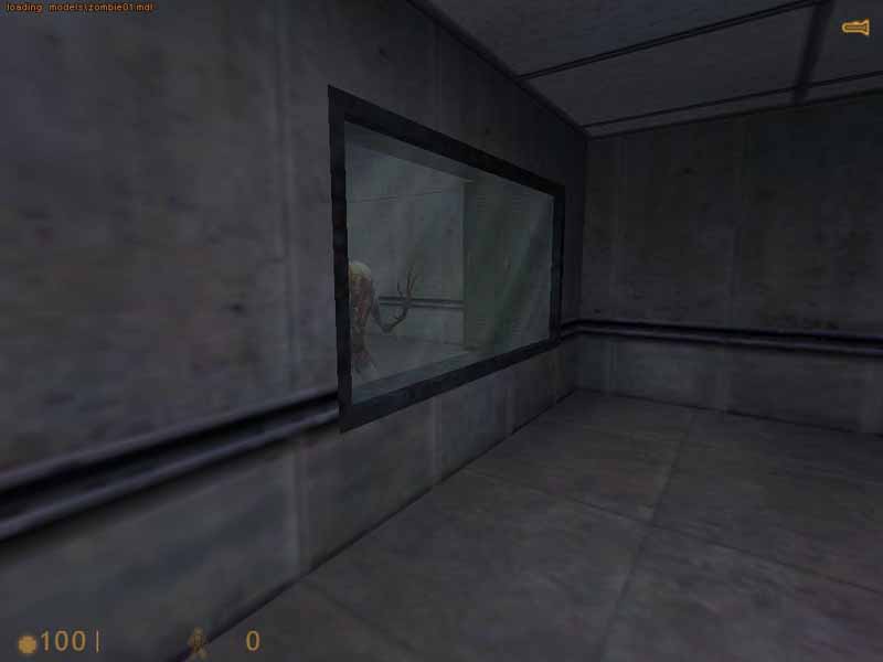
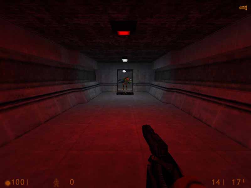
The first screenshot looks technically sound but
creatively...non-existant. The second screenshot at least shows some
degree of imagination in your brushwork and lighting. Try to make more
of the map like the second area, though less empty and symmetrical, and
it will improve it greatly. That's assuming the first screenshot is
indicative of the overall map style since you chose to profile it, but
I guess that could be wrong.
You might wanna check out this tutorial if you haven't already...
http://www.snarkpit.com/editing.php?page=tutorials&game=HL&id=93