Guidance was intended as an entry for a TWHL competition. Due to school, wich just started during the competition time, I haven't been able to put in all features. While the competition was all about glas, I've only put in one glass feature... but some other stuff too, wich I think can be quite interesting.
So while this map doesn't really offer an interesting gameplay, there's some effects in it that make it worth a look: volumetric light, random fire and some glass stuff.
Oh, and be aware that it's put in mod-form, so you can just extract it to your Half-Life folder. Also, run HL with 32bpp, for best appearance of the volumetric light.
Discussion
Posted by half-dude on
Tue Jul 19th 2005 at 8:32am
Looks like something from They Hunger, good job.
Posted by Captain P on
Mon Nov 1st 2004 at 10:53pm
But if it's finished, there is no point as listing as 50% complete. It basically equates to lying :razz:
Posted by Captain P on
Mon Nov 1st 2004 at 10:45pm
[Author]
You're righ in that, feedback is especially important. But I don't
concider this map to have a real playable state, it's more the effects
I wanted to show off.
Besides... a person can have other places to get feedback from, as I do
on my own small Dutch forums. Mhh, perhaps it's best to ask on as
many places as possible. Guess that's a personal decision to make.
Well, maybe I should put it on a 50% status and leave it there?
not to be a wet blanket, but work in progress maps receive a bit more attention than competed maps..
i am sure that if you bring your next project around before it hits 100% you will have more input than you want..
i can't speak for anyone else, but when i see 100% i also see "i am way to good for your opinion"
/ 2 cents
Posted by Captain P on
Mon Nov 1st 2004 at 10:02pm
[Author]
Anyone actually played the thing? My emphasis wasn't on architecture but on some specific effects...
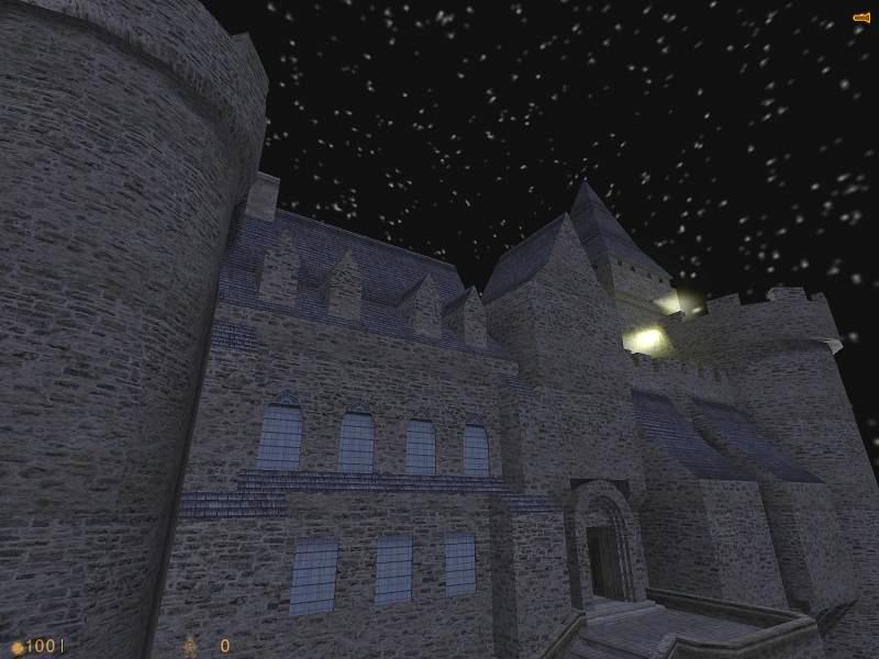
Well, good to hear you like the (in my eyes pretty basic) architecture
somewhat. As for the screenshot... it's modified a bit. In-game it's
darker, but that shows off so bad on a screenshot...
Yes Blister is correct it does look odd that the whole front of the castle is the same brightness. Try and get it darker and some shadows in there. Also maybe you could have some torches on the bridge and at the top of the towers. The front of the castle still looks bland though.
Posted by MisterBister on
Mon Nov 1st 2004 at 10:46am
Really good brushwork you have done there!
BUT since the sky is almost pitch black it looks a little odd that the castle is so good lit up.
My suggestion is that you cut down the strength of light_enviroment a bit, possibly changing the colour to a darker grey and then lit the castlewalls upp with torches (if the castle is in medieval time) or powerful spotlights positioned on the ground and pointed up on the walls to make a really cool effect.