This is the spiritual successor to my first HLDM map Torque and also my competition entry. The layout is basically the same but of course it looks radically different. I'm very pleased with the way I managed to keep to the original design so well while still updating it to look alot better.
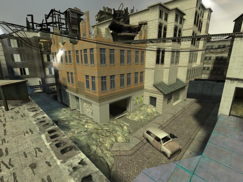
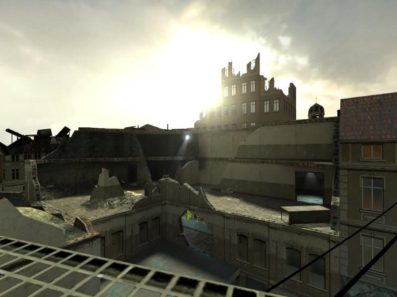
The theme is pretty simple. We've got a section of City 17 that's been fought over by the resistance and the Combine for quite some time. The connectivity and flow was always my favorite aspect of Torque, and I think I did a pretty good job of recapturing that for this map. There's plenty of pathways to get to where you need to go and some nice vertical play. The map is probably large enough to handle 20 or so players, but due to the compact and open nature of the map it could provide a good game with even 4 players. I'd suggest 12.
what stands out a lot, especially the building in the center of the first pic, is the amount of intact windows in a building that has been otherwise devastated.
why is it of late, these maps are not making it into the maps forums were work-in-progress shots can be posted and commented on?
i'd have figured by now that it was the obvious location to have a conversation. shrugs
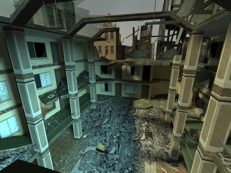
i actually enjoyed the shots with the green lines, what an odd texture
Posted by Yak_Fighter on
Fri Jan 7th 2005 at 10:37am
[Author]
Woah woah, I wasn't offended at all. I appreciate the harshness, as I get too enamored with my creations and fail to make changes when needed. I always want the truth about my maps. I don't want a bunch of people rubber stamping my maps as above average because of my name (haha like that even happens)
Posted by Agent Smith on
Fri Jan 7th 2005 at 10:30am
I also appreciate you putting me in my place ;D. Sorry mate, thought you'd want truthful commentary, didn't mean to come across so harsh. I just figured that the texturing, particularly in the first pic, was repeated too much. Also that you could probably afford to place some more props to enhance the realism of the scenario, as it seams really empty at the moment. Lighting will definately improve the situation though. Please forgive me if I gave any offense.
Posted by Yak_Fighter on
Fri Jan 7th 2005 at 3:26am
[Author]
I can always rely on the Snarkpit to put me in my place I'm glad I never get any serious 'this is awesome' comments, cause then I'd release substandard work.
Now I'll go blow up sections of this map and redo it to make it look better.
Posted by Agent Smith on
Thu Jan 6th 2005 at 11:49pm
The basic structure is looking pretty good, but at the moment the texturing and detail is pretty bland and almost non-existent. No offence Yak, but at the moment I wouldn't class this as your best work. If this is all the detail you are doing then make sure the lighting is really spectacular, because that will certainly make or break it.