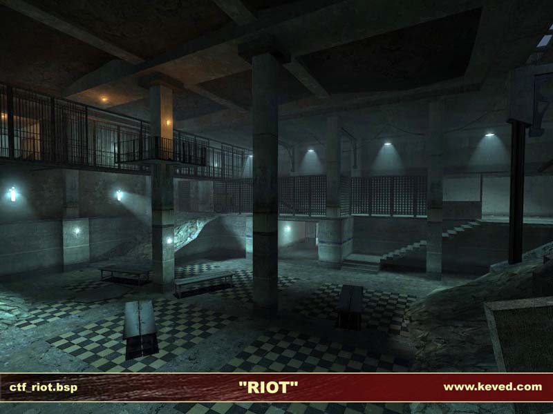
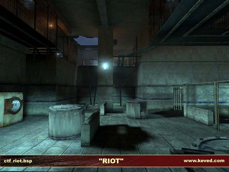
A Capture The Flag level set inside a prison during a riot. The prisoners are in command of the prison, with Combine armed forces brought in to breach the walls.
CREDITS:
Unknown author of tdm_flagtest.vmf which served as a basis for my ctf entities.
The doorways with six glass panels are from the Valve DM_Lockdown vmf file. All other brushwork is new.
The creators of the HL2CTF mod for their feedback.
The guys and gals at steampowered.com and snarkpit.net for their feedback.
I will try and give this a run through, but I would really like to play
this with other people. CTF is a hard game play to balance, do
you plan on submitting this to a server? I think the [K-9] server
would run somthing like this. If you do please send me a PM and I
would love to try it out.
A quick comment on the out door lighting that Reno talked about, I
quite like the screen shot there. I think that the blan, quited,
cold light really adds to the feeling that you seem to have all over
the map.
A few colored lights would help in some areas though. I'd look at
pictures from movies like 'the rock' for some insperation.
Posted by Agent Smith on
Mon Feb 21st 2005 at 12:48pm
Finally had a chance to check this out Keved and I am impressed with
how much you've done in such a short time (though CTF is a bit of a cut
and paste job :biggrin: ).
Most of Reno's criticism regarding the narrow
passages and quite bland architecture in some places I would definately
agree with. You should at least be able to fit two players side by side
down the corridors in question, so that it doesn't turn into a frag
fest when a grenade is thrown in, or someone has the ar2, giving people
move to run or manuever.
I really noticed the lack of finer
scene setting detail and interactivity. While the lighting is pretty
spot on (if a bit dark for my liking); and the architecture is good, I
found that for a destroyed prison, particularly after a riot, it felt
extremely empty and clean. I know its only an early beta and the props
and stuff will come later, but I know they will seriously enhance the
feel of the map.
On the lighting, I think you shouldn't go
overboard with different coloured lighting. The occaisional red
emergency light to highlight an area, or perhaps the flickering light
from some fires (a must in a prison riot) would certainly enhance the
feel of the map and make it more interesting.
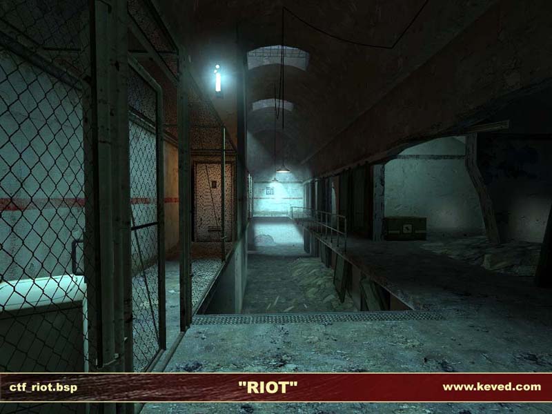
I had some
problems with the overhead walkway areas. I noticed this with refinery,
while most of the walkways are fine, every now and again you get this
wooden plank placed over a fall. In combat they are too small, I often
found myself falling off when forced to hot foot it. Also I'm not sure
where they would get planks for walkways in a prison. Perhaps instead
make it a piece of the fence used on the walkways, which would not only
fit the theme much better, but also provide a wider walkway across the
gaps.
You might also want to try spiffing up the architecture a
bit, as its pretty plain at the moment, lots of blocks, nothing too
complex. Even shearing off the corners of pillars and some detail like
pipes in tunnels greatly enhances the scene. I suppose its a trade off
between playability and looks, but like you said you have fps to spare,
perhaps they would be some minor but worthwhile additions you could
make.
<DIV class=quote>
<DIV class=quotetitle>? quoting Myrk-</DIV>
<DIV class=quotetext>If you need good lighting then your architecture is poor in form.</DIV></DIV>
??? I said nothing about needing good lighting, just that I recognise it needs improving and am doing something about it.
Snark Pit seems to pride itself on the quality of feedback given but with the exception of the outdoor lighting suggestion (which I'll try out), the feedback you've given thus far Myrk is what some here mock the Steam forums for. If you're going to give feedback, a bit more explanation than throwaway sentences like this (and your previous "Too bland and monocoloured") wouldn't hurt.
I'll have to disagree with Reno and many people completely about the outdoor lighting... I think you could do with some fog or something, make it kinda a misty day thats dull.
If you need good lighting then your architecture is poor in form.
Thanks Finger. I'm working on the lighting atm - the lighting in the rooms I've done so far is more interesting and not as flat. I used too many lights and not enough strong light_spots.
Regarding the layout, you're right, there is one section in between each base that I'll be changing. The main bottom tier of the level only takes 6 right-angled turns to go from one flag to another - I'm happy with that. I think the problem is the upper tier as there are too many twists & turns. Simplifying them is next on my hit-list.
Just gave the map a quick run-through. Just have to say, overall I really dig it. Your maps have a certain style/ambience that always come across well, and I see this one having lots of potential. As previous posters stated, I think you could push the lighting more in the middle areas, as they seemed to flatten out the most to me.
My big critique is with the layout. My first impression, was that it's just too dense and intricate between the two bases. I haven't really played any serious hl2dm-ctf, so this is just coming from the gut, but I would be curious to see how this map felt with more basic connectivity in the middle. Right now, with my impression of the game, and peoples willingness to learn new, big, maps - I think this map might be more accessible if simplified.
That was the beauty of maps like 2fort in tfc, and dust in cs; they are just so easy to jump into, quick to learn, and play fast. I have always been a fan of big maps, but from my experience selling them and getting them to stick around is a challenge.
I'd like to keep an oppressive feeling with the lighting - it is a prison setting after all - but yeah the lighting could do with some work and I'm trying out different stuff atm.
Downloaded 6.29mb in 3 seconds, woot :biggrin: Apologies for the very brief and obvious comments; I would agree with the above statements that it does look bland in places (especially that corridor near the flag) and the lighting is dull (it does give a cold feeling, but it just needs more... how about setting the time of day to be sunrise/set, so that the outdoor lighting isn't exactly the same as the interiors, and you get to stream in light through windows?)
Also I see from dm_steamlab that physics-enabled hanging lights are in fashion now :razz:
Thanks for the feedback, ReNo. All are valid comments - the type I'd expect from someone who himself has high standards. :smile:
I'll look into improving all the areas you mentioned for the next beta. Everyone has reported that performance is fine so adding more detailing isn't a problem.