Remake of cs_siege with some extra stuff in it. I'm going to be adding some extra areas to this. The layout is pretty much the same except that you've got an access tunnel that leads to a power station that you can blow up and cut power to the entire level. This will disable all the lights inside the buildings. You can also toggle the lights for the garage, the warehouse, and the sewers in this version. The switches are located at the warehouse enterance to the sewer, and also at the garage enterance to the sewer. The map geometry is constructed for the most part. I am currently optimizing the map, and making the lighting look good. I'm also adding things to spice up the rooms.
Heh, well considering I am doing the very map at the moment, but I had planned on not doing it the same as the original because I suspect Valve will re-release someday in the future, and I wanted to just capture the idea behind the map. Some problems with yours is its a blind run into what will be AWPer hell, no cover, and the textures are pretty bad. And thats just from the screenshots above. I do like the displacement walls you did.. but they can be better.. like the displacement walls done in the other siege map here, his are fantastic.
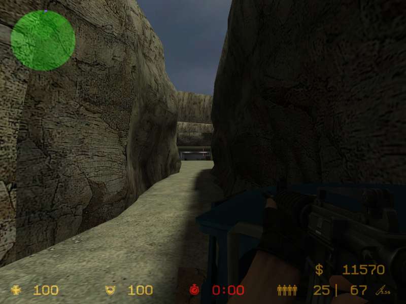
Eeeek! Dangit! Forgot to rescale the textures in the skybox! That one above the parking lot on the far wall is actually in the skybox. The map is surrounded by cliffs to give the impression that it's in the middle of a vast setup of canyons with oil refineries here and there.
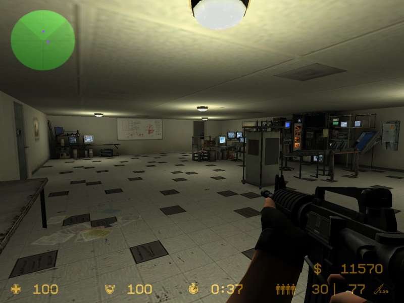
screen one is looking great, try turning out one of the lights in there to make some light contrast.
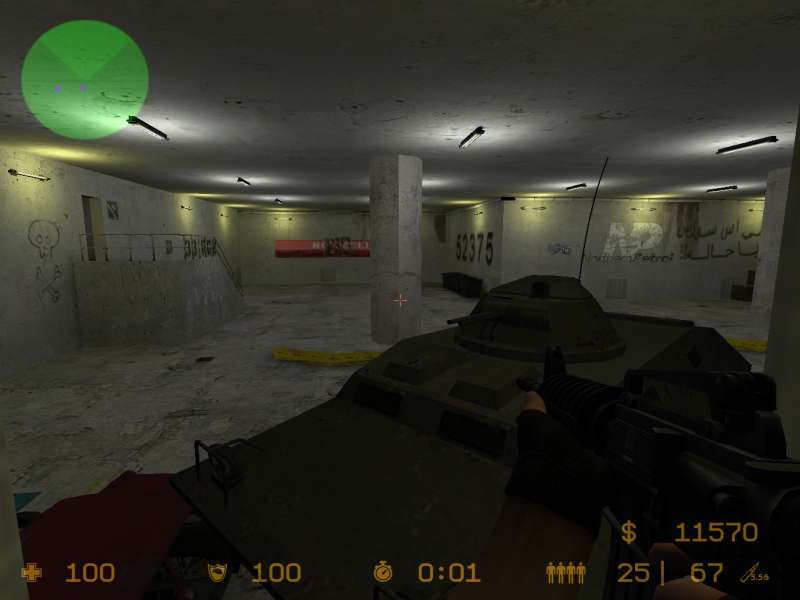
screen two, there are too many decals it is way to busy. that arabic writing and the NP dont seem to fit at all.
screen three, not bad at all add some rock models for a bit of cover
and think about a better way to do that far wall above the entrance to
the parking lot, the reapeating texture dosn't look all that great.
I have done displacment maps for most of the map (only half of ct spawn
left to do), and I did some scaling on a lot of the textures. I
took care of the lighting issues, and added decals to the lab area to
make the room look more interesting. I also installed a door to
the lab. More doors to come. I'll upload screenshots as
soon as I can.
Yep, yep! I agree, guys. I've got the displacment maps half done for the rock walls. It's looking much better in that area. I'll also look at the texture scaling. I'll definately do some playing around with overlays and decals to make it not look so bland. Anymore feedback, let me know.
Add some decals to break up the very flat wall texure you are
using. Play around with displacment mapping some more and get a
real feel for it, then come back and try to tackle those rock walls.
Screen 1: Half the number of the light's, some contrast can be good,
also the wall's look a bit plain, look at the "trim" textures and use
one of them to break it up, also it can be broken up vertically, the
wall doesn't have to be straight to the next wall, it could also have a
block which is sticking out.
Screen 2: With the rocks make the bottom stick out so that it looks
more curved, both horizontally and vertically, some difference in
verticle ness and horizontalness is good. also with the walls on that
building split them up with trim/ sticky-out-ness.
Screen 3: You could cut one of those tiles out so that it looks out of place, walls again -trim and less lighting.