Remake of cs_siege with some extra stuff in it. I'm going to be adding some extra areas to this. The layout is pretty much the same except that you've got an access tunnel that leads to a power station that you can blow up and cut power to the entire level. This will disable all the lights inside the buildings. You can also toggle the lights for the garage, the warehouse, and the sewers in this version. The switches are located at the warehouse enterance to the sewer, and also at the garage enterance to the sewer. The map geometry is constructed for the most part. I am currently optimizing the map, and making the lighting look good. I'm also adding things to spice up the rooms.
Screen 1 - I'd lose the spotlight effect on those lights - they are
really meant for actual spotlights as opposed to strip lighting. Try
putting in some parking space markers, posters on the walls, and other
overlays to make the place a bit more visually varied. The texture set
you have chosen here is all extremely monotone as well, consider
changing one or two textures to something a bit less grey.
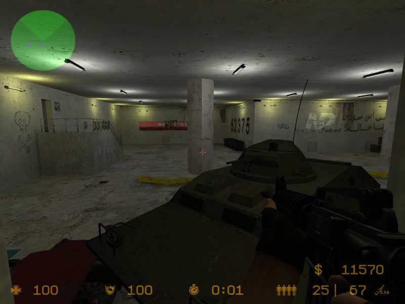
Screen 2 - Your rockwork is in desperate need of improvement, and the
scale looks completely off compared to the old siege. Consider
decompiling the original to find the correct sort of scale, but don't
use any of the actual brushwork it spits out as it will be horribly
made. The ground and cliff textures look really repetitive, perhaps
scale them up a little bit (eg. 0.5 instead of 0.25) and use some
texture blending (paint alpha in the displacement tool, when using a
texture with "blend" in the title).
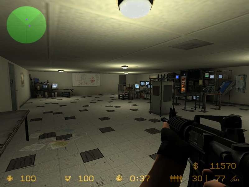
Screen 3 - Dull but somewhat realistic. Put a frame on that doorway and
perhaps even an opened door, or perhaps make it into a double door and
keep one of the two doors closed or something. Put some overlays on the
walls, some simple pillars perhaps, anything to stop it being so flat
and repetitive. Consider adding some vents along the ceiling in places.
Posted by Yak_Fighter on
Wed Feb 23rd 2005 at 3:47pm
Once they added the Scout to the arsenal of weapons and increased the amount of money you get per round which allowed for a scout at least every two rounds if you're losing they effectively made siege obsolete. The layout may have worked in CS beta 1 (if they had a round timer that is) but once sniper rifles became so prevalent it became basically broken. Same thing with assault. They were designed for a different version of CS than the one we have now, and it's painfully obvious that they just don't work any more.
If you're remaking the original cs_siege I'd say don't bother.
That was always the worst official map and doesn't deserve to be played
ever again... unless of course you've got a real hard-on for sniper
rifles, constant and unstoppable camping, and long drawn out rounds.
I dont agree! I for one love siege... most people arn't up for
the challenge of the map. You have a point about the sniper rifle
and camping. I supose I like any map that isn't a dust remake or
CPL type map. cs_maps just screem counter-strike to me, they are
the real deal in my mind.
Posted by Yak_Fighter on
Wed Feb 23rd 2005 at 9:03am
If you're remaking the original cs_siege I'd say don't bother. That was always the worst official map and doesn't deserve to be played ever again... unless of course you've got a real hard-on for sniper rifles, constant and unstoppable camping, and long drawn out rounds.
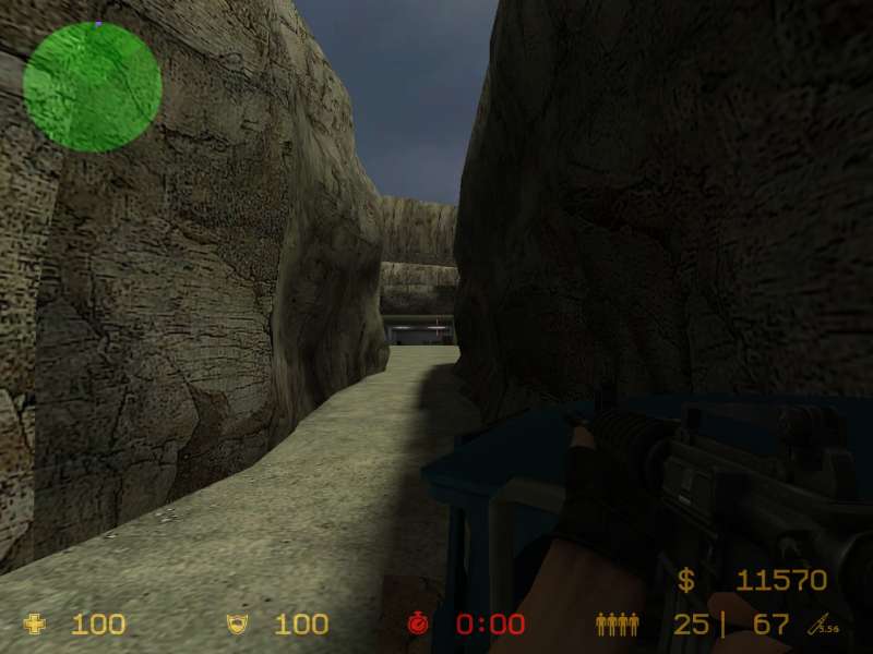
screen 1: the tunnle is way too large, the hole dosn't look like
somthing you would find in a normal sewer. Even the one in
the real siege wasn't too real. The wide rectangle clean cut hole
looks too fake.
screen 2: Not bad at all, work on the model placment (green generator
is just free standing out there) with out the props though, it is just
a blan empty space.
screen 3: Again, if you take out the props that is just a square
room. Wall texture looks horrible. Lighting is very
poor. you have the same light fixture all over the room.
Spred them out a bit, shadows will add depth to the room. Also
add some decals, like water stains, pealing plaster, or posters these
will break up the texture of the wall.
Ok, I have new screenshots up for it. It correctly uploaded two of the three screenshots I wanted to upload. It appears that there is a bug with the uploads. However, at least you get some idea of things.
Well, if you want to critique what you can see, I'd love to get more feedback guys!