dm_swamplight by Finger

Map Rating

  • Star map!
  • 5
  • 1 rating / 5 stars

Map Download

Map Info

Map Description

This map was born from a chunk of dm_parasite, which I ripped out and built around. The setting is an industrial structure, on the edge of a swampy region. Hopefully a good time to be found for all - enjoy.

Discussion

Posted by ReNo on Tue Feb 22nd 2005 at 5:49pm

Thing is, my computer isn't even low end, its a mid range really. I'm
running a decent system bar my graphics card, which, being a GF4
ti4200, isn't exactly that bad either. Almost every map I've seen with
poor performance has been so due to this swap buffers bar :sad:
Posted by Gwil on Tue Feb 22nd 2005 at 5:41pm

Finger, to further ReNo's chain reaction explosion note, through my extensive research (read: playing HL2DM nonstop :razz: ) I've found that the chain reaction issue can cause clients (and servers) to go loopy and just crash.

Might be worth reducing the numbers.

Also, props piled on spawn areas disarm the player for all weapons bar the default (SMG), so try and avoid having stacks of props near spawn areas.

EDIT: Also, weapons placed too close to walls, if hit by an explosion (and sail through the air cos of the physics) they have a tendency to disappear out of the level and never return.
Posted by habboi on Tue Feb 22nd 2005 at 5:32pm

Looks Great, and use the tips these guys suggested and it will be a great map :smile:
Posted by Orpheus on Tue Feb 22nd 2005 at 5:22pm

i went to the exact same place Duncan did to see how it looked from my angle/perspective. the difference was phenomenal. note that i am in almost exactly the same position.

User posted image

User posted image

this is a perfect example of how difficult it is going to be to not only critique these new maps, but to construct maps that will play on low end PC's..
Posted by Orpheus on Tue Feb 22nd 2005 at 4:56pm

NOTICE:I do not really read other peoples critiques till I have done my own. In this way I do not pre-judge a map and possibly alter my views before I have even seen the map. If I comment on something that someone else has already, consider it note worthy enough that more than one person saw it and move on. Lastly, as i stated before, due to the HL2's engine ability, machine size is going to effect a critique in some ways. I may not notice some slowdowns now that I used to on my older machine. I figure however, anything over 30 FPS is all goodness.

Now without further delay..

User posted image

The light level in my screens always seems a bit dimmer than in game, as such it sounds odd when i say this light is to bright, cause the screen says otherwise but, take my word for it, this light is way to bright.

User posted image

If this thing sparked this much for real, it would long ago have burned to a cinder. if possible its spark frequency needs reduced to an occasional outburst.

User posted image

Texture misalignment, but my reason for the screen was to say that i felt the pillar/beam looked wrong in there and either needed removed or altered in some way. perhaps it was the fat that it reflected the outside blue, far more than the inside white light it was closer to. the white light should have overpowered the blue.

User posted image

I know you can suck those things out of there with the gravity gun, but the narrow area looks wrong... almost n00b. no construction structure would have such a space between. at least none i have seen before.

User posted image

that light, where is it all coming from?

User posted image

nice glass, but would be nicer with small opening to fire through to below. not big enough to walk through, just fire through.

User posted image

that patch on the floor, reflected like ice, what is it?

User posted image

from an engineering standpoint, i can say honestly that beam will not work to hold the weight above.

User posted image

skybox way to low.. my son fired off an exploding drum and it contacted the sky and blew up

User posted image

heavy weapon, easy access = bad.

User posted image

those heat ripples were a nice touch.

User posted image

texture misalignment, very noticeable too.

as apparent, most of my comments are small issues, i could find nothing blatant to complain about other than the maps vast size. I am not even sure i saw it all, as i got lost several times. there is no real identifying features in this map to say "go here"

architecturally, i love it and it plays smooth, course that could be only my new machine too :smile:

nice job old man.
Posted by Orpheus on Tue Feb 22nd 2005 at 4:08pm

/me stops reading/looking, i am doing this critique next.. go read the one i did for keved just now guys. :smile:
Posted by Finger on Tue Feb 22nd 2005 at 4:04pm
[Author]

Thanks Reno. All good observations, and motivation to keep polishing things up. Mucho appreciation!
Posted by ReNo on Tue Feb 22nd 2005 at 3:42pm

Had a run about and I'm impressed. Quite an improvement over parasite
in my opinion, and its significantly nicer in game than in the
screenshots. Anyway, onto the feedback...

User posted image

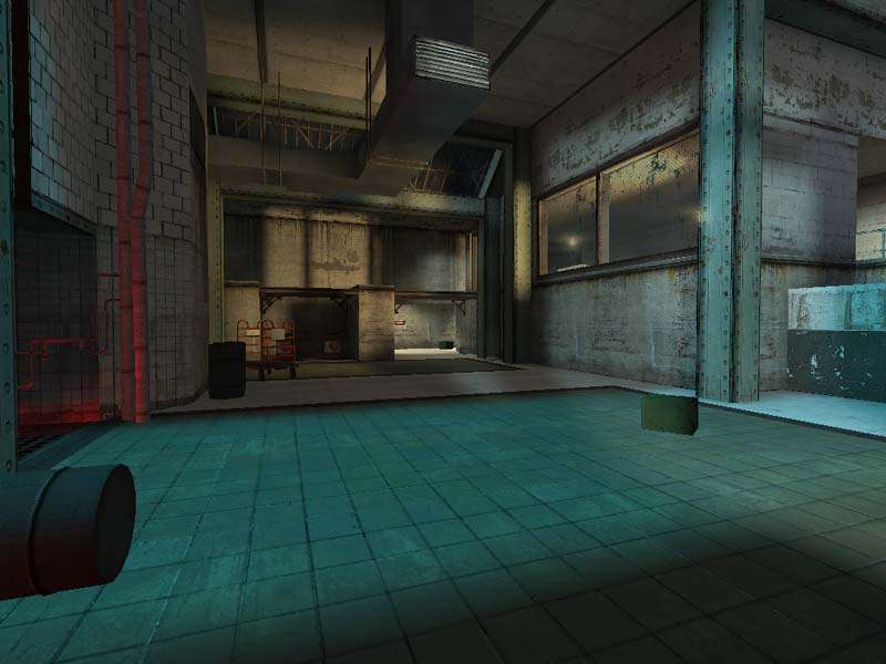
I like the intensity of this light on the ceiling, but does that
shadowed line make sense? I'm not sure whats casting it, but perhaps
I'm just overlooking it.

User posted image

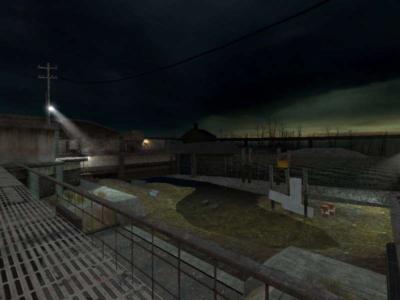
I like the ambience in this area, but looks wise its leaving a little
to be desired. That just doesn't look like a convincing vertical end to
the wall. Its kinda nitpicking, but some of the pipes kinda clash with
the texture on the wall as well, when they just jut straight into it.

User posted image

Kinda awkward looking at the corner there, might wanna try and make it look more smooth or something?

User posted image

This line of debris or whatever looks odd. Try and make it more
naturally shaped perhaps, with more variety in how far it comes into
the swampy area?

User posted image

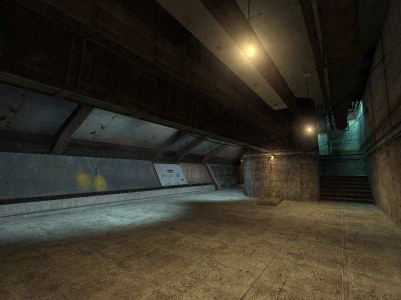
I don't think this texture works as a floor texture. If you insist on using it, it could probably use better alignment.

User posted image

If that stain decal is meant to be due to the duct, then you might
wanna reorder the overlays so the duct hides the stain section it is
above.

User posted image

The texture used on this vent looks pretty crappy in my opinion. The
duct on the end of it is too detailed and shiny compared to the body
texture's simplicity, and it ends up looking pretty bad.

User posted image

I really liked this bit, but felt the yellow gas looked a bit wierd.
Not sure if it had crossed your mind, but this could prove to be a
fairly decent trap by having a valve somewhere that increases the steam
output and burns players below.

User posted image

I would have liked this room to have a line of fire to the one below -
maybe breakable glass or something? If you have purposefully blocked
off the firing line for gameplay reasons then its cool.

User posted image

Love it :biggrin: The heat waves were a bit of a shock at first (thought it
was a visual glitch for a few seconds!) but its good to see them used.
Could perhaps have used a more obvious source though, like some broken
pipes inside that hole instead of just that intact one?

User posted image

Not sure if I accidentally knocked something from under this or it begins like this, but this sawblade is just floating there...

User posted image

4 barrels together like this seems over the top, particularly given
that you can't get direct access to throw them. Chain explosions kill
performance for a lot of people, and in HL2DM (unless they have fixed
it) chain reactions only work once and after respawn any additional
explosive barrels just get launched away from the first one to go off.

User posted image

Another good example of the rather poor looking vents. I think you should use the prop ones or find a better texture.

User posted image

My performance took a dive at this point, but I never noticed it
stutter elsewhere. Looks like overuse of fancy, expensive
materials...damn swapbuffers!

All in all, looking great. I love the layout for the most part, nowhere
felt redundant or out of the way. Lighting was overall nicely handled.
Should be a fun map :smile:
Posted by Finger on Tue Feb 22nd 2005 at 3:09pm
[Author]

Hmmm, well isn't the whole point of this endeavor to find create something that is fun to play and looks interesting. I don't see anything wrong with a random deathmatch arena, as long as it plays well and looks good. Do you even play this game Myrk?

Actually, I wouldn't mind a little gauss action.
Posted by Myrk- on Tue Feb 22nd 2005 at 11:37am

Hurrah! Random Deathmatch arenas! All we need now is the Gauss gun...