Make sure you Right-Click the Download URL and choose "Save target as" to download this map. This Zip file includes a working .NAV file for bot play!
This is a great map where I've combined the best features of both Office and Siege. It has a working elevator, a parking garage and a complete office with cubicles, etc. Anyone who loves a good Hostage map will like this map guaranteed.
from the screen shots it looks like you need to add more details.
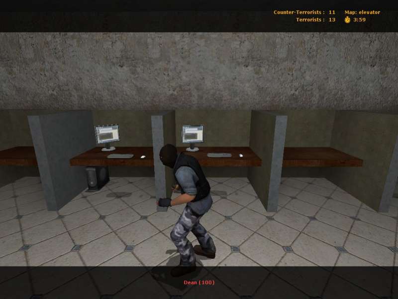
Take the thrid picture for instance. The cubical walls are way to
thick and the whole area is far to blocky. This lack of detail is
enflamed by the computer models, which are very detailed.
you need ti jazz up places like where the floor meets the
ceiling/floor. Add trim, collums, and other things that will
break up the dull flat layout.
with a little work this looks like it could be very nice. I'll try and download it in a few days.
I hope people like my map. It has a great layout and I do realize the environment needs more decorations, but the layout is basically finished. I would really appreciate feedback.
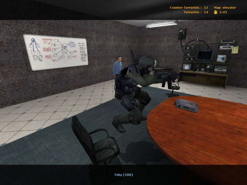
Sorry...I did it in bold because it was my foreword. I know its annoying when people type weird like "all-caps" lets say, but didn't think i'd get flammed for bold lettering. I just wanted to make the foreword stand out. I used the carpet-style walls because believe it or not the lower-half of the walls at my work are textured soft like carpet. Plus you are right...the cubicles look a lil thick, I never noticed that when playing the map, just when users pointed out the pics I took. Please try the map, it's not to dissapoint. Please give it 5 minutes. I promise i will make the cubicle thinner...
If you've been at the snarkpit a while you should have noticed that we
don't post entirely in bold :razz: Easy jabs aside, the map looks pretty
basic but at these early stages thats to be expected. You have a few
things in those pics that make me go "eh?", such as the concrete
cubicles, or apparently carpeted walls in a screenshot that seems
undecided between being a conference room or a techy room. Looks like a
decent first effort though, good to see you are putting thought into
gameplay and visuals rather than churning out some FY map.
Oh and I don't mean to sound like a dick here, but its not really such
a great idea to proclaim your map as great or guaranteed fun,
particularly not so early in your mapping life :wink:
Yeah I agree about the blockiness. It is too blocky and I'm working on it. The inside is pretty much done, but the outside needs lots of detail and little things here and there. There definately be windows but I don't plan of them affecting glameplay so they will be strictly for looks. Also the outside walls will be somewhat like Italy's with doors that look like you can open, but can't. That will improve the blandness of the current release of that map alot!
Thanks for your input and play it a little more when you have a chance. I think it has one of the best layouts of a user created map I have ever played. I say this as a CS:S fan. Peace.
Hmm, I think the architecture could be less blocky, and the textures could use some spicing up too. Add more curves and diagonals to the architectural elements. Perhaps some windows or glass would help too.
The partitions for the cubicle appear to be very thick. Make them thinner, and perhaps change their texture as well.
The concept and the layout sound interesting, so with some additional work it can be a great map.