cs_bulletheory by SpiKeRs

Map Rating

  • 0
  • unrated

Map Download

Map Info

  • 0 ratings
  • 8084 views
  • 1241 downloads
  • added Mon Jun 20th 2005
  • updated Mon Oct 27th 2025
  • more content for: Counter Strike Source

Map Description

This is a hostage rescue map for CS:S . The setting is an abandonded/run down apartment building in some Eastern Bloc country

Discussion

Posted by SpiKeRs on Thu Apr 14th 2005 at 11:44am
[Author]

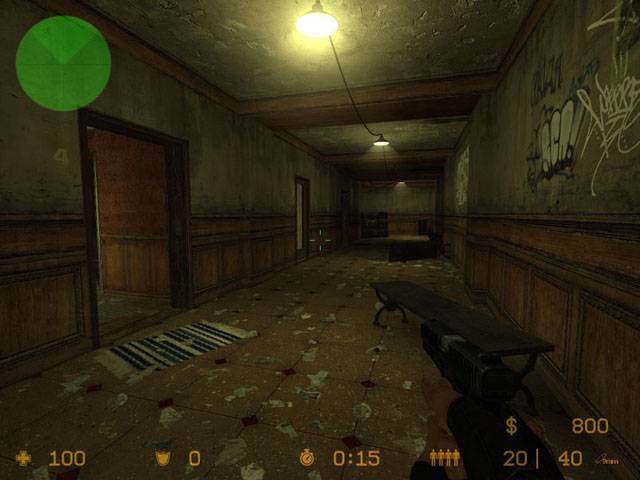
A new pic up (4th one). Its meant to be the corridor of a dingy
apartment block. Am thinking of doing some of the trashed apartments
next and having the hostages kept in them.
Posted by habboi on Tue Apr 12th 2005 at 7:52pm

I was going to say the same thing.
Posted by Addicted to Morphine on Tue Apr 12th 2005 at 6:44pm

wow, pic5 looks nice. You have a good mood setting.
I agree. I think that's a big step in the right direction. Glad my comment inspired some creation.
Posted by DrGlass on Tue Apr 12th 2005 at 6:08pm

wow, pic5 looks nice. You have a good mood setting.
Posted by SpiKeRs on Tue Apr 12th 2005 at 3:35pm
[Author]

Ive scrapped the mansion thing because as was said, it did remind me of
de_chateau. Will keep the rooms and play around with them in the future
as did like doing a mansion setting.

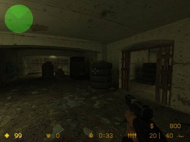
Addicted To Morphines comment about Max Payne got me thinking so now am playing around with a general
abandoned place setting, which will fit in better with the
cellars (pics 1 + 2). Pic 5 shows what I have currently done regarding
this. Let me know ya thoughts :smile:
Posted by Cassius on Mon Apr 11th 2005 at 9:44pm

willow said:
Way to dark man. The architecture/ambience doesn't look bad, however I really can't see more then a few rooms and hallways.
Posted by DrGlass on Mon Apr 11th 2005 at 7:11pm

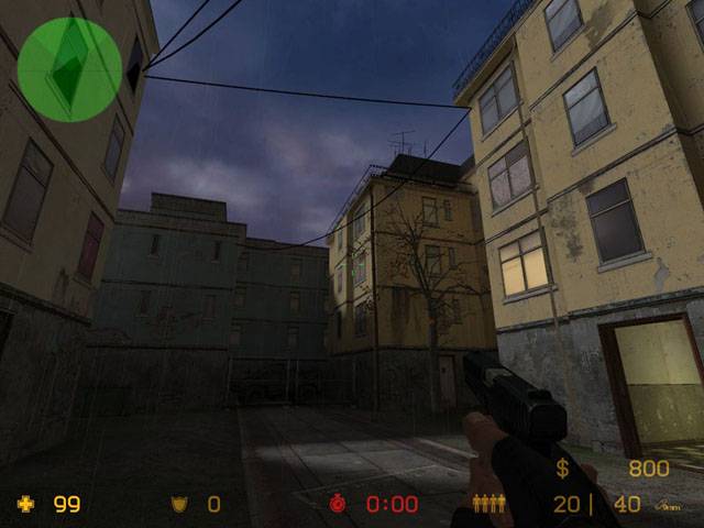
The mood seems nice, but the scale seems a little too big (pics
3-5). You havn't got much more than a large box room. It
seems empty to me, I'll wait for another update to make any real
critiziums.

I do like pic 1-2 though
Posted by Addicted to Morphine on Mon Apr 11th 2005 at 6:33pm

The two arches in the fourth shot look a little awkward where they
intersect with the wall. I'm not sure how you would remedy it,
but they just look like they don't connect well / naturally with the
wall.

Otherwise, looks very chateau. To be honest I like the first two
shots best, because they look the most original. Reminds me of a
location out of the first Max Payne for some reason...
Posted by SpiKeRs on Mon Apr 11th 2005 at 6:25pm
[Author]

Added 2 more pics, hopefully these shud be a little brighter for ya :smile:
Posted by willow on Fri Apr 8th 2005 at 4:49pm

Way to dark man. The architecture/ambience doesn't look bad,
however I really can't see more then a few rooms and hallways.