de_temple007 by Noir

Map Rating

  • 0
  • unrated

Map Download

Map Info

  • 0 ratings
  • 1389 views
  • 448 downloads
  • added Wed Apr 5th 2006
  • updated Wed Apr 5th 2006
  • more content for: Counter Strike Source

Map Description

I know this map has seen its day, but I couldn't resist. Everyone remembers the Temple from GoldenEye, right?

As my first Source map, I tried to get the overall feeling of the Temple. I know the lighting is kind of lame, and the texturing isn't perfect. But I think I brought CS:S and the Temple together well enough for a GoldenEye fan to appreciate.

There's a bombsite in the middle to keep the action focused, and the whole thing is pretty nostalgic. So give it a try, and let me know what you think.

Discussion

Posted by Myrk- on Sun Jun 26th 2005 at 10:08am

Its repetition of textures, and bleeding light... Never good... As someone said earlier, never release your first map!
Posted by Jinx on Sat Jun 25th 2005 at 2:56pm

heh I made a map initially inspired by Temple for Action HL a while back. It's for HL1... and yours are for HL2... and... ummm... well I'll let the pics speak for themselves ;p

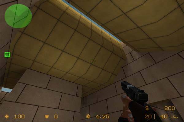
This is the HL1 version of the room shown in Cobra's pic:
User posted image

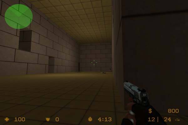
This is the lower part of the central room. I added water so jumping down there would not be an issue:
http://www.cryotank.net/maps/temple/ahlt_lower.jpg

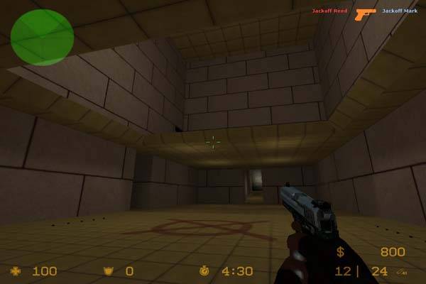
This is the huge, upper room. Quite a bit different in this case. I ended up redoing the layout a good bit as I went along, since imo the GE version had way too many empty corridors and rooms:
http://www.cryotank.net/maps/temple/ahlt_main.jpg

I know what you mean about liking the clean simplicity of the original Goldeneye map, and porting a simple map is a great way to learn. I think that for Source maps, though, both are painfully bland. I think it's better for go for "inspired by" with ports. Different games have different gameplay, and that means you need to make changes sometimes. Also, occasionally you will notice an older map simply has flaws in it that should be fixed. And why not give the map the visual makeover it deserves?

I made Basement as one of my first maps when I was learning Hammer/Worldcraft years ago. The first version was horrible, but I learned a lot making it. Then I went back and made a more playable version.... THEN I went back a third time and used the map to test certain eyecandy effects I was developing for Temple:

http://www.cryotank.net/maps/basement/index.html

Kinda wish I'd made a HLDM version of Temple... :/

I think a simple port like this is an excellent way to learn, but it's really not 'done' compared to a real Source map.
Posted by Noir on Fri Jun 24th 2005 at 7:57pm
[Author]

That's funny - that very screenshot is the reason I decided to make
this map. Aside from the use of floor textures on the walls, moving the
temple to a jungle setting, and a pretty liberal reworking of the map's
look, there are obviously lots of ways to mess it up. Don't claim to
have the map just because it's prettier.
Posted by SuperCobra on Fri Jun 24th 2005 at 7:20pm

Now that is the temple map..(click the LINK) GoldenEye: Source baby! I am a mapper in it :wink:

http://mods.moddb.com/gallery/image/24501/
Posted by Noir on Fri Jun 24th 2005 at 4:46pm
[Author]

There will be no decals, overlays, props, point lights, i.e. nothing
different from the N64 GoldenEye. Even the bombsite decal is too
deviant from the simple beauty of the original, but it had to be done.
There's no reason to spruce it up with geometry, textures, or lights,
just because I can. It's a fun, nostalgic map, so I hope you all can
see it in that light. Thanks for the comments.
Posted by Loco on Fri Jun 24th 2005 at 10:45am

Looking like good basic architecture from the screenies, but this map is not
99% complete as listed. Props, decals, overlays - just general stuff!
All it seems to have at the moment is brushwork. You have lights with
no actual sources (i.e. light bulbs!) either with the exception of
those holes in the roof, but even these holes don't occur everywhere
there is light, so that needs to be remedied asap. Judging by the
architecture, I'd say take a look at the corridors in de_dust for ideas.
Posted by Madedog on Fri Jun 24th 2005 at 7:34am

Hmm... it is foretold that "never release your first map :wink: "

I haven't got time to test the map itself, but hey - from the
screenshots it's not so bad. It is bad, yes, but not SO bad. You could
have done it a lot better :smile: