Say hi to our newest member, RichardELDEN!
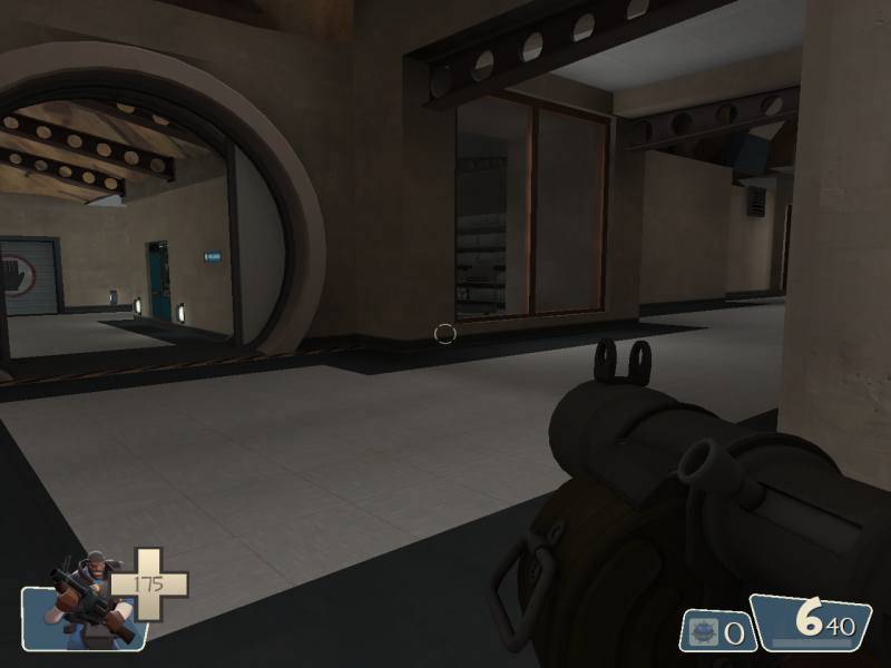
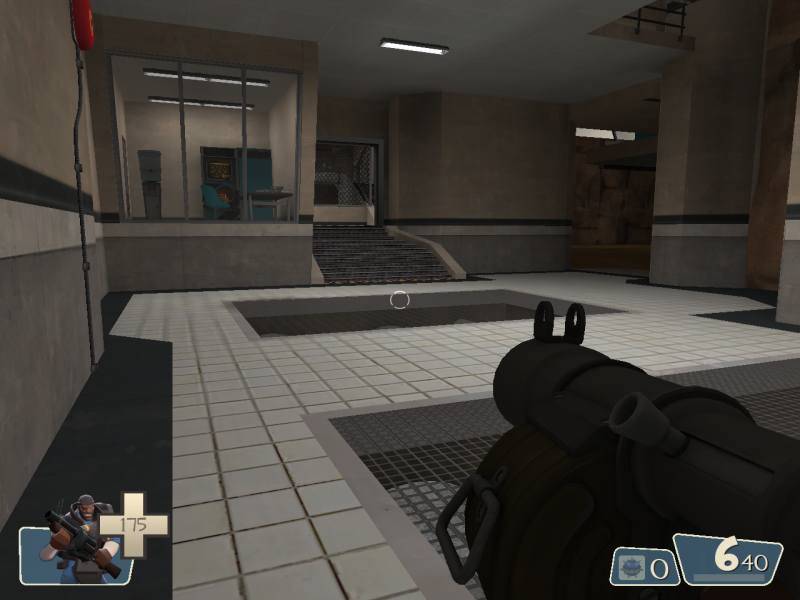
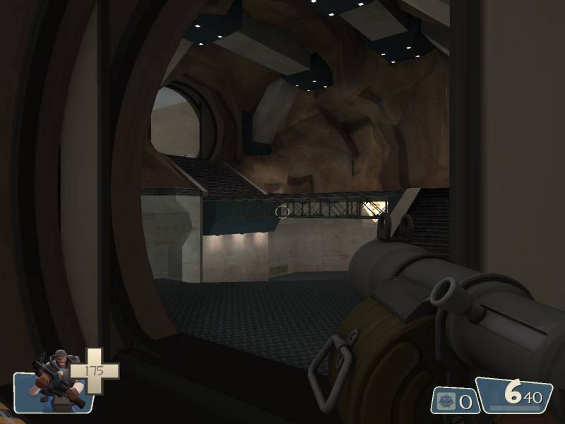

These have a striking resemblance to Goldeneye. If that was already noticed, sorry, I didn't read the thread.This occured to me, too. That's not a bad thing by any means, however. At least in its current spareness -- which I trust Fishy will not leave unimproved -- it recalls the feel of an older age of mapping. Let's talk rocks. My biggest qualm with most TF2 maps, Valve's releases included, is the terrain. In almost every level, it's flatly textured, choppily lit and colored like coffee with too much milk in it, and the rock ceiling you've shown here is no exception. Give it a texture that brings out its shape. If none are available, I'll give you some of mine.


