tf_to_be_decided by fishy

Map Rating

  • 4
  • 2 ratings / 4 stars

Map Download

Map Info

  • 2 ratings
  • 17552 views
  • 14 downloads
  • added Sat Nov 24th 2007
  • updated Tue Sep 9th 2008
  • more content for: Team Fortress 2

Map Description

A simple 2fort style ctf map for TF2 that I've started on, to familiarize myself with the spinky new content. There's still only one base, so I haven't uploaded it anywhere yet. I'll stick it somewhere for people to try out as soon as I've put together a playable version.

Discussion

Posted by fishy on Sat Jan 12th 2008 at 12:01am
[Author]

I've done a fair amount since I last posted anything about this here. There's been a b2 version running on "milky's test server" at 74.63.67.163:27015 for a little under a week, but as soon as I had a run around on it with other players, I knew I had to add the underground exit, and some cover for the main doors of the bases.

With that done, and being relatively happy with the outcome, I'm posting b3 for general crit, though I know that some of the inaccessible areas (behind glass etc) will need more detail before a final release.

User posted image User posted image User posted image

User posted image User posted image User posted image

User posted image User posted image

http://www.invalid-brush.com/images/tf/b3/ctf_fishy4.jpg

http://www.invalid-brush.com/images/tf/b3/ctf_fishy6.jpg

http://www.invalid-brush.com/images/tf/b3/ctf_fishy8.jpg

Download ctf_fishy_b3 here
milky's server ( 74.63.67.163:27015 ) has now been updated to this version.
Posted by mrnatural332000 on Sat Dec 15th 2007 at 11:45am

looking real good fishy. i dont care for the girders under the windowed offices outside. doesnt look stable enoufe to support them or something. but it still looks real good. keep up the good work.
Posted by G.Ballblue on Tue Dec 11th 2007 at 4:31pm

Thus far, I've been enjoying what I've been seeing. My biggest concern is with the bulk of the texturing and perhaps some of the lighting -- it's not bad, but then again, it doesn't stand out as anything particularly eye catching. The majority of the rooms have a constant gray/plaster/concrete look to them, and the look is being recycled quite a lot in most parts of the map.

Let me validate my point with this area of the map. Like I said: It isn't bad, but the gray walls with the gray/monotone lighting aren't helping it. Something needs to be thrown into certain areas of the map to add some contrast in -- specifically in this case, some color.

Ultimately, nice work thus far -- just keep hammering away at it.
Posted by Finger on Tue Dec 11th 2007 at 7:50am

Looks good from what I can tell in the screenshots. First thought; the map could use a visual hook; some set-peice room or vista that is memorable and stands out....where people say "lets play that map with the bananna rocket!", or whatever that thing is. Is this entirely interior?

A small nitpick observation... the small square lights mounted on the support beams on the ceiling bother me. They stand out as 'HL1 light texture on a square brush' lights; I say remove them and stick with whatever light models are available. It seems stange that they would build such lights into those chunky support beams, and my eye always goes straight to them. End nitpick.

Looking forward to playing this map.
Posted by fishy on Mon Dec 3rd 2007 at 4:23am
[Author]

RedWood said:
Their appears to be a start to a tunnel at the bottom of your pit. Is it ever going to lead some ware?
It's there as an option, as are a couple of doors elsewhere. I'll need to see how the map plays first.
Posted by RedWood on Mon Dec 3rd 2007 at 1:41am

Their appears to be a start to a tunnel at the bottom of your pit. Is it ever going to lead some ware?
Posted by fishy on Sun Dec 2nd 2007 at 6:19pm
[Author]

Aye, Gwil, it's CTF. What I probably should have already mentioned, is that this is aimed at lower number servers. All of the default maps suck big time when the numbers drop. Quite a lot of custom ones that I've played do too. It seems to be that when numbers drop to around 5v5, most of the remaining players on a server will decide to give up and go and look for somewhere else to play. It's impossible to tell until the map gets played, but I'm expecting 5 v 5 to be enough to keep this one moving along at a reasonable pace. Intense would probably be the wrong word to describe the play on a full 32 man server though.

As for the corridors, they are few, and needed for visblocking. I've also got my fov at max, which sort of streaches the view into the distance, and makes them everything appear a bit longer than it is.

[edit]

reaper, the todo list includes setting a min light level for the map, so that it isn't too dark between the pools of light. Some spotlights in the s**ts corridor would be better. I like the little wall lights, and I've tried to ignore the fact that they do look out of place, but I think you're right about removing them.
Posted by reaper47 on Sun Dec 2nd 2007 at 6:16pm

It all looks somewhat saturated to me now
It seems sticking with DOD for so long has seriously affected your eye's Cone cells. :biggrin: Honestly, if anything, the texturing is too little saturated still, especially for a TF2 map. I'd say base coloring could be even more obvious, it remains very subtle, especially for players who aren't familiar with both sides. Aiming for in-your-face obviousness when it comes to team colors is the way to go for TF maps, especially for texturing.

I like the lighting much more now. Pics 3, 4, 7, 9, 10, 11 have "dark spots" in them (parts between lights that are near pitch-black on darker monitors). Make sure all your lights, especially if spotlights are used, overlap and have no shadow areas between them. It might be a more subtle thing, but I always found it to turn out rather annoying if lighting isn't gapless.

As for the corridor that gives you the "s**ts": Besides getting rid of that weird, bright/grey ceiling texture, I - once again - suggest lighting as a solution. I know I bring it up almost everywhere, but it's kinda my thing...
I'd cut the row of little lamps (which don't quite fit the place) and rely on nice spotlight use again. Basically, I think the ceiling lighting is too fullbright/homogeneous. Make the ceiling darker, and throw an upwards-aiming spotlight across it from the right, to give it structure.

There might be a time when spotlights get out of fashion, but it works so well for TF2 and the game is just out for two months - so why not try the obvious first and start experiment later? :wink:
Posted by Gwil on Sun Dec 2nd 2007 at 2:34pm

Is this a CTF map fishy? My only concern at the moment would be that it seems too much of a corridoor layout - an issue which chokes up 2fort and puts people off it. 24 man servers especially need more vistas and wide spaces in light of how medics work in TF2 as opposed to TFC.
Posted by fishy on Sun Dec 2nd 2007 at 2:37am
[Author]

I don't think I ever played goldeneye, so that one's lost on me. The link to the .mp3 doesn't want to work either, but I guess it's some Bond music. And Bond music, when I think about it, would be perfect for a lot of tf2 maps. :smile:

Cass, your textures are too realistic for tf2. Cartoonism ftw, at least for the moment.

I've worked some on lighting. Out of the various trials there wasn't too much that impressed me. Each base is now more 'team coloured', using coloured light from the various office windows, slight tints to the overhead lights, and, as Reaper suggested, some strong spots bouncing off of coloured logos. It all looks somewhat saturated to me now, so normalizing the light a little, and retexturing, is still on the cards.

Here's a sort of walkthrough of the blue base,

User posted image
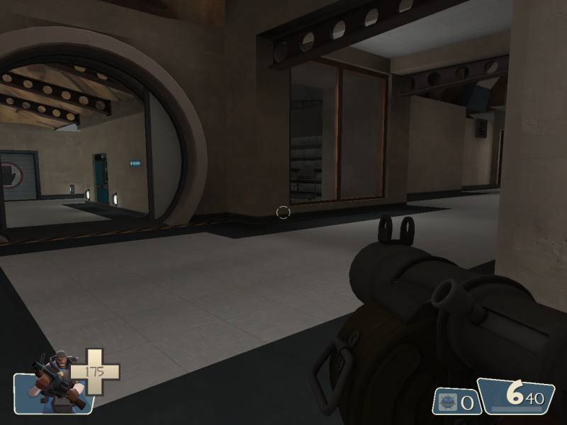
From the stairs at one end of the base, overlooking the main entrance hall, the main door is on the right, just after the blue logo. The lower spawn room is in the recess.

User posted image
Looking up the stairs from the same place. The final half set of stair will lead to the front battlements, still a w.i.p.

User posted image
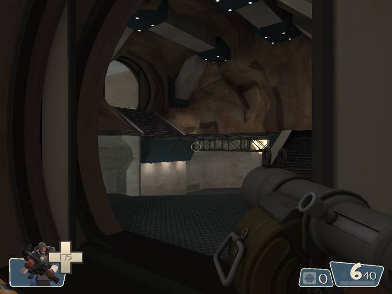
A good view of the upper deck from the top of the half set of stairs. The round door on the right is the predicted secondary route to the intel, but we'll come back that way later. :smile:

User posted image
This one is taken from the opposite end of the previous pic. The upper spawn is directly behind the pov.

User posted image
Heading down the stairs takes us to a short corridor leading to the intel room. The square door leads back into the main entrance hall, and is the same square door that's seen in the 1st pic.

User posted image
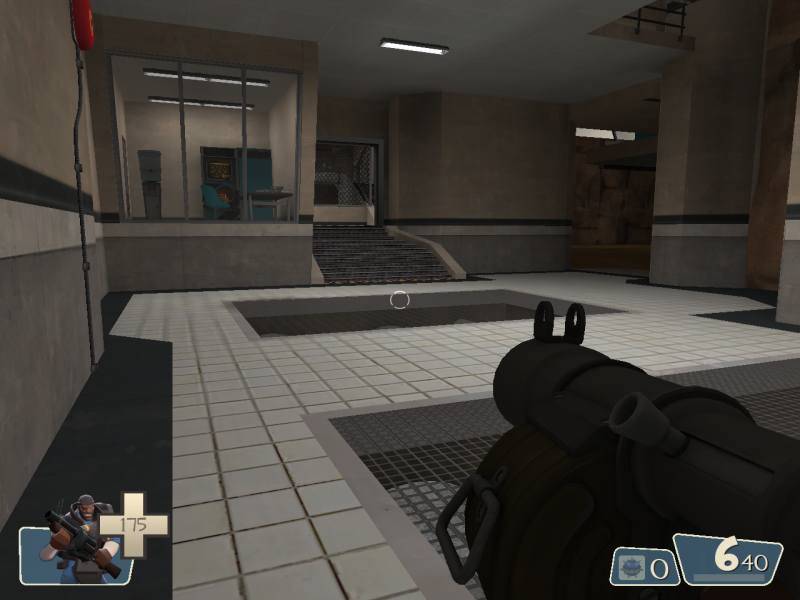
Into the intel room. The intel itself is on the lower deck, so even though the attackers might have a slight height advantage when they enter the room, they need to make the most of it before comitting to a grab.

User posted image
Looking back down into the room from the other end.

User posted image
This corridor is still giving me the s**ts, but I'll sort it. It leads from the intel room (left) to the top deck of the stairs that we started on. User posted image

User posted image
The only thing I like about that corridor is the window, but even that has a very iffy view.

And a couple of pics from the red base for colour comparison.

User posted image

User posted image

There's a door on the top deck, almost directly above the front door, which leads the an office, capzone, battlements area, but there was a hicup. :rolleyes: